Páginas desplazables y vistas de lista
Kirigami.ScrollablePage
A Kirigami.ScrollablePage is a page that holds scrollable content, such as a ListView. Scrolling, as well as scrolling indicators, are automatically managed.
Kirigami.ScrollablePage {
    id: root
    //El rectángulo se podrá desplazar automáticamente
    Rectangle {
        width: root.width
        height: 99999
    }
}
En casi todos los demás aspectos, una página desplazable es lo mismo que una página normal.
Advertencia
Do not put a ScrollView inside of a Kirigami.ScrollablePage; children of aKirigami.ScrollablePage are already inside a ScrollView.ListView en una ScrollablePage
When the direct children of a Kirigami.ScrollablePage extend vertically beyond the size of the page itself, a scrollbar appears at the right edge of the page and the page will be scrollable.
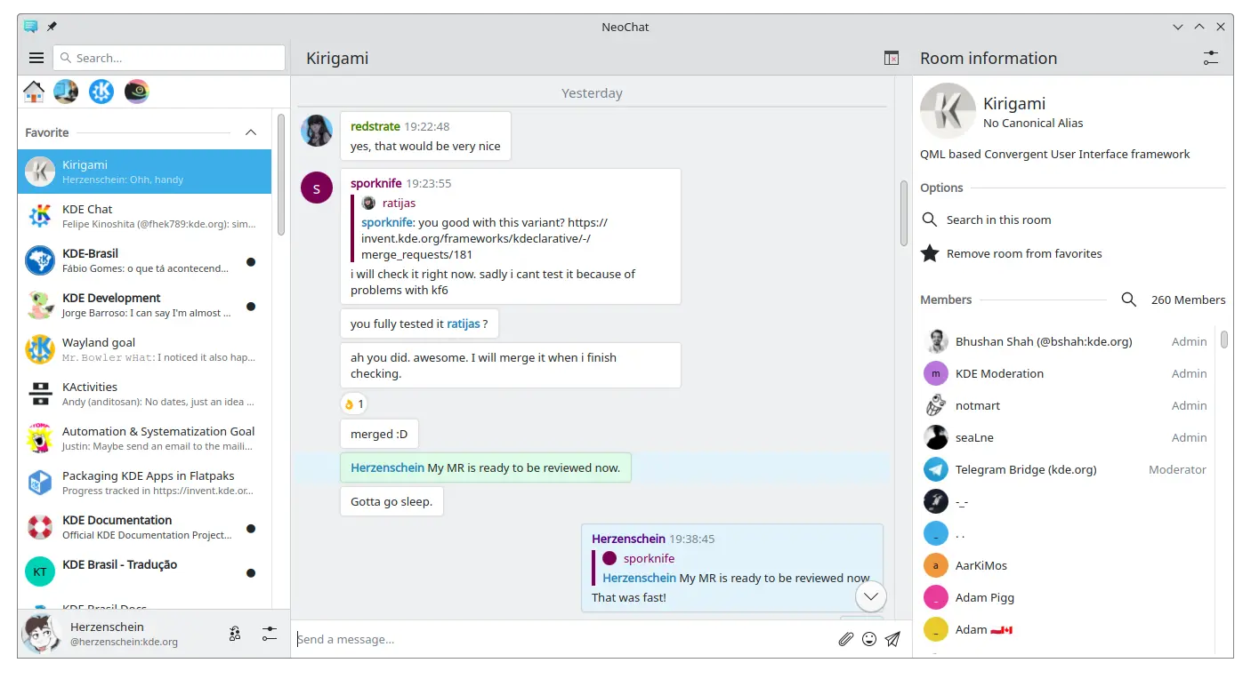
Dos páginas desplazables, ambas conteniendo una ListView con contenido personalizado (captura de pantalla de NeoChat)
Often you have more than one child in your Kirigami.ScrollablePage, and positioning items can be tricky—especially in combination with a ListView.
- For non-visual components, having them inside the ListView component won't change the visuals of the page, so we can move them inside the scope of the list view. Same for elements anchored to the center of the page, such as placeholder messages for empty list views.
- For other items, it might make sense to move them to the header or footer of the Kirigami.ScrollablePage. This is often the case for search bars.
PlaceholderMessage
It is possible to add a Kirigami.PlaceholderMessage with some instructions in case the list view is empty.
Kirigami.ScrollablePage {
    ListView {
        id: listView
        Kirigami.PlaceholderMessage {
            anchors.centerIn: parent
            width: parent.width - (Kirigami.Units.largeSpacing * 4)
            visible: listView.count === 0
            text: i18n("No data found")
            helpfulAction: Kirigami.Action {
            text: i18n("Load data")
                // Más código…
            }
        }
        model: // Código del modelo…
    }
}
Buscar en la ListView
A search field is often added to a Kirigami.ScrollablePage to filter the ListView. This can be done by changing the default titleDelegate to use a Kirigami.SearchField instead.
Kirigami.ScrollablePage {
    titleDelegate: Kirigami.SearchField {
        Layout.topMargin: Kirigami.Units.smallSpacing
        Layout.bottomMargin: Kirigami.Units.smallSpacing
        Layout.fillHeight: true
        Layout.fillWidth: true
        onTextChanged: mySortFilterModel.filterText = text
        KeyNavigation.tab: listView
    }

    ListView {
        id: listView
        // Resto del código de la vista de lista…
    }
}
Sugerencia
You can use KSortFilterProxyModel from KItemModel to easily add filtering capability directly in QML without any need for C++ code.Tirar para actualizar
Otra función que proporciona este componente es una acción «tirar para actualizar». Para usarla, actívela como se indica a continuación:
Kirigami.ScrollablePage {
    id: view
    supportsRefreshing: true
    onRefreshingChanged: {
        if (refreshing) {
            myModel.refresh();
        }
    }
    ListView {
        // Nota: MyModel no proviene de los componentes; solo es un ejemplo de cómo se puede usar
        // junto con alguna lógica de aplicación que puede actualizar el modelo de la lista y emitir
        // una señal cuando haya terminado.
        model: MyModel {
            onRefreshDone: view.refreshing = false;
        }
        delegate: BasicListItem {}
    }
}
Al tirar hacia abajo, también puede activar un modo especial con un margen superior más grande que facilita el uso de la aplicación con una sola mano.