Barras de avance e indicadores
Siempre que su aplicación haga algo que requiera una cantidad considerable de tiempo, querrá usar un elemento visual que le diga al usuario que algo está sucediendo en segundo plano.
Los controles de QtQuick proporcionan dos componentes útiles que puede usar para este fin.
Barra de avance
Controls.ProgressBar es un componente que le permite incluir barras de avance con facilidad en una aplicación. Existen cuatro propiedades principales que tendrá que usar:
- from: el valor mínimo representado por el inicio de la barra de avance
- to: el valor máximo representado por el final de la barra de avance
- value: el valor actual de la acción que está en proceso (por ejemplo, 50 % cargado)
- indeterminate: si la acción que está en proceso en la actualidad no tiene un valor de avance claro, puede definir esta propiedad a
truepara indicar al usuario que está ocurriendo algo, pero que su avance todavía no está claro (aunque lo estará en breve).
import QtQuick
import QtQuick.Layouts
import QtQuick.Controls as Controls
import org.kde.kirigami as Kirigami

Kirigami.ApplicationWindow {
    title: "Progressbar App"
    width: 400
    height: 400
    pageStack.initialPage: Kirigami.Page {
        ColumnLayout {
            anchors.left: parent.left
            anchors.right: parent.right
            Controls.ProgressBar {
                Layout.fillWidth: true
                from: 0
                to: 100
                value: 50
                indeterminate: false
            }
            Controls.ProgressBar {
                Layout.fillWidth: true
                from: 0
                to: 100
                // value: 50
                indeterminate: true
            }
        }
    }
}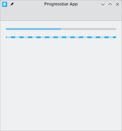
Arriba: barra de avance al 50 %; abajo: barra de avance indeterminada
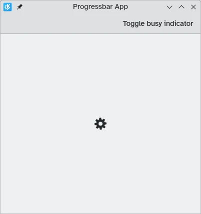
Indicador de ocupado
En los casos en los que los tiempos de carga son más cortos o la medición del avance no es factible, puede usar un Controls.BusyIndicator. Este componente proporciona una sencilla rueda giratoria que indica al usuario que está sucediendo algo.
Si prefiere que el indicador deje de girar, puede definir la propiedad running a false.
import QtQuick
import QtQuick.Controls as Controls
import org.kde.kirigami as Kirigami

Kirigami.ApplicationWindow {
    title: "Progressbar App"
    width: 400
    height: 400
    pageStack.initialPage: Kirigami.Page {
        actions: [
            Kirigami.Action {
                text: "Toggle busy indicator"
                onTriggered: indicator.running ? indicator.running = false : indicator.running = true
            }
        ]
        Controls.BusyIndicator {
            id: indicator
            anchors.centerIn: parent
        }
    }
}