Cajones
Los cajones son paneles que se deslizan por los lados de la ventana de la aplicación. Pueden contener elementos interactivos, como acciones de Kirigami, botones y texto, entre otros.
Los cajones pueden ser de distintos tipos, formas y formatos. En esta página vamos a repasar cada tipo y proporcionaremos un resumen de sus características.
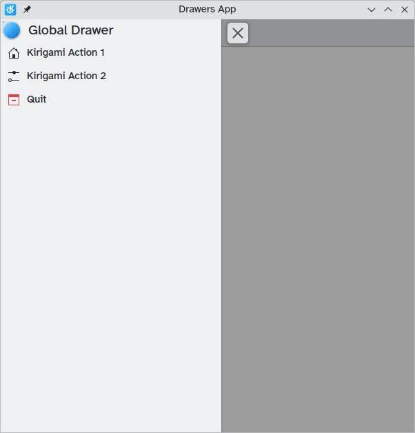
Cajón global
El cajón global es una funcionalidad estándar de las aplicaciones móviles de KDE, que a veces también se puede encontrar en sus reencarnaciones del escritorio. Contiene el menú principal de una aplicación: aquí se incluyen todas las funciones que no son específicas de la página actual, aunque siguen siendo importantes para la navegación general o la interacción dentro de la aplicación.
Se puede activar tocando el menú de hamburguesas o deslizando el dedo desde el borde izquierdo hacia el centro de la pantalla en el modo de izquierda a derecha, o desde el borde derecho en el modo de derecha a izquierda.
Kirigami.GlobalDrawer components are what we use to create such drawers. These are set to the globalDrawer property of the Kirigami.ApplicationWindow that forms the basis of our Kirigami application.
import QtQuick
import org.kde.kirigami as Kirigami

Kirigami.ApplicationWindow {
    title: "Drawers App"
    width: 600
    height: 600
    pageStack.initialPage: Kirigami.Page { /* Page code here... */ }

    globalDrawer: Kirigami.GlobalDrawer {
        title: "Global Drawer"
        titleIcon: "applications-graphics"
        actions: [
            Kirigami.Action {
                text: "Kirigami Action 1"
                icon.name: "user-home-symbolic"
                onTriggered: showPassiveNotification("Action 1 clicked")
            },
            Kirigami.Action {
                text: "Kirigami Action 2"
                icon.name: "settings-configure-symbolic"
                onTriggered: showPassiveNotification("Action 2 clicked")
            },
            Kirigami.Action {
                text: i18n("Quit")
                icon.name: "application-exit-symbolic"
                shortcut: StandardKey.Quit
                onTriggered: Qt.quit()
            }
        ]
    }
}
Nota
The titleIcon property takes names for system-wide icons according to the FreeDesktop specification. These icons and icon names can be viewed with KDE's CuttleFish application which comes with plasma-sdk, or by visiting FreeDesktop's icon naming specification.Cabecera
Las cabeceras se pueden usar para situar componentes adhesivos en la parte superior de nuestro cajón global. Los componentes de cabecera permanecerán en su sitio incluso cuando el cajón global contiene acciones anidadas de Kirigami que sustituyen la capa actual del cajón global.
Your chosen header component can be set with the global drawer's header property, and it will replace the global drawer's title. This is useful to add a Kirigami.SearchField, for example:
import QtQuick
import org.kde.kirigami as Kirigami

Kirigami.ApplicationWindow {
    title: "Drawers App"
    width: 600
    height: 600
    pageStack.initialPage: Kirigami.Page { /* Page code here... */ }

    globalDrawer: Kirigami.GlobalDrawer {
        title: "Global Drawer with searchfield (not visible)"

        header: Kirigami.SearchField {
                id: searchField
        }

        actions: [
            Kirigami.Action {
                text: "Kirigami Action 1"
                icon.name: "user-home-symbolic"
                onTriggered: showPassiveNotification("Action 1 clicked")
            },
            Kirigami.Action {
                text: "Kirigami Action 2"
                icon.name: "settings-configure-symbolic"
                onTriggered: showPassiveNotification("Action 2 clicked")
            },
            Kirigami.Action {
                text: i18n("Quit")
                icon.name: "application-exit-symbolic"
                shortcut: StandardKey.Quit
                onTriggered: Qt.quit()
            }
        ]
    }
}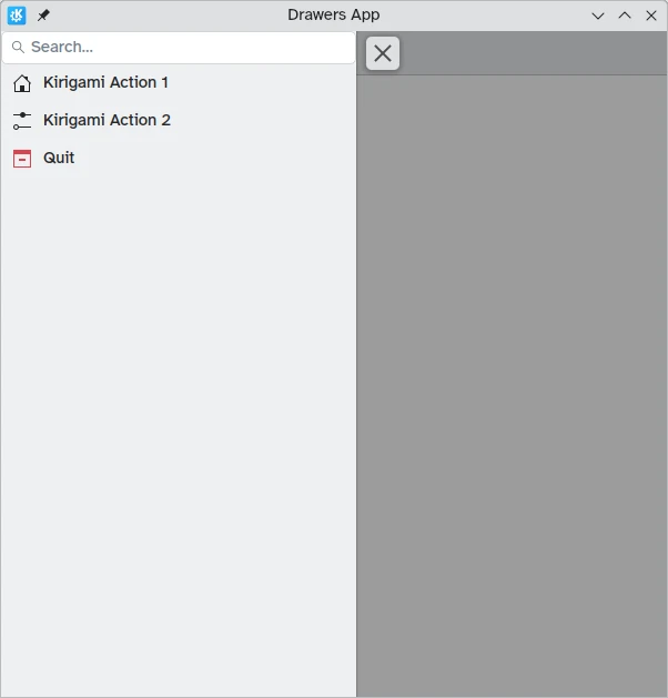
Nuestro cajón global muestra ahora el componente de barra de búsqueda que hemos definido como cabecera
Adaptación para el escritorio
Aunque los cajones globales de estilo panel pueden ser útiles en entornos móviles, es posible que sean demasiado grandes en el escritorio, especialmente cuando la aplicación tiene pocas acciones.
Thankfully, Kirigami global drawers provide an isMenu property. When set to true, they turn into more traditional menus only on the desktop.
Nota
En este modo de menú, las cabeceras y los banners no son visibles.globalDrawer: Kirigami.GlobalDrawer {
isMenu: true
actions: [
// Aquí van las acciones de Kirigami…
]
}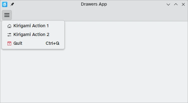
Cajón global en modo menú, sin cabecera ni banner
Cajones de contexto
While a Kirigami.GlobalDrawer displays global actions available throughout your application, a Kirigami.ContextDrawer should be used to display actions that are only relevant in certain contexts. This is usually used in separate pages.
A context drawer will behave differently depending on whether it is being used on a mobile platform or on a desktop.
On a desktop, when a window has enough space, contextual actions show up as part of the actions group in the top toolbar. When space is limited, such as on a mobile device or in a narrow window, contextual actions are hidden behind a hamburger menu on the right side. This is different from other actions in the actions group, namely actions.main, actions.left and actions.right; these do not get hidden in space-constrained windows, and are instead collapsed into their respective icons.
| |
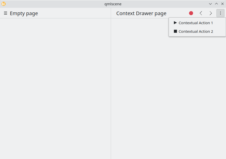
Cajón de contexto con acciones de contexto ocultas
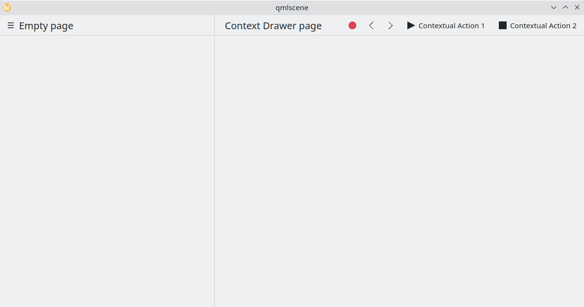
Cajón de contexto mostrando todas las acciones de contexto
On mobile, the drawer always consists of actions hidden behind a hamburger menu. It can be activated by tapping the hamburger menu or by swiping from the right edge to the middle of the screen in Left to Right mode or from the left edge in Right to Left mode.
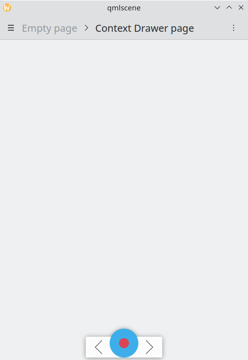
El mismo ejemplo anterior, ejecutado en modo móvil
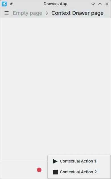
Cajón de contexto abierto en modo móvil
Cajones modales y en línea
Kirigami ofrece dos tipos adicionales de cajones: modales y en línea. Los dos son bastante similares: ambos se extienden por la totalidad de la anchura o de la altura de la aplicación y se pueden situar en los bordes de la ventana de la aplicación. No obstante, reaccionan de forma diferente a la interacción del usuario.
- Los cajones modales están ocultos de forma predeterminada y oscurecen el resto de la aplicación, desapareciendo al hacer clic en un área oscurecida.
- Los cajones en línea se muestran de forma predeterminada y permiten que el usuario pueda interactuar con el resto de la aplicación sin ser descartados, y no oscurecen otras áreas.
Este tipo de cajón es abierto y flexible, aunque por lo general querrá usar este tipo de cajón cuando quiera que aparezca una pequeña lista de opciones al hacer una pulsación prolongada o un clic derecho.
These two drawers are so similar because they can, in fact, be implemented using the same Kirigami component: Kirigami.OverlayDrawer. Here are a few important inherited properties of this component to keep in mind:
- Popup.modal controla si el cajón será modal o en línea según un valor booleano.
- Drawer.edge controla en qué borde de la ventana de la aplicación aparecerá el cajón; las opciones para esta propiedad forman parte del enumerador Edge, en concreto
Qt.TopEdge,Qt.RightEdge,Qt.BottomEdgeyQt.LeftEdge. - Popup.contentItem contiene el componente que formará el contenido del cajón.
import QtQuick
import QtQuick.Layouts
import QtQuick.Controls as Controls
import org.kde.kirigami as Kirigami

Kirigami.ApplicationWindow {
    title: "Drawers App"
    width: 400
    height: 600
    pageStack.initialPage: Kirigami.Page {
        title: "OverlayDrawer at the bottom"
        actions: [
            Kirigami.Action {
                text: "Open bottomDrawer"
                onTriggered: bottomDrawer.open()
            }
        ]
        Kirigami.OverlayDrawer {
            id: bottomDrawer
            edge: Qt.BottomEdge
            // Defina `modal` a falso para hacer que este cajón esté en línea.
            modal: true

            contentItem: RowLayout {
                Controls.Label {
                    Layout.fillWidth: true
                    text: "Say hello to my little drawer!"
                }
                Controls.Button {
                    text: "Close"
                    onClicked: bottomDrawer.close()
                }
            }
        }
    }
}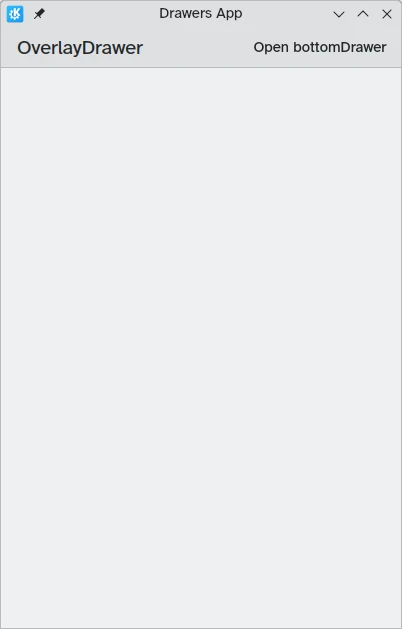
Cajón modal no visible
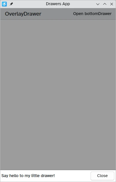
Cajón modal en el borde inferior de la pantalla