Controles y elementos interactivos
Kirigami hace uso de una amplia selección de distintos elementos interactivos de Qt que puede usar en sus aplicaciones. Cada tipo diferente tiene estilos de interacción, estilos visuales y funcionalidades ligeramente diferentes. El uso del tipo de control correcto en su aplicación puede ayudar a que su interfaz de usuario sea más receptiva e intuitiva.
Botones
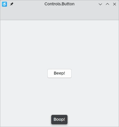
In Kirigami apps, we use the QtQuick Controls Button. Using them is pretty straightforward: we set the text property and any action we want it to perform is set to the onClicked property.
import QtQuick
import QtQuick.Layouts
import QtQuick.Controls as Controls
import org.kde.kirigami as Kirigami

Kirigami.ApplicationWindow {
    title: "Controls.Button"
    width: 400
    height: 400
    pageStack.initialPage: Kirigami.Page {
        ColumnLayout {
            anchors.fill: parent
            Controls.Button {
                Layout.alignment: Qt.AlignCenter
                text: "Beep!"
                onClicked: showPassiveNotification("Boop!")
            }
        }
    }
}
Botones conmutables
The behavior of buttons can be changed to make them toggleable: in this mode, they will stay pressed until clicked on once more. This mode can be activated by setting their checkable property to true; we can also set buttons to be toggled on by default by setting checked to true.
We can get the most out of toggleable buttons by using the onCheckedChanged signal handler which is automatically generated from the checked signal. It works similarly to onClicked, except here the assigned action will be executed when the button's state changes. It is a boolean property, which can come in handy for specific use cases.
En este ejemplo, configuramos la visibilidad de un cajón en línea según el estado de un botón conmutable:
import QtQuick
import QtQuick.Layouts
import QtQuick.Controls as Controls
import org.kde.kirigami as Kirigami

Kirigami.ApplicationWindow {
    title: "Controls.Button (toggleable version)"
    width: 400
    height: 400
    pageStack.initialPage: Kirigami.Page {
        ColumnLayout {
            anchors.fill: parent
            Controls.Button {
                Layout.alignment: Qt.AlignCenter
                text: "Hide inline drawer"
                checkable: true
                checked: true
                onCheckedChanged: myDrawer.visible = checked
            }

            Kirigami.OverlayDrawer {
                id: myDrawer
                edge: Qt.BottomEdge
                modal: false

                contentItem: Controls.Label {
                    text: "Peekaboo!"
                }
            }
        }
    }
}
Nota
Con el tema Brisa predeterminado de KDE Plasma puede ser difícil saber si un botón está conmutado, ya que los botones son de color azul cuando se pulsa en ellos. Asegúrese de tener esto en cuenta al crear su aplicación: un control diferente podría ser más fácil de usar.Botones de la barra de herramientas
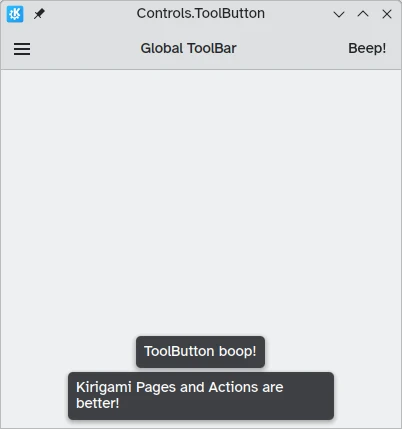
There is a specific button type meant for use in toolbars, Controls.ToolButton. The most obvious difference between this and a conventional Button is the styling, with toolbuttons being flat (though this is alterable with the boolean property flat).
import QtQuick
import QtQuick.Layouts
import QtQuick.Controls as Controls
import org.kde.kirigami as Kirigami

Kirigami.ApplicationWindow {
    title: "Controls.ToolButton"
    width: 600
    height: 600

    header: Controls.ToolBar {
        RowLayout {
            anchors.fill: parent
            Controls.ToolButton {
                icon.name: "application-menu-symbolic"
                onClicked: showPassiveNotification("Kirigami Pages and Actions are better!")
            }
            Controls.Label {
                text: "Global ToolBar"
                horizontalAlignment: Qt.AlignHCenter
                verticalAlignment: Qt.AlignVCenter
                Layout.fillWidth: true
            }
            Controls.ToolButton {
                text: "Beep!"
                onClicked: showPassiveNotification("ToolButton boop!")
            }
        }
    }
}
Controles de selección
Los controles de selección permiten al usuario elegir o escoger una opción. Hay distintos tipos que se adaptan mejor a diferentes situaciones.
Casillas de verificación
Una Controls.CheckBox es adecuada para opciones donde las elecciones no son exclusivas y en las que cada opción tiene una alternativa clara.
import QtQuick
import QtQuick.Layouts
import QtQuick.Controls as Controls
import org.kde.kirigami as Kirigami

Kirigami.ApplicationWindow {
    title: "Controls.CheckBox"
    width: 400
    height: 400
    pageStack.initialPage: Kirigami.Page {
        ColumnLayout {
            anchors.left: parent.left
            anchors.right: parent.right
            Controls.CheckBox {
                Layout.alignment: Qt.AlignHCenter
                text: "This checkbox is checked!"
                checked: true
            }
            Controls.CheckBox {
                Layout.alignment: Qt.AlignHCenter
                text: "This checkbox is not checked!"
                checked: false
            }
        }
    }
}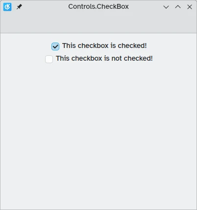
Como puede ver, son fáciles de usar. La propiedad checked tiene un valor booleano que determina si se han marcado o no.
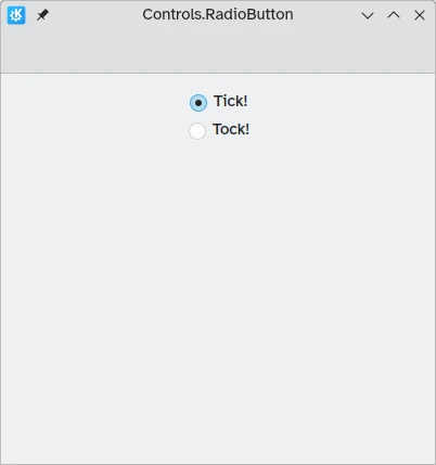
Botones de opción
Un Controls.RadioButton está diseñado para situaciones en las que el usuario debe elegir una opción de un conjunto de varias opciones.
Los botones de opción son mutuamente exclusivos de forma predeterminada: solo se puede marcar un botón del mismo elemento principal.
Al igual que las casillas de verificación, se pueden configurar para que estén marcados o desmarcados de forma predeterminada con la propiedad checked.
import QtQuick
import QtQuick.Layouts
import QtQuick.Controls as Controls
import org.kde.kirigami as Kirigami

Kirigami.ApplicationWindow {
    title: "Controls.RadioButton"
    width: 400
    height: 400
    pageStack.initialPage: Kirigami.Page {

        ColumnLayout {
            anchors.left: parent.left
            anchors.right: parent.right
            Controls.RadioButton {
                Layout.alignment: Qt.AlignCenter
                text: "Tick!"
                checked: true
            }
            Controls.RadioButton {
                Layout.alignment: Qt.AlignCenter
                text: "Tock!"
                checked: false
            }
        }
    }
}
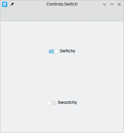
Interruptores
On the desktop, changing settings usually involves changing the setting and then applying it by clicking on an "Apply" or "OK" button. On mobile, we can use a Controls.Switch instead.
Switches can be toggled between an on and off state. They can be toggled by clicking or tapping on them, or they can be dragged towards the on or off position. Once again, switches can be set to be on or off by default with the checked property.
import QtQuick
import QtQuick.Layouts
import QtQuick.Controls as Controls
import org.kde.kirigami as Kirigami

Kirigami.ApplicationWindow {
    title: "Controls.Switch"
    width: 400
    height: 400
    pageStack.initialPage: Kirigami.Page {
        ColumnLayout {
            anchors.fill: parent
            Controls.Switch {
                Layout.alignment: Qt.AlignCenter
                text: "Switchy"
                checked: true
            }
            Controls.Switch {
                Layout.alignment: Qt.AlignCenter
                text: "Swootchy"
                checked: false
            }
        }
    }
}
Deslizadores
Los deslizadores permiten a los usuarios seleccionar ciertos valores deslizando un asa a lo largo de una pista. Existen varios tipos entre los que puede elegir, según los valores que desea que los usuarios elijan en su aplicación.
Deslizadores estándares y con marcas
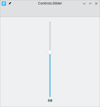
Un Controls.Slider estándar proporciona al usuario un control muy preciso sobre la selección que desee realizar.
En el modo de izquierda a derecha, los controles deslizantes se mueven de izquierda a derecha para aumentar cuando están en orientación horizontal, mientras que en el modo de derecha a izquierda se mueven en la dirección inversa. En ambos modos, los controles deslizantes con orientación vertical se mueven de abajo hacia arriba.
La coloración proporciona un indicador visual de la magnitud del valor seleccionado.
Los deslizadores tienen algunas propiedades importantes a las que debemos prestar atención:
- value: contiene el valor en el que se coloca el asa; también se puede definir manualmente para proporcionar un valor inicial predeterminado
- to: define el intervalo del deslizador indicando el valor máximo hasta el que puede llegar
- orientation: permite situar el deslizador verticalmente si se usa el valor Qt.Vertical
import QtQuick
import QtQuick.Layouts
import QtQuick.Controls as Controls
import org.kde.kirigami as Kirigami

Kirigami.ApplicationWindow {
    title: "Controls.Slider"
    width: 400
    height: 400
    pageStack.initialPage: Kirigami.Page {
        ColumnLayout {
            anchors.fill: parent
            Controls.Slider {
                id: normalSlider
                Layout.alignment: Qt.AlignHCenter
                Layout.fillHeight: true
                orientation: Qt.Vertical
                value: 60
                to: 100
            }
            Controls.Label {
                Layout.alignment: Qt.AlignHCenter
                text: Math.round(normalSlider.value)
            }
        }
    }
}
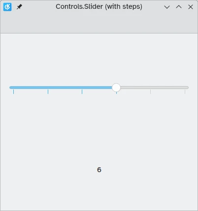
Otra propiedad útil que podemos usar es stepSize. Si le asignamos un valor numérico podremos crear un deslizador que salta en valores que son múltiplos del stepSize indicado, estando estos múltiplos indicados mediante marcas visuales. Por lo tanto, si asignamos el valor 2.0 a esta propiedad, al arrastrar el asa del deslizador solo se podrán seleccionar los valores 0.0, 2.0, 4.0, etc. hasta el valor indicado en la propiedad to.
import QtQuick
import QtQuick.Layouts
import QtQuick.Controls as Controls
import org.kde.kirigami as Kirigami

Kirigami.ApplicationWindow {
    title: "Controls.Slider (with steps)"
    width: 400
    height: 400
    pageStack.initialPage: Kirigami.Page {
        ColumnLayout {
            anchors.fill: parent
            Controls.Slider {
                id: tickmarkedSlider
                Layout.alignment: Qt.AlignHCenter
                Layout.fillWidth: true
                orientation: Qt.Horizontal
                snapMode: Controls.Slider.SnapAlways
                value: 6.0
                to: 10.0
                stepSize: 2.0
            }
            Controls.Label {
                Layout.alignment: Qt.AlignHCenter
                text: tickmarkedSlider.value
            }
        }
    }
}
Deslizadores de intervalo
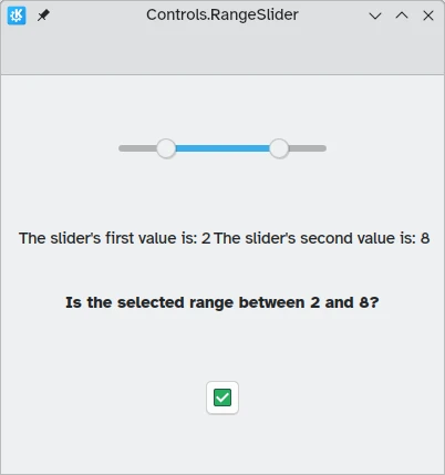
Los controles de QtQuick también proporcionan Controls.RangeSliders. Estos tienen dos asas, por lo que le permiten definir un intervalo de números entre las dos asas.
Es importante tener en cuenta dos nuevas propiedades: first.value y second.value, que contienen los valores de las dos asas. Al igual que la propiedad value de los deslizadores estándares, estas dos propiedades también se pueden establecer previamente.
import QtQuick
import QtQuick.Layouts
import QtQuick.Controls as Controls
import org.kde.kirigami as Kirigami

Kirigami.ApplicationWindow {
    title: "Controls.RangeSlider"
    width: 400
    height: 400
    pageStack.initialPage: Kirigami.Page {
        ColumnLayout {
            anchors.fill: parent
            Controls.RangeSlider {
                id: rangeSlider
                Layout.alignment: Qt.AlignHCenter
                to: 10.0
                first.value: 2.0
                second.value: 8.0
                stepSize: 1.0
                snapMode: Controls.Slider.SnapAlways
            }
            RowLayout {
                Layout.alignment: Qt.AlignHCenter
                Layout.fillWidth: true
                Controls.Label {
                    Layout.fillWidth: true
                    text: "The slider's first value is: " + Math.round(rangeSlider.first.value)
                }
                Controls.Label {
                    Layout.fillWidth: true
                    text: "The slider's second value is: " + Math.round(rangeSlider.second.value)
                }
            }
            Controls.Label {
                Layout.alignment: Qt.AlignHCenter
                font.bold: true
                text: "Is the selected range between 2 and 8?"
            }
            Controls.Button {
                Layout.alignment: Qt.AlignHCenter
                icon.name: {
                    if (rangeSlider.first.value >= 2 && rangeSlider.second.value <= 8)
                        return "emblem-checked"
                    else
                        return "emblem-error"
                }
            }
        }
    }
}