Tarjetas
Los tipos de Kirigami AbstractCard y Card se usan para implementar el popular componente de tarjetas que se usa en muchas plataformas móviles y web. Las tarjetas se pueden usar para mostrar una recopilación de información o acciones de una forma atractiva y distintiva.
Kirigami también ofrece tres tipos de vistas y posicionadores para ayudarle a presentar tarjetas con diseños agradables y receptivos.
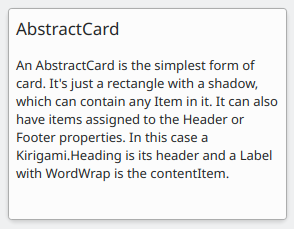
AbstractCard
A Kirigami.AbstractCard is the simplest type of card. It's just a rectangle with a shadow, which can contain any Item in it. It can also have Items assigned to its header or footer properties. In this case a Kirigami.Heading is its header and a Controls.Label is the card's contentItem.
Kirigami.AbstractCard {
    Layout.fillHeight: true
    header: Kirigami.Heading {
        text: qsTr("AbstractCard")
        level: 2
    }
    contentItem: Controls.Label {
        wrapMode: Text.WordWrap
        text: "..."
    }
}
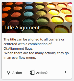
Card
A Kirigami.Card inherits from AbstractCard and provides more features out of the box. Cards inherit the same header and footer from an Abstract Card, but you are encouraged to use a banner and a set of Kirigami.Action in the actions group instead.
Kirigami.Card {
    actions: [
        Kirigami.Action {
            text: qsTr("Action1")
            icon.name: "add-placemark"
        },
        Kirigami.Action {
            text: qsTr("Action2")
            icon.name: "address-book-new-symbolic"
        },
        // …
    ]
    banner {
        source: "../banner.jpg"
        title: "Title Alignment"
        // El título se puede situar en el *banner*
        titleAlignment: Qt.AlignLeft | Qt.AlignBottom
    }
    contentItem: Controls.Label {
        wrapMode: Text.WordWrap
        text: "My Text"
    }
}
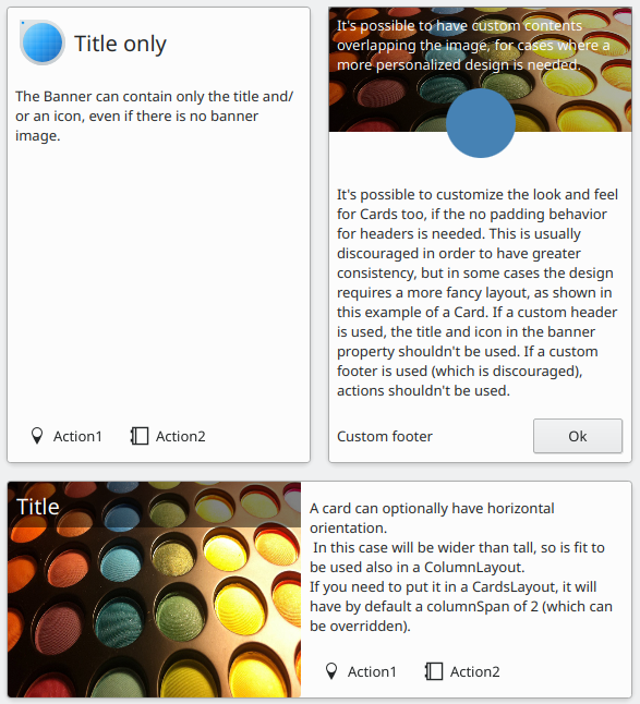
CardsLayout
Un Kirigami.CardsLayout es más útil cuando las tarjetas que se presentan no están instanciadas por un modelo o se han instanciado por un modelo que siempre tiene muy pocos elementos. Se presentan como una cuadrícula de dos columnas que permanecerán centradas si la aplicación es realmente ancha, o se convertirán en una sola columna si no hay suficiente espacio para dos columnas, como la pantalla de un teléfono móvil.
Nota
CardsListView es más apropiada para modelos grandes.A card can optionally be oriented horizontally. In this case it will be wider than tall, and is better suited to being placed in a ColumnLayout. If you must put it in a CardsLayout, it will have a maximumColumns of 2 by default.
ColumnLayout {
    Kirigami.CardsLayout {
        Kirigami.Card {
            contentItem: Controls.Label {
                wrapMode: Text.WordWrap
                text: "My Text2"
            }
        }
        Kirigami.AbstractCard {
            contentItem: Controls.Label {
                wrapMode: Text.WordWrap
                text: "My Text"
            }
        }
        Kirigami.Card {
            headerOrientation: Qt.Horizontal
            contentItem: Controls.Label {
                wrapMode: Text.WordWrap
                text: "My Text2"
            }
        }
    }
}
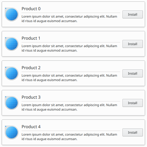
CardsListView
Una Kirigami.CardsListView es una vista de lista que se puede usar con componentes AbstractCard.
A CardsListView will stretch child cards to its own width. This component should therefore only be used with cards which will look good at any horizontal size. Use of a Card component inside it is discouraged, unless it has Qt.Horizontal as its headerOrientation property.
Kirigami.CardsListView {
    id: view
    model: 100

    delegate: Kirigami.AbstractCard {
        //NOTA: no usar nunca un Layout como contentItem, ya que puede provocar bucles de enlace.
        contentItem: Item {
            implicitWidth: delegateLayout.implicitWidth
            implicitHeight: delegateLayout.implicitHeight
            GridLayout {
                id: delegateLayout
                anchors {
                    left: parent.left
                    top: parent.top
                    right: parent.right
                    //IMPORTANTE: no colocar nunca el margen inferior
                }
                rowSpacing: Kirigami.Units.largeSpacing
                columnSpacing: Kirigami.Units.largeSpacing
                columns: width > Kirigami.Units.gridUnit * 20 ? 4 : 2
                Kirigami.Icon {
                    source: "applications-graphics"
                    Layout.fillHeight: true
                    Layout.maximumHeight: Kirigami.Units.iconSizes.huge
                    Layout.preferredWidth: height
                }
                Kirigami.Heading {
                    level: 2
                    text: qsTr("Product ")+ modelData
                }
                Controls.Button {
                    Layout.alignment: Qt.AlignRight
                    Layout.columnSpan: 2
                    text: qsTr("Install")
                }
            }
        }
    }
}