Barras de herramientas de acciones
Aunque las páginas de Kirigami le permiten situar con facilidad un conjunto de acciones en la cabecera de la página, hay veces en las que preferirá tener algo más flexible.
Kirigami proporciona el componente Kirigami.ActionToolBar. Muestra una lista de objetos Kirigami.Action que contendrá tantos como sea posible, proporcionando un menú de sobrantes para los que no quepan en ella. La ActionToolBar es dinámica y moverá acciones dentro y fuera del menú de sobrantes dependiendo del tamaño disponible para ella.
Nota
Esta página supone que está familiarizado con los objetos Kirigami.Action. En caso contrario, puedes aprender todo lo necesario sobre ellos en nuestro tutorial para principiantes o en la página de documentación dedicada a los mismos.Creando su primera ActionToolBar
El diseño y la ubicación de su Kirigami.ActionToolBar dependen realmente de usted, aunque en aras de la facilidad de uso, suele ser una buena idea ceñirse a las convenciones de interfaces de usuario y colocar la barra de herramientas cerca de la parte superior o inferior de la página y que se extienda a lo ancho.
Like most other action-holding components, Kirigami.ActionToolBar has an actions property. We can assign an array of Kirigami.Action components to this property.
import QtQuick
import QtQuick.Layouts
import QtQuick.Controls as Controls
import org.kde.kirigami as Kirigami
Kirigami.ApplicationWindow {
id: root
title: "ActionToolBar App"
width: 600
height: 400
pageStack.initialPage: Kirigami.Page {
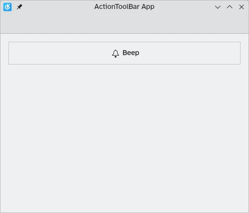
Kirigami.ActionToolBar {
anchors.left: parent.left
anchors.right: parent.right
actions: [
Kirigami.Action {
text: "Beep"
icon.name: "notifications"
onTriggered: showPassiveNotification("BEEP!")
},
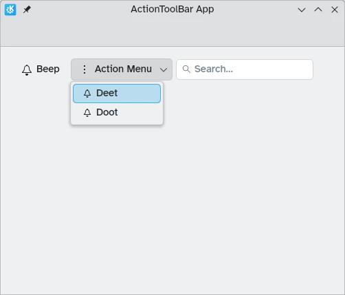
Kirigami.Action {
text: "Action Menu"
icon.name: "overflow-menu"
Kirigami.Action {
text: "Deet";
icon.name: "notifications"
onTriggered: showPassiveNotification("DEET!")
}
Kirigami.Action {
text: "Doot";
icon.name: "notifications"
onTriggered: showPassiveNotification("DOOT!")
}
},
Kirigami.Action {
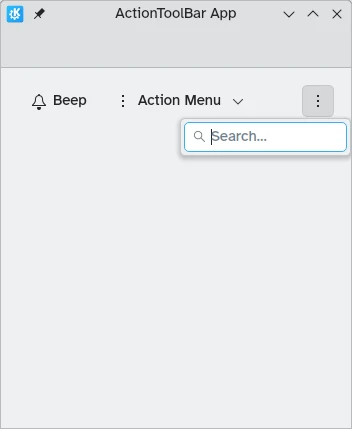
icon.name: "search"
displayComponent: Kirigami.SearchField { }
}
]
}
}
}
ActionToolBar con suficiente espacio para todas las acciones hijas
ActionToolBar con un menú de sobrantes que contiene acciones hijas
Alineación
By default, actions in the Kirigami.ActionToolBar will be left aligned. This might not be desirable in all situations. Thankfully we can change this with the alignment property. We can set this property to a range of values, but the three most relevant ones are Qt.AlignLeft, Qt.AlignCenter, and Qt.AlignRight (which deal with horizontal alignment).
import QtQuick
import QtQuick.Layouts
import QtQuick.Controls as Controls
import org.kde.kirigami as Kirigami

Kirigami.ApplicationWindow {
    id: root

    title: "ActionToolBar App"
    width: 600
    height: 400

    pageStack.initialPage: Kirigami.Page {
        Controls.GroupBox {
            anchors.left: parent.left
            anchors.right: parent.right

            Kirigami.ActionToolBar {
                anchors.fill: parent

                alignment: Qt.AlignCenter

                actions: [
                    Kirigami.Action {
                        text: "Beep"
                        icon.name: "notifications"
                        onTriggered: showPassiveNotification("BEEP!")
                    }
                ]
            }
        }
    }
}