Componentes basados en acciones
Acciones
Una Kirigami.Action consiste en una acción sobre la que se puede hacer clic y cuya apariencia depende de donde se añada. Por lo general es un botón con un icono y un texto.
Podemos usarlas para proporcionar a nuestras aplicaciones acciones de fácil acceso que son esenciales para su funcionalidad.
Nota
Las acciones de Kirigami heredan de QtQuick.Controls.Action y se les pueden asignar atajos de teclado.Al igual que las acciones de los controles de QtQuick, se pueden asignar a elementos del menú y a botones de la barra de herramientas, así como a otros componentes de Kirigami.
import org.kde.kirigami as Kirigami

Kirigami.Action {
    id: copyAction
    text: i18n("Copy")
    icon.name: "edit-copy"
    shortcut: StandardKey.Copy
    onTriggered: {
        // …
    }
}
Nota
The icon.name property takes names for system-wide icons following the FreeDesktop specification. These icons and icon names can be viewed with KDE's CuttleFish application which comes with plasma-sdk, or by visiting FreeDesktop's icon naming specification.Una funcionalidad que ofrecen las acciones de Kirigami sobre las acciones de QtQuick es la posibilidad de anidar acciones.
import org.kde.kirigami as Kirigami

Kirigami.Action {
    text: "View"
    icon.name: "view-list-icons"
    Kirigami.Action {
        text: "action 1"
    }
    Kirigami.Action {
        text: "action 2"
    }
    Kirigami.Action {
        text: "action 3"
    }
}
Another feature of Kirigami Actions is to provide various hints to items using actions about how they should display the action. These are primarily handled by the displayHint and displayComponent properties.
Estas propiedades serán respetadas por el elemento siempre que sea posible. Por ejemplo, la siguiente acción se mostrará como un TextField con el elemento haciendo todo lo posible para mantenerse visible el mayor tiempo posible.
import org.kde.kirigami as Kirigami

Kirigami.Action {
    text: "Search"
    icon.name: "search"

    displayComponent: TextField { }

    displayHint: Kirigami.DisplayHints.KeepVisible
}
Uso de acciones en otros componentes
Como se ha mencionado en el tutorial de introducción para las acciones, las acciones de Kirigami son contextuales, lo que significa que se muestran en distintos lugares según dónde las ponga. Además, también tienen distintas representaciones para el escritorio y para el móvil.
Página
Una Kirigami.Page muestra Actions a la derecha de la cabecera superior en modo escritorio, o en el pie de página en modo móvil.
| |
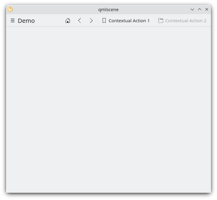
Acciones de página en el escritorio
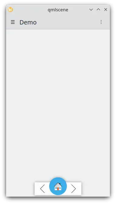
Acciones de página en un dispositivo móvil
Cajón global
El Kirigami.GlobalDrawer es una barra lateral semejante a un menú que proporciona navegación basada en acciones para su aplicación. Aquí es donde las acciones anidadas resultan útiles, ya que permiten crear navegación anidada:
import org.kde.kirigami as Kirigami

Kirigami.ApplicationWindow {
    title: "Actions Demo"
    globalDrawer: Kirigami.GlobalDrawer {
        title: "Demo"
        titleIcon: "applications-graphics"
        actions: [
            Kirigami.Action {
                text: "View"
                icon.name: "view-list-icons"
                Kirigami.Action {
                    text: "View Action 1"
                    onTriggered: showPassiveNotification("View Action 1 clicked")
                }
                Kirigami.Action {
                    text: "View Action 2"
                    onTriggered: showPassiveNotification("View Action 2 clicked")
                }
            },
            Kirigami.Action {
                text: "Action 1"
                onTriggered: showPassiveNotification("Action 1 clicked")
            },
            Kirigami.Action {
                text: "Action 2"
                onTriggered: showPassiveNotification("Action 2 clicked")
            }
        ]
    }
    //…
}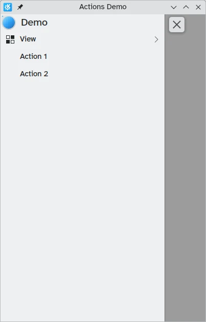
Acciones del cajón global en el escritorio
Puede obtener más información sobre los cajones globales en la página de documentación de los cajones.
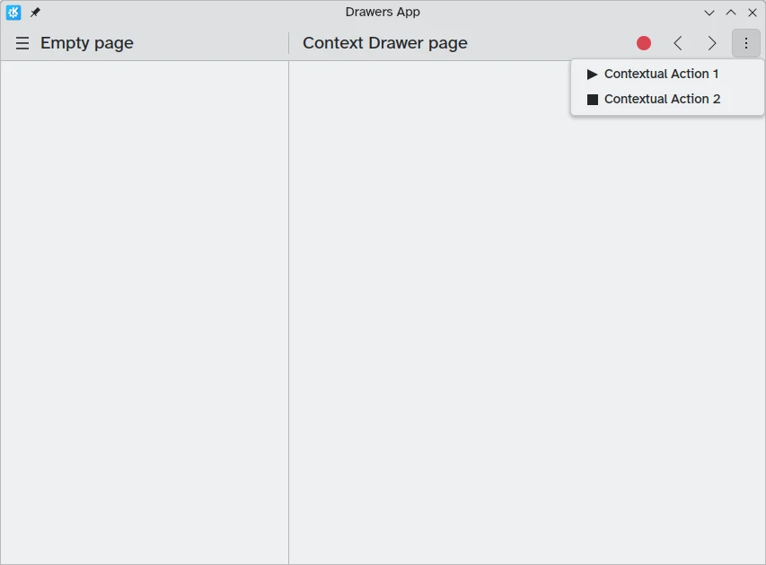
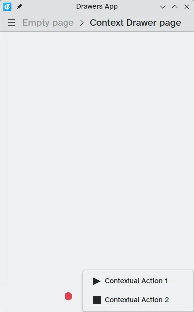
Cajón de contexto
Un Kirigami.ContextDrawer consta de un conjunto adicional de acciones ocultas tras un menú de tres puntos en la esquina superior derecha en el modo de escritorio o en la esquina inferior derecha en el modo móvil si no hay espacio. Se usa para mostrar acciones relevantes solo para una determinada página. Puede leer más sobre ellas en nuestro tutorial sobre los cajones de Kirigami.
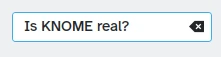
ActionTextFields
Una Kirigami.ActionTextField se usa para añadir algunas acciones de contexto a un campo de teto. Por ejemplo, para borrar el texto o para buscar dicho texto.
Kirigami.ActionTextField {
    id: searchField
    rightActions: [
        Kirigami.Action {
            icon.name: "edit-clear"
            visible: searchField.text !== ""
            onTriggered: {
                searchField.text = ""
                searchField.accepted()
            }
        }
    ]
}
En este ejemplo, vamos a crear un botón de borrado para un campo de búsqueda, que solo será visible tras introducir texto.
Nota
You should rarely use an ActionTextField directly. SearchField and PasswordField both inherit from ActionTextField and are likely to cover your desired use-case.SwipeListItem
Un Kirigami.SwipeListItem es un delegado diseñado para permitir acciones adicionales. Cuando se usa un ratón, siempre se mostrarán sus acciones. En un dispositivo táctil, se mostrará al arrastrar el elemento mediante un asa. En las siguientes imágenes, son los iconos de la derecha.
ListView {
    model: myModel
    delegate: SwipeListItem {
        Controls.Label {
            text: model.text
        }
        actions: [
             Action {
                 icon.name: "document-decrypt"
                 onTriggered: print("Action 1 clicked")
             },
             Action {
                 icon.name: model.action2Icon
                 onTriggered: //hacer algo
             }
        ]
    }
}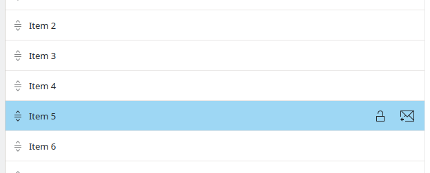
SwipeListItem en una computadora
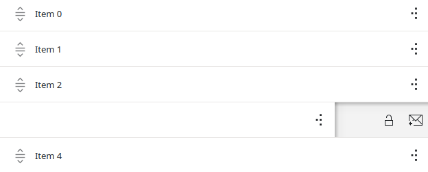
SwipeListItem en un dispositivo móvil
ActionToolBar
Una Kirigami.ActionToolBar es una barra de herramientas creada a partir de una lista de acciones. De forma predeterminada, cada acción que quepa en la barra de herramientas se representará mediante un ToolButton, mientras que las que no quepan se moverán a un menú en un extremo de la barra de herramientas.
Como ActionTextField, no necesita usar ActionToolBar directamente, ya que la usan las cabeceras de las páginas y de las tarjetas para mostrar sus acciones.
import org.kde.kirigami as Kirigami

Kirigami.ApplicationWindow {
    title: "Actions Demo"
    width: 350
    height: 350
    header: Kirigami.ActionToolBar {
        actions: [
            Kirigami.Action {
                text: i18n("View Action 1")
                onTriggered: showPassiveNotification(i18n("View Action 1 clicked"))
            },
            Kirigami.Action {
                text: i18n("View Action 2")
                onTriggered: showPassiveNotification(i18n("View Action 2 clicked"))
            },
            Kirigami.Action {
                text: i18n("Action 1")
                onTriggered: showPassiveNotification(i18n("Action 1 clicked"))
            },
            Kirigami.Action {
                text: i18n("Action 2")
                onTriggered: showPassiveNotification(i18n("Action 2 clicked"))
            }
        ]
    }
}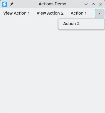
Una barra de herramientas horizontal que se muestra en la parte superior de la aplicación
Puede leer más sobre los componentes ActionToolBar en su propia página de documentación.
Tarjetas
A Kirigami.Card is used to display a collection of information or actions together. These actions can be added to the actions group, similarly to previous components.
Kirigami.Card {
    actions: [
        Kirigami.Action {
            text: qsTr("Action1")
            icon.name: "add-placemark"
        },
        Kirigami.Action {
            text: qsTr("Action2")
            icon.name: "address-book-new-symbolic"
        },
        // …
    ]
    banner {
        source: "../banner.jpg"
        title: "Title Alignment"
        titleAlignment: Qt.AlignLeft | Qt.AlignBottom
    }
    contentItem: Controls.Label {
        wrapMode: Text.WordWrap
        text: "My Text"
    }
}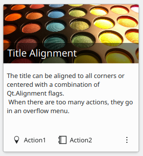
Para más información, consulte la página del componente de tarjetas.