Delegados de Form en sus páginas de preferencias
Los complementos de Kirigami son un conjunto adicional de componentes visuales que funcionan bien en el móvil y en el escritorio, con la garantía de ser multiplataforma. Usan Kirigami internamente para crear sus componentes.
You have learned how to add About and AboutKDE pages to your application. Now you will be able to use their same inner components to create your settings pages.
La estructura del proyecto debería parecerse a esto:
addonsexample
├── CMakeLists.txt
├── main.cpp
├── Main.qml
├── MyAboutPage.qml
└── SettingsPage.qml
Cambios necesarios
Cambie Main.qml para que incluya nuestra nueva página de preferencias:
import QtQuick
import QtQuick.Layouts

import org.kde.kirigami as Kirigami
import org.kde.kirigamiaddons.formcard as FormCard

import org.kde.about 1.0

Kirigami.ApplicationWindow {
    id: root
    width: 600
    height: 700

    Component {
        id: aboutkde
        FormCard.AboutKDE {}
    }

    Component {
        id: aboutpage
        MyAboutPage {}
    }

    Component {
        id: settingspage
        SettingsPage {}
    }

    pageStack.initialPage: Kirigami.ScrollablePage {
        ColumnLayout {
            FormCard.FormCard {
                FormCard.FormButtonDelegate {
                    id: aboutKDEButton
                    icon.name: "kde"
                    text: i18n("About KDE Page")
                    onClicked: root.pageStack.layers.push(aboutkde)
                }

                FormCard.FormButtonDelegate {
                    id: aboutPageButton
                    icon.name: "applications-utilities"
                    text: i18n("About Addons Example")
                    onClicked: root.pageStack.layers.push(aboutpage)
                }

                FormCard.FormButtonDelegate {
                    id: settingsButton
                    icon.name: "settings-configure"
                    text: i18n("Single Settings Page")
                    onClicked: root.pageStack.layers.push(settingspage)
                }
            }
        }
    }
}
Ahora podemos comenzar a revisar los componentes usados para crear nuestra página de «Preferencias»: la tarjeta de formulario y sus delegados.
Delegados de Form
FormCard y FormCardPage
FormCard.FormCard is the main component we will be using to group all its child components, the Delegates.
We used a form card in the Kirigami Addons introduction before. Its main purpose is to serve as a container for other components while following a color different from the background, in a similar manner to a Kirigami.Card.
Cree un nuevo archivo SettingsPage.qml:
import QtQuick
import org.kde.kirigamiaddons.formcard as FormCard

FormCard.FormCardPage {
    FormCard.FormCard {
        // Aquí es donde van nuestros delegados.
    }

    FormCard.FormCard {
        // Aquí es donde van nuestros delegados.
    }
}
Since we are making a separate QML file for our Settings page, and since we need to prepare for potential scrolling in our page, we use a FormCard.FormCardPage, which inherits Kirigami.ScrollablePage.
Lo bueno de la página de la tarjeta de formulario es que viene con un diseño interno, por lo que no necesita ningún «ColumnLayout» adicional, y nuestros delegados se pueden añadir directamente al mismo.
Nota
Se pueden usar delegados de FormCard directamente con una Kirigami.ScrollablePage, aunque en este caso tendrá que añadir sus propios diseños.FormHeader
For every FormCard you want to create, you can create a FormHeader just before it. The header uses bold text and shows up right above the form card.
import org.kde.kirigamiaddons.formcard as FormCard
FormCard.FormCardPage {
FormCard.FormHeader {
title: i18n("General")
}
FormCard.FormCard {
// Nuestros delegados van aquí…
}
FormCard.FormHeader {
title: i18n("Accounts")
}
FormCard.FormCard {
// Nuestros delegados van aquí…
}
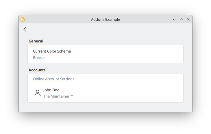
}FormTextDelegate y FormSectionText
Empecemos de forma sencilla, con texto sin formato.
FormSectionText solo añade un delegado delgado que contiene una etiqueta. FormTextDelegate tiene texto y una descripción en gris.
import QtQuick
import org.kde.kirigami as Kirigami
import org.kde.kirigamiaddons.formcard as FormCard

FormCard.FormCardPage {
    FormCard.FormHeader {
        title: i18n("General")
    }

    FormCard.FormCard {
        FormCard.FormTextDelegate {
            text: i18n("Current Color Scheme")
            description: "Breeze"
        }
    }

    FormCard.FormHeader {
        title: i18n("Accounts")
    }

    FormCard.FormCard {
        FormCard.FormSectionText {
            text: i18n("Online Account Settings")
        }
        FormCard.FormTextDelegate {
            leading: Kirigami.Icon {source: "user"}
            text: "John Doe"
            description: i18n("The Maintainer ™️")
        }
    }
}
We add some dummy text for the hypothetical theme detection. If we wanted to have actual color scheme detection, in the future it could be done similarly to Neochat (code here), making use of a C++ model with KColorSchemeManager.
In the Online Accounts section, we see an additional property, leading. We can add an Item to it so that it appears before the text. Its opposite property, trailing, would be able to show an Item after the text, but we won't use it in our program.
We use a Kirigami.Icon here for simplicity, but this could also be implemented using a Kirigami Addons Avatar that grabs the information from a model, as is done in Neochat.
Debería terminar pareciéndose a esto:
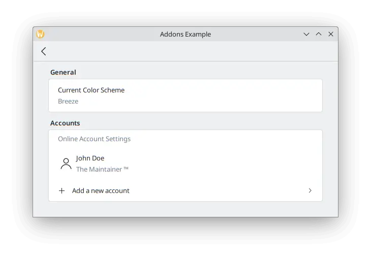
FormButtonDelegate
The FormButtonDelegate is visually similar to a FormTextDelegate, but it is clickable and shows an arrow pointing to the right. We used it in the Kirigami Addons introduction before.
While the FormTextDelegate had the leading and trailing properties to show an item before and after the main content, the FormButtonDelegate only has the leading property, because the right side is occupied by the arrow.
import QtQuick
import org.kde.kirigami as Kirigami
import org.kde.kirigamiaddons.formcard as FormCard

FormCard.FormCardPage {
    FormCard.FormHeader {
        title: i18n("General")
    }

    FormCard.FormCard {
        FormCard.FormTextDelegate {
            text: i18n("Current Color Scheme")
            description: "Breeze"
        }
    }

    FormCard.FormHeader {
        title: i18n("Accounts")
    }

    FormCard.FormCard {
        FormCard.FormSectionText {
            text: i18n("Online Account Settings")
        }
        FormCard.FormTextDelegate {
            leading: Kirigami.Icon {source: "user"}
            text: "John Doe"
            description: i18n("The Maintainer ™️")
        }
        FormCard.FormButtonDelegate {
            icon.name: "list-add"
            text: i18n("Add a new account")
            onClicked: console.info("Clicked!")
        }
    }
}
We use its icon.name property to set a plus (+) icon to appear after the space where the leading would appear, and before the main content. This is a common pattern to indicate your button will add something to a list.
Dado que este ejemplo tiene fines ilustrativos sencillos, no profundizamos en lo que se haría tras pulsar el botón: solo muestra «¡Pulsado!» en la terminal. Podríamos crear una nueva página para crear una cuenta que añada otro usuario a un modelo y luego mostrar la página en la vista, de forma similar a lo que hicimos en Main.qml.
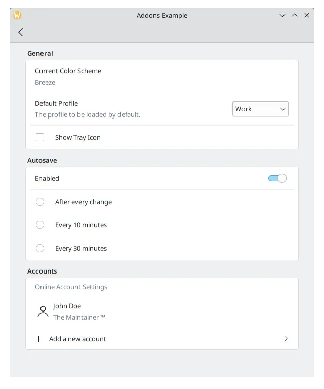
FormRadioDelegate, FormCheckDelegate y FormSwitchDelegate
The RadioButton, CheckBox and Switch are very commonly used components in any user interface. Kirigami Addons provides them as FormRadioDelegate, FormCheckDelegate and FormSwitchDelegate.
Sus únicas propiedades principales son text y description. Se usan de forma diferente porque heredan de AbstractButton, por lo que se espera que use sus señales y manejadores: «checked» y «onChecked», «toggled» y «onToggled», «clicked» y «onClicked».
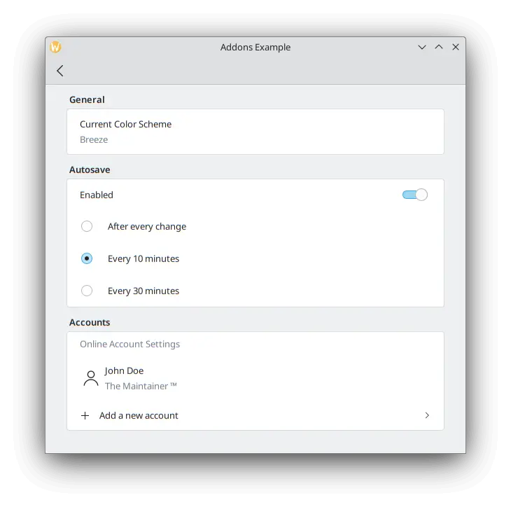
We want to create some autosave functionality in our application, and we want to only show its settings if the user has enabled this functionality. Create a new section using a FormCard and a FormHeader, then add a FormSwitchDelegate and a FormRadioDelegate.
FormCard.FormHeader {
    title: i18n("Autosave")
}

FormCard.FormCard {
    FormCard.FormSwitchDelegate {
        id: autosave
        text: i18n("Enabled")
    }
    FormCard.FormRadioDelegate {
        text: i18n("After every change")
        visible: autosave.checked
    }
    FormCard.FormRadioDelegate {
        text: i18n("Every 10 minutes")
        visible: autosave.checked
    }
    FormCard.FormRadioDelegate {
        text: i18n("Every 30 minutes")
        visible: autosave.checked
    }
}
Vinculamos la visibilidad de cada botón de opción a un interruptor, por lo que solo aparecen cuando el interruptor está activado.
Mejores prácticas
Pulse aquí para leer más
If you have some programming background in imperative languages such as C++, you might be tempted to set the checked property of the switch to turn the visibility of the radio buttons to true with a JavaScript assignment such as:
checked: {
    radio1.visible = true;
    radio2.visible = true;
    radio3.visible = true;
}
Esto no es muy eficiente para el lenguaje declarativo de QML y sus señales y ranuras. Trate de usar enlaces QML, como en el caso de visible: autosave.checked, tanto como sea posible en lugar de expresiones JavaScript.
Consulte esta paǵina para más detalles.
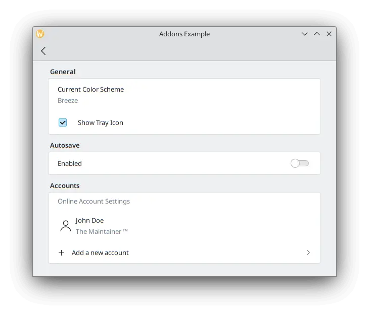
To test our checkbox, we can add a new FormCheckDelegate to our General section.
FormCard.FormHeader {
    title: i18n("General")
}

FormCard.FormCard {
    FormCard.FormTextDelegate {
        text: i18n("Current Color Scheme")
        description: "Breeze"
    }
    FormCard.FormCheckDelegate {
        text: i18n("Show Tray Icon")
        onToggled: {
            if (checkState) {
                console.info("A tray icon appears on your system!")
            } else {
                console.info("The tray icon disappears!")
            }
        }
    }
}
Here we use the signal handler called onToggled to show some dummy text to simulate a tray icon appearing in the system. If you really wanted to, you could easily implement a tray icon using KDE's KStatusNotifierItem or Qt's SystemTrayIcon.
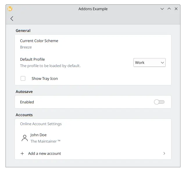
Hasta ahora, nuestra aplicación debería parecerse a esto:
FormComboBoxDelegate
The common ComboBox component can be created using a FormComboBoxDelegate.
Esta lista desplegable tiene varias propiedades útiles que podemos usar: editable, displayText y displayMode.
Defina editable: true para permitir que el usuario pueda modificar el texto de la lista desplegable, que será de utilidad si necesita añadir nuevas opciones de la lista desplegable.
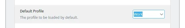
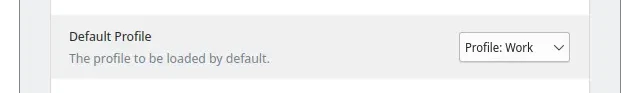
Siempre que necesite mostrar texto adicional antes de cada opción, puede usar algo semejante a displayText: "Perfil: " + textoActual:
And the most interesting one, which we will be using in our example, is displayMode. It can have three options:
- FormComboBoxDelegate.ComboBox: el pequeño cuadro estándar que muestra una lista de opciones.
- FormComboBoxDelegate.Dialog: a dialog showing a list of options in the middle of the window, like a Kirigami.OverlaySheet.
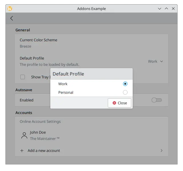
- FormComboBoxDelegate.Page: una nueva página que contiene una lista de opciones que se muestran en una ventana separada.
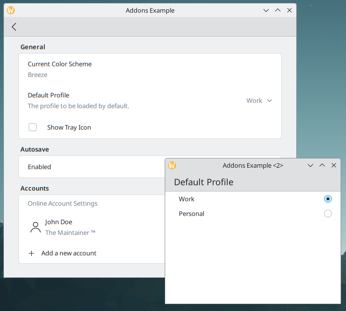
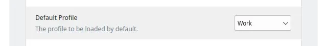
Añada lo siguiente entre los delegados "Esquema de color actual" y "Mostrar bandeja del sistema" de la tarjeta "General".
FormCard.FormComboBoxDelegate {
    text: i18n("Default Profile")
    description: i18n("The profile to be loaded by default.")
    displayMode: FormCard.FormComboBoxDelegate.ComboBox
    currentIndex: 0
    editable: false
    model: ["Work", "Personal"]
}
Con la casilla de verificación, nuestra página de «Preferencias» debería parecerse a esto:
FormDelegateSeparator
Our Settings page is taking shape, but each section is starting to get long. We can add a few FormDelegateSeparator instances to make our page tidier:
import QtQuick
import org.kde.kirigami as Kirigami
import org.kde.kirigamiaddons.formcard as FormCard

FormCard.FormCardPage {
    id: root

    title: i18nc("@title", "Settings")

    FormCard.FormHeader {
        title: i18nc("@title:group", "General")
    }

    FormCard.FormCard {
        FormCard.FormTextDelegate {
            text: i18nc("@info", "Current Color Scheme")
            description: "Breeze"
        }

        FormCard.FormComboBoxDelegate {
            id: combobox
            text: i18nc("@label:listbox", "Default Profile")
            description: i18nc("@info:whatsthis", "The profile to be loaded by default.")
            displayMode: FormCard.FormComboBoxDelegate.ComboBox
            currentIndex: 0
            editable: false
            model: ["Work", "Personal"]
        }

        FormCard.FormDelegateSeparator {
            above: combobox
            below: checkbox
        }

        FormCard.FormCheckDelegate {
            id: checkbox
            text: i18nc("@option:check", "Show Tray Icon")
            onToggled: {
                if (checkState) {
                    console.info("A tray icon appears on your system!")
                } else {
                    console.info("The tray icon disappears!")
                }
            }
        }
    }

    FormCard.FormHeader {
        title: i18nc("@title:group", "Autosave")
    }

    FormCard.FormCard {
        FormCard.FormSwitchDelegate {
            id: autosave
            text: i18nc("@option:check", "Enabled")
        }
        FormCard.FormDelegateSeparator {
            above: autosave
            below: firstradio
            visible: autosave.checked
        }
        FormCard.FormRadioDelegate {
            id: firstradio
            text: i18nc("@option:radio", "After every change")
            visible: autosave.checked
        }
        FormCard.FormRadioDelegate {
            text: i18nc("@option:radio", "Every 10 minutes")
            visible: autosave.checked
        }
        FormCard.FormRadioDelegate {
            text: i18nc("@option:radio", "Every 30 minutes")
            visible: autosave.checked
        }
    }

    FormCard.FormHeader {
        title: i18nc("@title:group", "Accounts")
    }

    FormCard.FormCard {
        FormCard.FormSectionText {
            text: i18nc("@info:whatsthis", "Online Account Settings")
        }
        FormCard.FormTextDelegate {
            id: lastaccount
            leading: Kirigami.Icon {source: "user"}
            text: "John Doe"
            description: i18nc("@info:credit", "The Maintainer ™️")
        }
        FormCard.FormDelegateSeparator {
            above: lastaccount
            below: addaccount
        }
        FormCard.FormButtonDelegate {
            id: addaccount
            icon.name: "list-add"
            text: i18nc("@action:button", "Add a new account")
            onClicked: console.info("Clicked!")
        }
    }
}
Generalmente, puede usar separadores siempre que observe distinciones importantes entre los componentes, aunque la decisión de dónde colocarlos es, en última instancia, suya. Por ejemplo, en la sección «General», la casilla de verificación se diferencia de componentes anteriores en que no comienza con texto; en la sección «Guardar automáticamente», el separador agrupa los botones de opciones; y en la sección «Cuentas», si añade un separador entre la última cuenta y el botón, proporcionará un enfoque adicional para el botón.
The above and below properties are rather self-explanatory when it comes to their use: you pass the id of the components above and below the separator. When they are set, the separator will swiftly disappear whenever the above or below item is highlighted/hovered. They are most useful, for instance, when you need to generate components dynamically and you can't automatically assume which item will come immediately before or after the separator. That would be the case in the Accounts section of our application once the logic to add new accounts were actually implemented, in which case we could always grab the last item in the model to do so.
Observe cómo el separador sobre la preferencia del icono de la bandeja del sistema no aparece mientras está sobre él.