Koloroj kaj etosoj en Kirigami
Kirigami havas kolorpaletron, kiu sekvas la sistemajn kolorojn por pli bone integriĝi kun la platformo, sur kiu ĝi funkcias (t.e. Plasma Desktop, Plasma Mobile, GNOME, Android, ktp.).
Ĉiuj QML-komponentoj de Kirigami kaj QtQuick Controls jam devus sekvi ĉi tiun paletron defaŭlte, do kutime neniu propra kolorigo devus esti bezonata por ĉi tiuj regiloj.
Primitive components such as Rectangle should always be colored with the color palette provided by Kirigami via the Kirigami.Theme attached property.
Hardcoded colors in QML, such as #32b2fa or red, should usually be avoided; if it is really necessary to have elements with custom colors, it should be an area where only custom colors are used (usually in the content area of the app, and never in chrome areas such as toolbars or dialogs). For instance, a hardcoded black foreground cannot be used over a Kirigami.Theme.backgroundColor background, because if the platform uses a dark color scheme the result will have poor contrast with black over almost black. This is an accessibility issue and should be avoided.
Noto
Se vi vere bezonas uzi proprajn kolorojn, kontrolu Kontrast por certigi, ke la koloroj, kiujn vi elektas, havas bonan kontraston kaj konformas al WCAG. .wikipedia.org/wiki/Web_Content_Accessibility_Guidelines).Etoso
Kirigami.Theme is an attached property, and therefore it is available to use for any QML item. Its properties include all the colors available in the palette, and what palette to use, such as the colorSet property.
import QtQuick
import org.kde.kirigami as Kirigami

Kirigami.ApplicationWindow {
    height: 300
    width: 400

    pageStack.initialPage: Kirigami.Page {
        Rectangle {
            anchors.centerIn: parent
            implicitHeight: 100
            implicitWidth: 200
            color: Kirigami.Theme.highlightColor
        }
    }
}
Kirigami Gallery provides a code example showcasing all colors available for Kirigami through Kirigami.Theme. This includes all their states: if you click outside the window, the colors change to their inactive state, and if you switch your system to a dark theme, the dark variants of the colors should show up in real time.
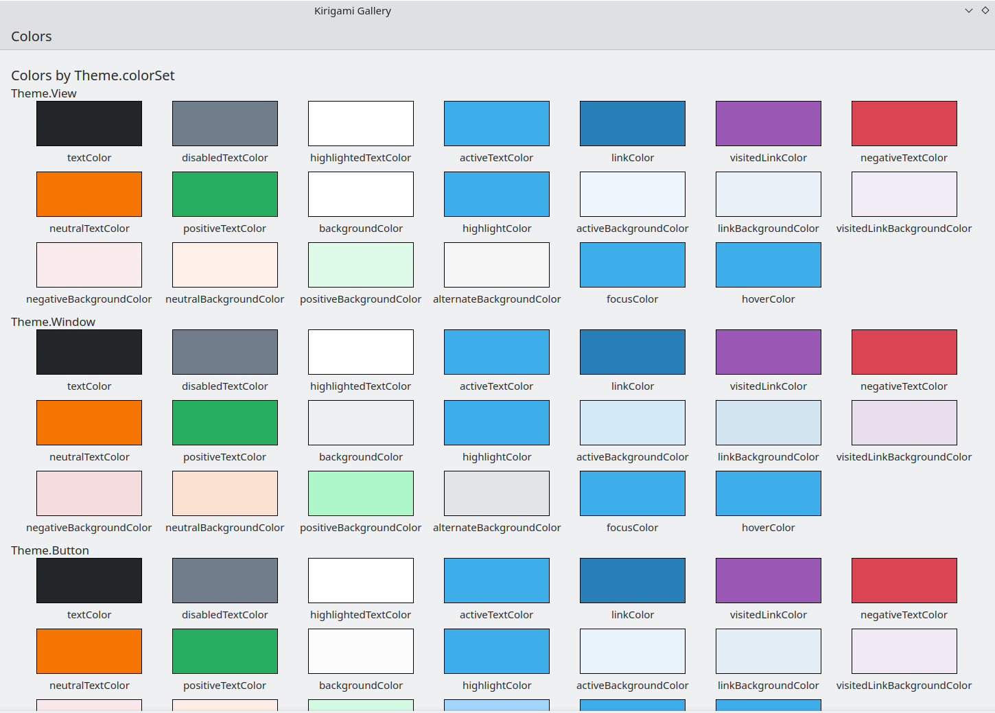
La Koloroj-komponento en Kirigami Gallery
Koloro Aro
Depende de kie troviĝas regilo, ĝi devus uzi malsaman koloraron: ekzemple, kiam la kolorskemo de Breeze Light estas uzata en [Vidoj](https://doc.qt.io/qt-6/qtquick-modelviewsdata- modelview.html), la normala fono estas preskaŭ blanka, dum en aliaj regionoj, kiel ilobretoj aŭ dialogoj, la normala fonkoloro estas griza.
If you define a color set for an item, all of its child items will recursively inherit it automatically (unless the property inherit has explicitly been set to false, which should always be done when the developer wants to force a specific color set) so it is easy to change colors for an entire hierarchy of items without touching any of the items themselves.
Kirigami.Theme supports 5 different color sets:
- Vido: Koloro aro por eroj-vidoj, kutime la plej malpeza el ĉiuj (en helkoloraj etosoj)
- Fenestro: Koloro aro por fenestroj kaj kromaj areoj (ĉi tio ankaŭ estas la defaŭlta koloraro)
- Butono: Koloro uzata de butonoj
- Elekto: Koloro uzata de elektitaj areoj
- Konsileto: Koloro uzata de konsiletoj
- Komplementa: Koloro intencita esti komplementa al Fenestro: kutime malhela eĉ en helaj etosoj. Povas esti uzata por emfazo en malgrandaj areoj de la apliko
Jen ekzemplo montranta kiel koloraroj estas hereditaj kaj povas esti uzataj por distingi malsamajn komponentojn. Granda bordo estis aldonita por kontrasti kolorojn.
| |
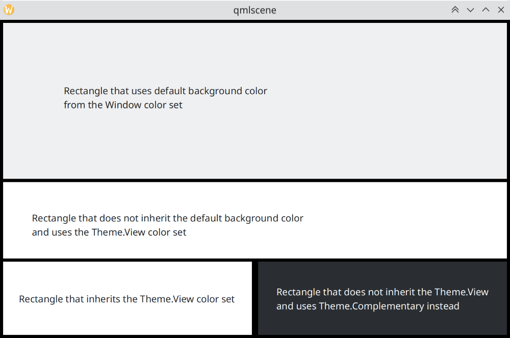
Kiel koloraroj diferencas en Breeze
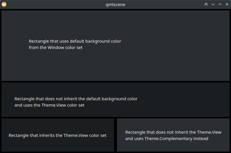
Kiel koloraroj diferencas en Breeze Dark
Uzante Proprajn Kolorojn
Kvankam estas malkuraĝigite uzi malmolkoditajn kolorojn, Kirigami ofertas pli konserveblan manieron asigni propran malmolkoditan paletron al objekto kaj ĉiuj ĝiaj infanoj, kio permesas difini tiajn proprajn kolorojn en unu loko kaj unu nur:
import QtQuick
import org.kde.kirigami as Kirigami

Kirigami.ApplicationWindow {
    title: "Custom colors"
    height: 300
    width: 300

    Rectangle {
        anchors.fill: parent
        Kirigami.Theme.inherit: false
        // RIMARKO: sendepende de la koloraro uzita, estas rekomendite antatataŭigi ĉiujn
        // disponeblajn kolorojn en Etoso por eviti malbone kontrastantajn kolorojn

        Kirigami.Theme.colorSet: Kirigami.Theme.Window
        Kirigami.Theme.backgroundColor: "#b9d795"
        Kirigami.Theme.textColor: "#465c2b"
        Kirigami.Theme.highlightColor: "#89e51c"
        // Redifini ĉiujn aliajn kolorojn kiejn vi volas

        // Tio ĉi estos "#b9d795"
        color: Kirigami.Theme.backgroundColor

        Rectangle {
            // Tio ĉi estos "#465c2b"
            anchors.centerIn: parent
            height: Math.round(parent.height / 2)
            width: Math.round(parent.width / 2)
            color: Kirigami.Theme.textColor
        }
    }
}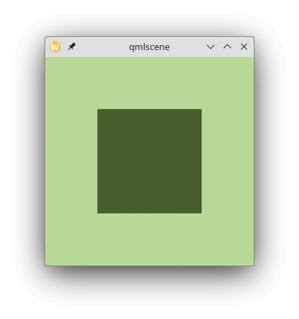
Ekzemplo kun propraj koloroj