Klarigante paĝojn
Nia apo
En la antaŭa lernilo, ni sukcesis agordi, konstrui kaj kompili nian unuan Kirigami-aplikaĵon. Kun la bazaĵoj en la loko, ni povas komenci nian vojaĝon al kreado de plene prezentita aplikaĵo.
Ĉi tiuj lerniloj koncentriĝos pri kreado de aplikaĵo, kiu ebligas al la uzanto vidi kiom da tagoj restas ĝis evento de ilia elekto.
Ni ankaŭ rekomendas vin kontroli la Kirigami Gallery, kiu provizas kelkajn utilajn UI-ekzemplojn.
En ĉi tiu sekcio ni koncentriĝos pri paĝoj, unu el la ŝlosilaj strukturaj elementoj de iu ajn Kirigami-apliko.
Paĝoj
Kirigami apps are typically organized in pages by using Kirigami.Page. Pages are the different "screens" of an app. You will want to have a page dedicated to specific aspects of your app's interaction, and to make things easier you can create different QML files for each page.
Pages are organized in a page stack where they can be pushed and popped. On a phone only the top-most page is shown, whereas on a larger screen (desktop or tablet), if desired, multiple pages can be shown next to each other.
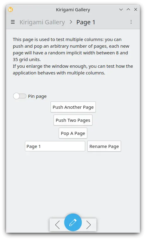
Ununura paĝo en la telefono
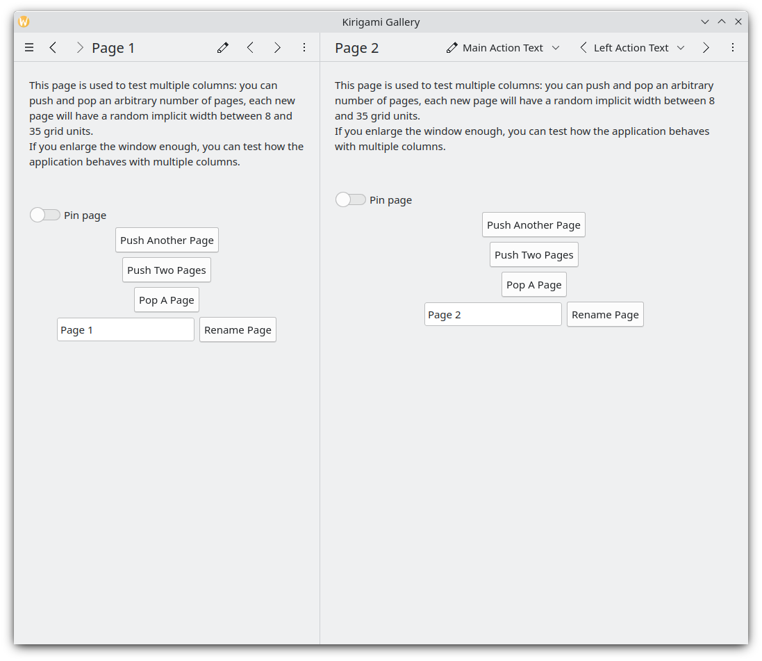
Du paĝoj unu apud la alia sur la labortablo
Noto
A Kirigami.Page inherits from a Controls.Page, and as such you can use the latter's properties as well.
Kiam vi trarigardas QML-API-dokumentadon, nepre rigardu la funkciojn kaj ecojn hereditajn de la API, kiun vi rigardas ankaŭ.
Ni reiru al la dosiero Main.qml, kiun ni kreis en nia antaŭa lernilo:
| |
We make our application start to our Kirigami.Page. All we have included in it is a label containing "Hello World", but we're going to spruce things up a little.
The idea behind our app is that we're going to be able to display a bunch of countdowns to the user. The problem with a normal Kirigami.Page is that it has a fixed vertical size, so instead we can use a Kirigami.ScrollablePage, which already comes with its own built-in scrollbar.
| |
Kirigami pages also feature neat titles placed within the toolbar, quickly indicating to the user which page they are on. All we need to do is to set a page title using the title property of Kirigami.ScrollablePage. In this case, we used one of the i18nc() functions we explored in our previous tutorial to this end.
Noto
Vi ankaŭ povus elekti difini vian paĝon ene de sia propra QML-dokumento. Por fari tion, vi kreus la novan QML-dosieron, ekzemple kirigami-tutorial/src/qml/StartPage.qml, aldonu ĝin al via kirigami-tutorial/src/CMakeLists.txt dosiero, kaj agordus la fenestron. unua paĝo por ŝargi ĝin, tiel:
pageStack.initialPage: Qt.resolvedUrl("StartPage.qml")pageStack.initialPage fiksas la komencan Paĝon de la paĝa stako de la aplikaĵo, kaj Qt.resolvedUrl konvertas la relativan URL de la QML-dosiero en absolutan.
Estas pliaj informoj pri alternativaj paĝaj strukturoj en nia Kirigami-dokumentado.