Aranĝoj, ListViews kaj Kartoj
Disponi vian enhavon
Nun kiam ni komprenas kiel funkcias paĝoj, estas tempo aldoni aĵojn al ili. Ni ekzamenos kelkajn gravajn aranĝajn komponantojn kaj elementojn, kiuj estos utilaj dum desegnado de nia apo.
Ĝis la fino de ĉi tiu sekcio vi havos aspektantan aplikaĵon.
ListViews
Se vi iam uzis Discover, NeoChat, aŭ la Sistemajn Agordojn de Plasma, vi havos trovi ListView. Tute simple, ĝi ebligas al vi montri datumojn en listo.
pageStack.initialPage: Kirigami.ScrollablePage {
    // ...
    Kirigami.CardsListView {
       id: cardsView
        model: kountdownModel
        delegate: kountdownDelegate
    }
}
Tio ŝajnas kripta, sed ne maltrankviliĝu. Ni komencu de la komenco.
We add this component inside our Kirigami.ScrollablePage from the last tutorial.
We're using Kirigami.CardsListView, which is a ListView that allows us to easily display cards in a list. However, ListViews are made to show data taken from a model - to automatically populate itself from a set of data that we point it to. That's where the model property comes in: in this example, it's pointing to kountdownModel.
Modelo
Kirigami.ApplicationWindow {
    // ...
    ListModel {
        id: kountdownModel
        // Ĉiu ListElement estas elemento en la listo, enhavante informojn
        ListElement {
            name: "Dog birthday!!"
            description: "Big doggo birthday blowout."
            date: 100
        }
    }
    // ...
}
We add our kountdownModel inside the Kirigami.ApplicationWindow from the last tutorial.
Modelo difinas la manieron kiel dateneniro estas strukturita. Nia countdownModel konsistos el nur unu elemento nuntempe. Rigardante nian ListElement supre, ni povas vidi kiel la datumoj de nia kountdownModel estas strukturitaj: ĝi enhavas nomo, priskribo kaj dato. Ĉi tio ne estas fiksita, kaj vi eble havas malsamajn specojn de datumoj en via modelo. La unuaj du estas nur ĉenoj, kaj la tria estas nombro, kiun ni uzas kiel anstataŭilon.
Noto
Ĉar QML estas konstruita sur Ĝavoskripto, multaj el la funkcioj de ĉi tiu lingvo estas disponeblaj por uzo en QML-dosieroj. Tamen, QML-variabloj devas esti prefiksitaj perproprieto, krom se ĝi estas ene de JS-kodbloko. Vi povas legi pli pri ĝi en ĉi tiu paĝo.Modeloj ankaŭ estas utilaj en kiel ili povas esti modifitaj per la uzo de pluraj metodoj. Iuj gravaj estas:
- ListModel.append(youobject: jsobject) aldonas JavaScript-objekton (JSObject)
youobjectal la ListModel kaj metas ĝin post la lasta elemento en la modelo. Por ke ĉi tio okazu ĝuste, vi devas provizi JSObject kun la ĝustaj proprecoj kaj respondaj datumtipoj. - ListModel.get(index: int) resendas la JSObject ĉe la indeksa loko, kiun vi provizas.
- ListModel.remove(index: int, count: int) forigas la JSObject ĉe la provizita ` indeksa loko, kaj tiom da post tiu indeksa loko kiom vi metas en "kalkulo" (1 inkluzivas nur la JSObject ĉe la provizita indekso)
- ListModel.set (indekso: int, viaobjekto: jsobject) ŝanĝas la eron ĉe la provizita
indexloko kun la valoroj provizitaj enyouobject. Samaj reguloj kiel ĉeappend().
Delegitoj
While our kountdownModel contains the data that will be displayed, our kountdownDelegate will handle how the data will be displayed in the ListView. For that we use a Kirigami.CardsListView designed to display card-type delegates, and those delegates will be visually represented by means of a Kirigami.AbstractCard.
Delegates automatically receive the properties of the ListElement instances that we have specified in our model. We can therefore just refer to their name, description, and date properties as if they were conventional variables within our delegate.
Konstruante la delegitan karton
The Component that will represent our delegate can be added inside our Kirigami.ApplicationWindow. We will then check what each part of our delegate component does.
Kirigami.ApplicationWindow {
    // ...
    Component {
        id: kountdownDelegate
        Kirigami.AbstractCard {
            contentItem: Item {
                // implicitWidth/Height difinas la naturan larĝon/alton de ero se neniu larĝo aŭ
                // alteco estas specifita. La suba agordo difinas la preferatan grandecon de
                // komponento laŭ ĝia enhavo
                implicitWidth: delegateLayout.implicitWidth
                implicitHeight: delegateLayout.implicitHeight
                GridLayout {
                    id: delegateLayout
                    anchors {
                        left: parent.left
                        top: parent.top
                        right: parent.right
                    }
                    rowSpacing: Kirigami.Units.largeSpacing
                    columnSpacing: Kirigami.Units.largeSpacing
                    columns: root.wideScreen ? 4 : 2

                    Kirigami.Heading {
                        level: 1
                        text: date
                    }

                    ColumnLayout {
                        Kirigami.Heading {
                            Layout.fillWidth: true
                            level: 2
                            text: name
                        }
                        Kirigami.Separator {
                            Layout.fillWidth: true
                            visible: description.length > 0
                        }
                        Controls.Label {
                            Layout.fillWidth: true
                            wrapMode: Text.WordWrap
                            text: description
                            visible: description.length > 0
                        }
                    }
                    Controls.Button {
                        Layout.alignment: Qt.AlignRight
                        Layout.columnSpan: 2
                        text: i18n("Edit")
                        // onKlakita: farota... baldaŭ!
                    }
                }
            }
        }
    }
    // ...
}
implicitWidth kaj implicitHeight
La unua parto, kiun ni rigardos, estas kiel administri la larĝon kaj altecon de nia komponanto:
Kirigami.AbstractCard {
    contentItem: Item {
        implicitWidth: delegateLayout.implicitWidth
        implicitHeight: delegateLayout.implicitHeight
        GridLayout {
            id: delegateLayout
            // ...
        }
    }
}
Looking at our Kirigami.AbstractCard, the first properties we set are implicitWidth and implicitHeight. We have set these to the delegateLayout.implicitWidth and delegateLayout.implicitHeight, i.e. the implicitWidth and implicitHeight of the GridLayout element.
Implicaj larĝoj kaj altecoj estas proprecoj haveblaj en iu ajn Ero kiuj funkcias kiel sugestoj kaj estas agordita kiel defaŭlta, aŭ kiel rezervi, se ne ekzistas eksplicita larĝo aŭ alteco agordita por ĉi tiuj komponantoj. Ĉi tiuj valoroj defaŭlte estas 0x0, do estas tre grave, ke vi difinas tiujn en krudaj Item-komponentoj kiel farite supre.
Here we have set the implicitWidth and implicitHeight of our Kirigami.AbstractCard to that of the GridLayout below to ensure it does not spill out of the card. This way, the card takes as much space is necessary for its contents.
Aranĝoj
La GridLayout estas ene de la [Ero](https://doc.qt.io/qt-6/ qml-qtquick-item.html) komponanto, kiun ni provizis por la propreco contentItem. Ĉi tiu estas la Ero kiu enhavas tion, kio estos montrata en via karto.
Ni ankaŭ devas elekti aranĝon por niaj komponantoj, por ke ili ne nur amasiĝu unu sur la alian. Estas tri ĉefaj tipoj, kiujn ni povas elekti:
- ColumnLayout aranĝas viajn komponantojn vertikale, en ununura kolumno
- RowLayout aranĝas viajn komponantojn horizontale, en ununura vico
- GridLayout prezentas viajn komponantojn en krado kun komponado de via elekto
Kun ColumnLayout kaj [RowLayout](https://doc.qt.io/qt-6/qml- qtquick-layouts-rowlayout.html), ĉio, kion ni devas fari, estas skribi niajn komponantojn ene de la Layout-komponento. Kiel vi povas vidi, ni iris kun GridLayout, kiu implicas iom pli da manlaboro.
GridLayout {
    id: delegateLayout
    anchors {
        left: parent.left
        top: parent.top
        right: parent.right
    }
    rowSpacing: Kirigami.Units.largeSpacing
    columnSpacing: Kirigami.Units.largeSpacing
    columns: root.wideScreen ? 4 : 2
    // ...
}
La unua afero, kiun vi vidas, estas niaj ankroj. La ankra sistemo de QtQuick provizas utilan manieron certigi, ke viaj komponantoj estas poziciigitaj en certaj partoj de gepatra komponanto. Ni ankris nian GridLayout maldekstren, supre kaj dekstren de la gepatra karto, certigante ke nia enhavo etendiĝas transe. la tuta karto.
Next we specify the spacing between the rows and columns within our grid, so that our components don't bunch up. Kirigami provides a number of handy predefined units to use for this purpose:
| Kirigami Unuo | Rastrumeroj |
|---|---|
| malgranda interspaco | 4px |
| granda interspaco | 8px |
| gridUnit | 18px |
Noto
La Vida Dezajno-Grupo (VDG) de KDE havas multe pli da informoj pri la malsamaj unuoj difinitaj ene de Plasma kaj Kirigami sur la Gvidlinioj pri Homaj Interfaco.As you might remember, root is the id of our Kirigami.ApplicationWindow. It provides the wideScreen property, used to determine whether the current device screen is a widescreen (i.e. a computer monitor or a phone in landscape). We use a ternary conditional here to vary the number of columns in our grid depending on the screen we are using: if it's a widescreen, the grid will have 4 columns, else it will have 2.
Internaj komponantoj
Ni povus simple krei tri etikedojn ene de nia delegita komponanto kaj nomi ĝin tage, sed tio ne aspektus precipe bela. Ni uzos kelkajn pli oportunajn komponantojn:
GridLayout {
    // ...
    Kirigami.Heading {
        Layout.fillHeight: true
        level: 1
        text: date
    }

    ColumnLayout {
        Kirigami.Heading {
            Layout.fillWidth: true
            level: 2
            text: name
        }

        Kirigami.Separator {
            Layout.fillWidth: true
            visible: description.length > 0
        }

        Controls.Label {
            Layout.fillWidth: true
            wrapMode: Text.WordWrap
            text: description
            visible: description.length > 0
        }
    }

    Controls.Button {
        Layout.alignment: Qt.AlignRight
        Layout.columnSpan: 2
        text: i18n("Edit")
    }
}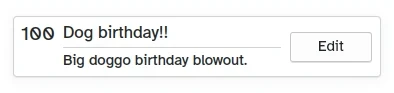
Kiel aspektas la propra Karto
- Left, Kirigami.Heading: uses the
ListElement'sdateas a level 1 heading. - Middle, ColumnLayout: has a Kirigami.Heading that displays the task name; a Kirigami.Separator, which provides the horizontal line; and a Controls.Label, that displays a task's optional description. The latter two components have a visible property, which checks if the description is empty or not and displays the components depending on the result of
description.length > 0. - Ĝuste, Controls.Button: butono kiu faros ion... baldaŭ!
Nia aplikaĵo ĝis nun
| |

Do estas nia baza karto!
Kun ĉi tiuj paŝoj, ni nun metis la bazan bazon por aldoni ĉiujn funkciojn al nia programo.