Aldonante agojn
Resumo
Ĝis nun, ni konstruis simplan apon kiu povas montri kartojn. Tamen, nuntempe ne ekzistas maniero por la uzanto aldoni novajn kartojn al la kartvido.
En ĉi tiu lernilo, ni rigardos Kirigami-agojn. Ĉi tiuj helpos nin aldoni interagadon al nia aplikaĵo en konsekvenca, rapida kaj alirebla maniero.
Agoj
A Kirigami.Action encapsulates a user interface action. We can use these to provide our applications with easy-to-reach actions that are essential to their functionality.
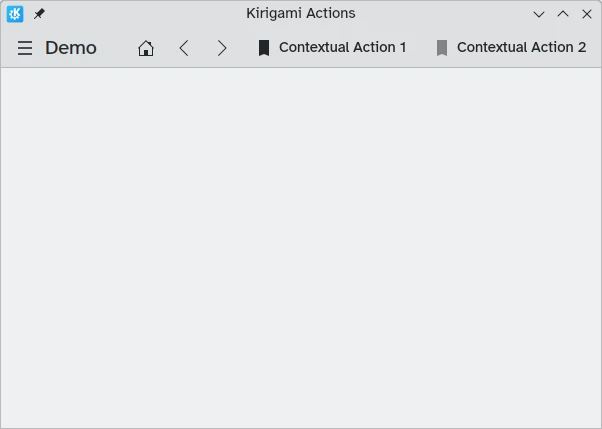
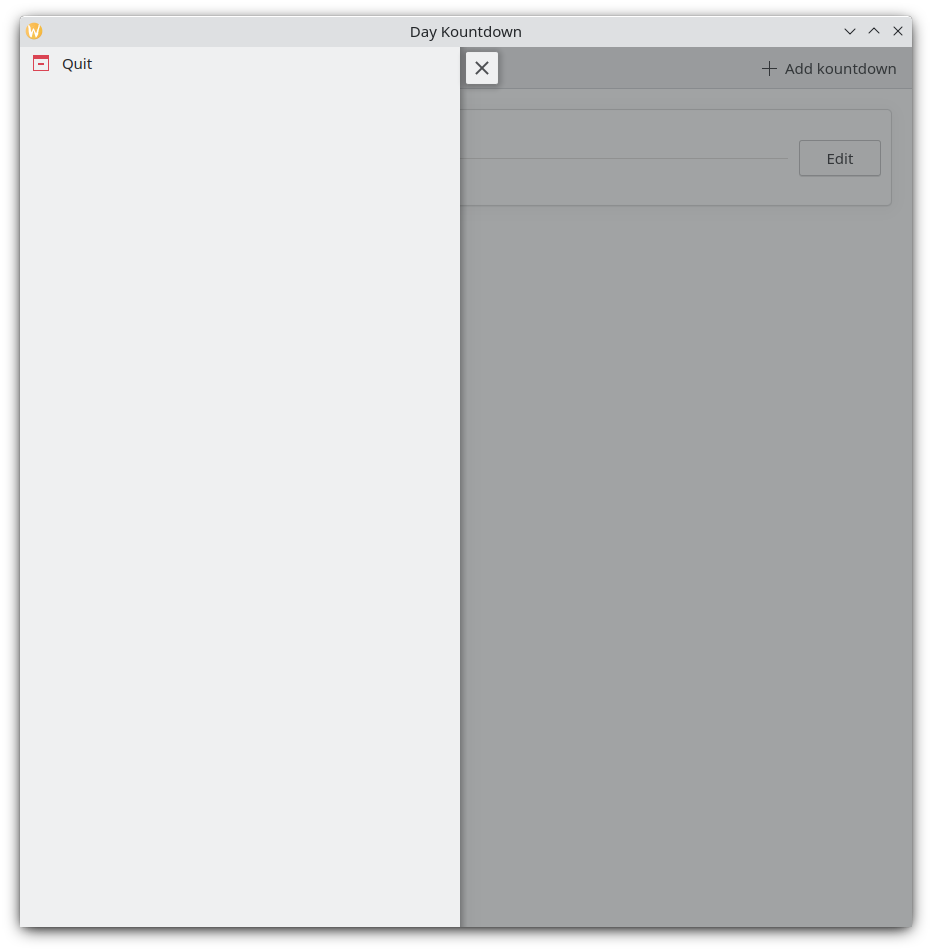
Se vi antaŭe uzis Kirigami-apojn, vi certe interagis kun Kirigami-agoj. En ĉi tiu bildo, ni povas vidi agojn dekstre de la paĝotitolo kun diversaj piktogramoj. Kirigami-agoj povas esti montrataj en pluraj manieroj kaj povas fari diversajn aferojn.
Aldonante retronombradojn
Retronombrada programo estas sufiĉe senutila sen la kapablo aldoni retronombradojn. Ni kreu agon, kiu permesos al ni fari ĉi tion.
pageStack.initialPage: Kirigami.ScrollablePage {
    // Aliaj paĝaj trajtoj...
    actions: [
        Kirigami.Action {
            id: addAction
            icon.name: "list-add-symbolic"
            text: i18nc("@action:button", "Add kountdown")
            onTriggered: kountdownModel.append({
                name: "Kirigami Action added card!",
                description: "Congratulations, your Kirigami Action works!",
                date: 1000
            })
        }
    ]
    // ...
}
We are placing our Kirigami.Action within our main page from the previous tutorials. If we wanted to, we could add more actions to our page (and even nest actions within actions!).
La krampoj [] uzataj supre estas similaj al JavaScript arrays, kio signifas, ke vi povas transdoni unu aŭ plurajn aferojn al ili, apartigitaj per komo:
// Ĝenerala JavaScript aro de komponantoj:
variable: [ component1, component2 ]
// Transdonante aron de Kirigami-agoj al QML:
actions: [ Kirigami.Action {}, Kirigami.Action {} ]
La ecoj id kaj text devus esti konataj de antaŭaj lerniloj. Tamen, la heredita Action.icon devus esti interesa: ĝi estas objekto kun pluraj ecoj. lasante vin montri certajn piktogramojn por viaj agoj. Feliĉe, por uzi KDE-piktogramojn, ĉio, kion ni devas fari, estas provizi la nomproprecon por la piktograma propreco, icon.name.
Vidante la disponeblajn piktogramojn
Click here to see how to check the available icons on your system
Icon Explorer is a KDE application that lets you view all the icons that you can use for your application. It offers a number of useful features such as previews of their appearance across different installed themes, previews at different sizes, and more. You might find it a useful tool when deciding on which icons to use in your application.
Many of KDE's icons follow the FreeDesktop Icon Naming specification. Therefore, you might also find it useful to consult The FreeDesktop project's website, which lists all cross-desktop compatible icon names.
La onTriggered signaltraktilo estas la plej grava. Jen kion faros nia ago kiam ĝi estos uzata. Vi rimarkos, ke en nia ekzemplo ni uzas la metodon kountdownModel.append de la kountdownModel ni kreis en nia antaŭa lernilo. Ĉi tiu metodo permesas al ni aldoni novan elementon al nia listo-modelo. Ni provizas ĝin per objekto (indikita per buklaj krampoj {}) kiu havas la koncernajn ecojn por niaj retronombradoj (nomo, priskribo, kaj lokokupilon dato).
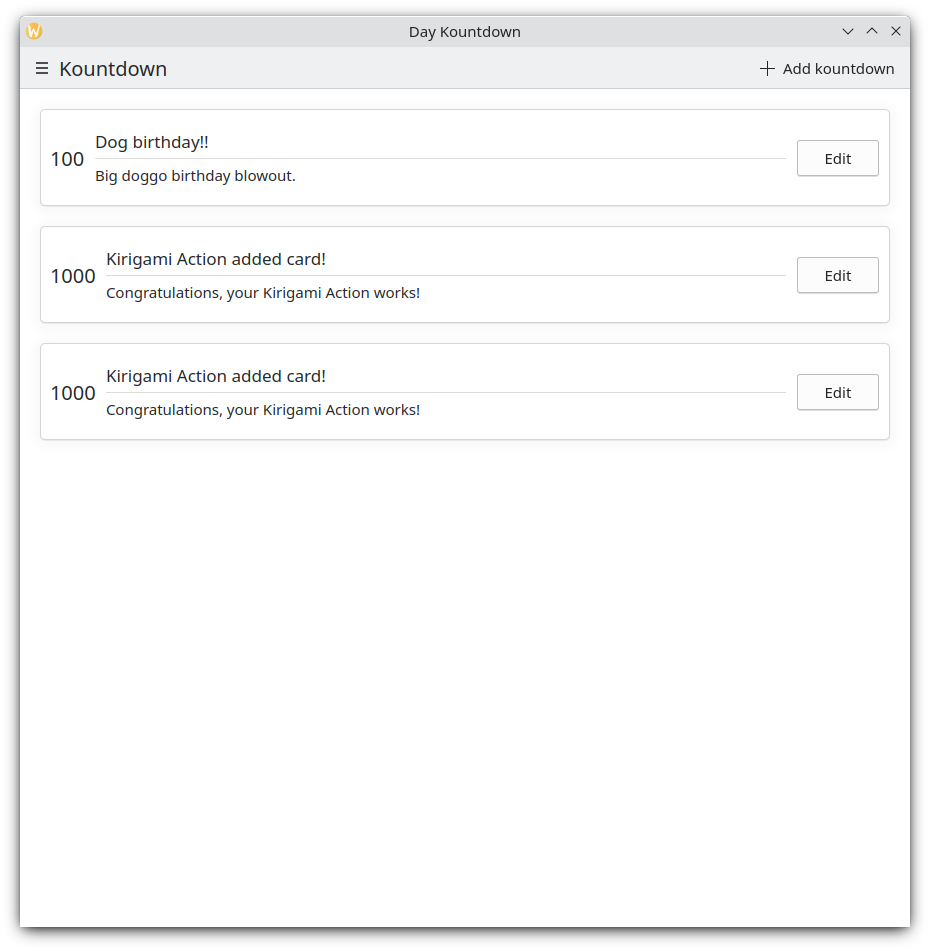
Ĉiufoje kiam ni alklakas nian butonon "Aldoni kountdown" supre dekstre, nia propra retronombrado estas aldonita
Poŝtelefona versio
Ĉiea tirkesto
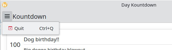
The next component is a Kirigami.GlobalDrawer. It shows up as a hamburger menu. By default it opens a sidebar, which is especially useful on mobile, as the user can just swipe in a side of the screen to open it. Global drawers are useful for global navigation and actions. We are going to create a simple global drawer that includes a "quit" button.
Kirigami.ApplicationWindow {
    id: root
    // Aliaj fenestraj proprecoj...
    globalDrawer: Kirigami.GlobalDrawer {
        isMenu: true
        actions: [
            Kirigami.Action {
                text: i18n("Quit")
                icon.name: "application-exit-symbolic"
                shortcut: StandardKey.Quit
                onTriggered: Qt.quit()
            }
        ]
    }
    // ...
}
Here, we put our global drawer inside our application window. The main property we need to pay attention to is GlobalDrawer.actions, which takes the form of an array of Kirigami.Action components. This action has an appropriate icon and executes the Qt.quit() function when triggered, closing the application.
Since we are keeping our global drawer simple for now, we are setting the GlobalDrawer.isMenu property to true. This displays our global drawer as a normal application menu, taking up less space than the default global drawer pane.
Ĉiea tirkesto
Ĉiea tirkesto kiel menuo
Konsileto
La paĝo Agoj bazitaj komponantoj de ĉi tiuj dokumentoj provizas pliajn detalojn pri Kirigami-Agoj kaj kiel ili povas esti uzataj.Agoj estas kontekstaj
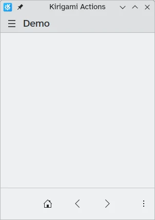
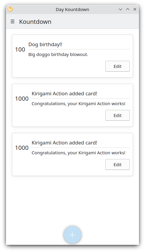
Kirigami components are designed in such a way that the place where you put Kirigami Actions is relevant. As seen above, if you add actions to a Kirigami.Page, Kirigami.ScrollablePage or any other derivative Page component, they will show up on the right side of the header in desktop mode, and on the bottom in mobile mode.
Similarly, if Kirigami Actions are added to a Kirigami.GlobalDrawer, they will show up in the resulting drawer or menu.
Aliaj ekzemploj de Kirigami-Agoj aperantaj alimaniere depende de sia gepatra komponento estas:
- Kirigami.ContextDrawer - ContextDrawer tutorial here
- Kirigami.AbstractCard and derivatives - Card tutorial here
- Kirigami.Dialog and derivatives - Dialog tutorial here
- Kirigami.ActionToolBar - ActionToolBar tutorial here
Inter aliaj Kirigami-komponentoj.
Nia aplikaĵo ĝis nun
| |