Form-aranĝoj
Kirigami.FormLayout components make it easy for you to create forms that conform to the KDE Human Interface Guidelines. They are optimal for settings dialogs and for large groups of controls and input fields that are related to each other.
Se provizitaj per sufiĉe da spaco, formularaj aranĝoj okupos du kolumnojn. La kolumno maldekstre estos okupita de la etikedoj provizitaj por la infanaj komponantoj de la formo, dum la dekstre estos okupita de la infanaj komponantoj mem. En pli spac-limigitaj fenestroj (aŭ sur poŝtelefono), formoj konsistos el ununura vertikala kolumno kun la etikedoj de infankomponentoj metitaj super sia respektiva komponento.
Simpla formo
Kirigami.FormLayout components are similar in use to QtQuick Layout components such as ColumnLayout or RowLayout. The child components will be automatically arranged according to the size available to the form layout.
Children of a Kirigami.FormLayout have a property named Kirigami.FormData.label. This property lets you set the label that will be provided for the child component in question.
import QtQuick
import QtQuick.Layouts
import QtQuick.Controls as Controls
import org.kde.kirigami as Kirigami

Kirigami.ApplicationWindow {
    pageStack.initialPage: Kirigami.Page {

        Kirigami.FormLayout {
            anchors.fill: parent

            Controls.TextField {
                Kirigami.FormData.label: "TextField 1:"
            }
            Controls.TextField {
                Kirigami.FormData.label: "TextField 2:"
            }
            Controls.TextField {
                Kirigami.FormData.label: "TextField 3:"
            }
        }
    }
}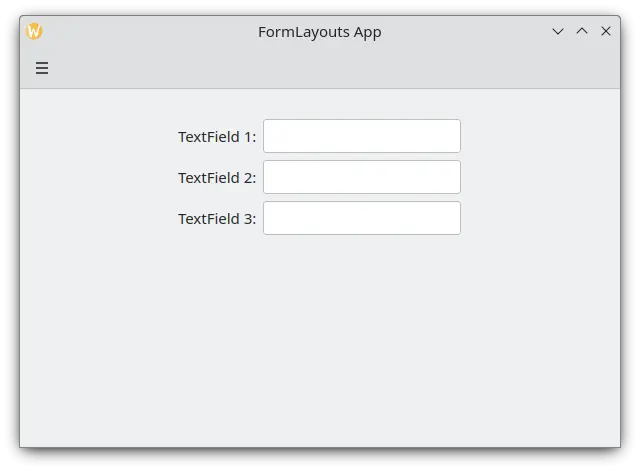
Simpla forma aranĝo en labortabla reĝimo
Sekcioj kaj apartigiloj
FormLayouts can also be divided into sections. Setting where a section starts is as easy as setting a child component's Kirigami.FormData.isSection to true. This will provide the component with some extra margin at the top to demarcate the start of the new section.
Kirigami.Separator components are best suited for starting new sections. Separators are used to draw a thin horizontal line, demarcating the end of a section. If you would rather not have a line drawn between sections, you can use a standard QML Item property. Alternatively you could use the Kirigami.FormData.isSection property on any other component.
However, this is not recommended. On components where Kirigami.FormData.isSection is set to true, the label text provided for this component's Kirigami.FormData.label property will be displayed as the section's header text.
Averto
This does not apply to every component, hence the recommendation that you use Kirigami.Separator or Item components in places where you would like to use a header text.Ĉi tiu kaplinia teksto estas pli granda ol la normala etikeda teksto, kaj provizas uzantojn kun bela vida indiko pri kio temas la form-aranĝo.
Kirigami.FormLayout {
    anchors.fill: parent

    Controls.TextField {
        Kirigami.FormData.label: "TextField 1:"
    }
    Controls.TextField {
        Kirigami.FormData.label: "TextField 2:"
    }
    Controls.TextField {
        Kirigami.FormData.label: "TextField 3:"
    }
    Kirigami.Separator {
        Kirigami.FormData.isSection: true
        Kirigami.FormData.label: "New Section!"
    }
    ColumnLayout {
        Kirigami.FormData.label: "Radio buttons"
        Controls.RadioButton {
            text: "Radio 1"
            checked: true
        }
        Controls.RadioButton {
            text: "Radio 2"
        }
        Controls.RadioButton {
            text: "Radio 3"
        }
    }
    Item {
        Kirigami.FormData.isSection: true
        Kirigami.FormData.label: "Another Section! (lineless though)"
    }
    Controls.TextField {
        Kirigami.FormData.label: "TextField 4:"
    }
    Controls.TextField {
        Kirigami.FormData.label: "TextField 5:"
    }
    Controls.TextField {
        Kirigami.FormData.label: "TextField 5:"
    }
}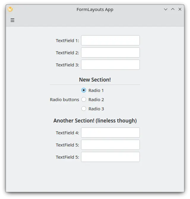
Form-aranĝo kun sekcioj
Devigante labortablon aŭ moveblan aranĝon
If you would rather have your form layout stay consistent regardless of your application's environment, you can use the wideMode property of the Kirigami.FormLayout component:
- Kiam agordita al "vera", la formo-aranĝo estos strukturita en labortabla optimumigita larĝekrana (du-kolumna) aranĝo
- Kiam agordita al "falsa", la formularenpaĝigo estos strukturita en movebla aranĝo (unu kolumno)
Kirigami.FormLayout {
    anchors.fill: parent
    wideMode: false

    Controls.TextField {
        Kirigami.FormData.label: "TextField 1:"
    }
    Controls.TextField {
        Kirigami.FormData.label: "TextField 2:"
    }
    Controls.TextField {
        Kirigami.FormData.label: "TextField 3:"
    }
}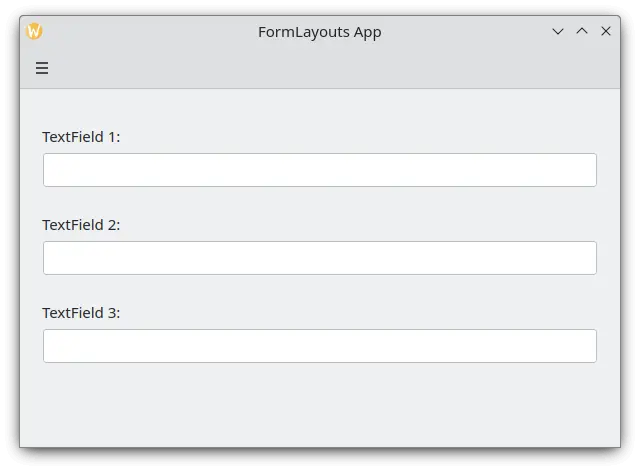
Form-aranĝo kun devigita movebla aranĝo
Vicigante viajn etikedojn
There are instances when you want a label to be assigned to components that have more than one line or to a list of components. This can be achieved by putting the Kirigami.FormData.label in the ColumnLayout, as you might have noticed in Sections and Separators. By default the label is positioned in the vertical center of the layout, which is not always desirable. We can change this with help of Kirigami.FormData.labelAlignment.
Kirigami.FormLayout {
    anchors.fill: parent

    ColumnLayout {
        Kirigami.FormData.label: "This is a label:"
        Kirigami.FormData.labelAlignment: Qt.AlignTop

        Controls.Label {
            text: "This is some rather long text \nthat should elide to multiple lines \nto show how the label gets aligned."
            elide: Text.elideLeft
        }
    }
}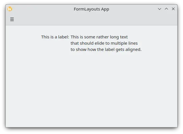
Form-aranĝo kun supra vicigita etikedo
Agordi la etikedan vicigon estas precipe oportuna por administri komponantojn aŭ listojn de komponantoj, kies grandecon vi ne scias antaŭe. Elisa estas tre bona ekzemplo de tio:
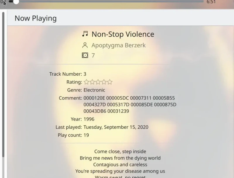
La Komento-etikedo estas nur supre vicigita kiam ĝia responda komponanto havas pli ol unu linion
Ni povas fari ion similan al ĉi tio per JavaScript ternara operatoro:
Kirigami.FormLayout {
    anchors.fill: parent

    ColumnLayout {
        Kirigami.FormData.label: "This is a label:"
        Kirigami.FormData.labelAlignment: labelText.text.lineCount > 1 ? Qt.AlignTop : Qt.AlignVCenter

        Controls.Label {
            id: labelText
            text: "This is some rather long text \nthat should elide to a new line \nso it appears below the Form Label."
            elide: Text.elideLeft
        }
    }
}