Formu delegitojn en viaj agordaj paĝoj
Kirigami Addons estas plia aro de vidaj komponantoj, kiuj bone funkcias ĉe poŝtelefono kaj labortablo kaj estas garantiitaj esti transplatformaj. Ĝi uzas Kirigami sub la kapuĉo por krei siajn komponentojn.
You have learned how to add About and AboutKDE pages to your application. Now you will be able to use their same inner components to create your settings pages.
La projekta strukturo devus aspekti jene:
addonsexample
├── CMakeLists.txt
├── main.cpp
├── Main.qml
├── MyAboutPage.qml
└── SettingsPage.qml
Bezonataj Ŝanĝoj
Ŝanĝu Main.qml por inkluzivi nian novan paĝon de Agordo:
import QtQuick
import QtQuick.Layouts

import org.kde.kirigami as Kirigami
import org.kde.kirigamiaddons.formcard as FormCard

import org.kde.about 1.0

Kirigami.ApplicationWindow {
    id: root
    width: 600
    height: 700

    Component {
        id: aboutkde
        FormCard.AboutKDE {}
    }

    Component {
        id: aboutpage
        MyAboutPage {}
    }

    Component {
        id: settingspage
        SettingsPage {}
    }

    pageStack.initialPage: Kirigami.ScrollablePage {
        ColumnLayout {
            FormCard.FormCard {
                FormCard.FormButtonDelegate {
                    id: aboutKDEButton
                    icon.name: "kde"
                    text: i18n("About KDE Page")
                    onClicked: root.pageStack.layers.push(aboutkde)
                }

                FormCard.FormButtonDelegate {
                    id: aboutPageButton
                    icon.name: "applications-utilities"
                    text: i18n("About Addons Example")
                    onClicked: root.pageStack.layers.push(aboutpage)
                }

                FormCard.FormButtonDelegate {
                    id: settingsButton
                    icon.name: "settings-configure"
                    text: i18n("Single Settings Page")
                    onClicked: root.pageStack.layers.push(settingspage)
                }
            }
        }
    }
}
Ni nun povas komenci pritrakti la komponantojn uzatajn por krei nian Agordan paĝon: la Formularo-Karto kaj ĝiaj Delegitoj.
Formu Delegitojn
FormCard kaj FormCardPage
FormCard.FormCard is the main component we will be using to group all its child components, the Delegates.
We used a form card in the Kirigami Addons introduction before. Its main purpose is to serve as a container for other components while following a color different from the background, in a similar manner to a Kirigami.Card.
Kreu novan dosieron SettingsPage.qml:
import QtQuick
import org.kde.kirigamiaddons.formcard as FormCard

FormCard.FormCardPage {
    FormCard.FormCard {
        // Ĉi tie iras ĉiuj niaj delegitoj!
    }

    FormCard.FormCard {
        // Ĉi tie iras ĉiuj niaj delegitoj!
    }
}
Since we are making a separate QML file for our Settings page, and since we need to prepare for potential scrolling in our page, we use a FormCard.FormCardPage, which inherits Kirigami.ScrollablePage.
La agrabla afero pri la formularkartpaĝo estas, ke ĝi venas kun interna aranĝo, do ne necesas plia ColumnLayout kaj niaj delegitoj povas esti aldonitaj rekte al ĝi.
Noto
Eblas uzi FormCard-delegitojn rekte kun Kirigami.ScrollablePage, sed tiukaze vi devos aldoni viajn proprajn aranĝojn.FormHeader
For every FormCard you want to create, you can create a FormHeader just before it. The header uses bold text and shows up right above the form card.
import org.kde.kirigamiaddons.formcard as FormCard
FormCard.FormCardPage {
FormCard.FormHeader {
title: i18n("General")
}
FormCard.FormCard {
// Niaj delegitoj iras ĉi tien...
}
FormCard.FormHeader {
title: i18n("Accounts")
}
FormCard.FormCard {
// Niaj delegitoj iras ĉi tien...
}
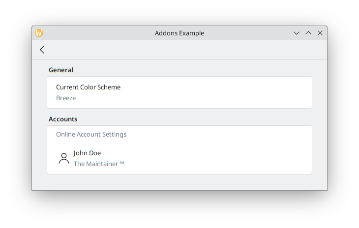
}FormTextDelegate kaj FormSectionText
Ni komencu simple, kun simpla teksto.
FormSectionText simply adds a thin delegate containing a label. FormTextDelegate has text and a grayed out description.
import QtQuick
import org.kde.kirigami as Kirigami
import org.kde.kirigamiaddons.formcard as FormCard

FormCard.FormCardPage {
    FormCard.FormHeader {
        title: i18n("General")
    }

    FormCard.FormCard {
        FormCard.FormTextDelegate {
            text: i18n("Current Color Scheme")
            description: "Breeze"
        }
    }

    FormCard.FormHeader {
        title: i18n("Accounts")
    }

    FormCard.FormCard {
        FormCard.FormSectionText {
            text: i18n("Online Account Settings")
        }
        FormCard.FormTextDelegate {
            leading: Kirigami.Icon {source: "user"}
            text: "John Doe"
            description: i18n("The Maintainer ™️")
        }
    }
}
We add some dummy text for the hypothetical theme detection. If we wanted to have actual color scheme detection, in the future it could be done similarly to Neochat (code here), making use of a C++ model with KColorSchemeManager.
In the Online Accounts section, we see an additional property, leading. We can add an Item to it so that it appears before the text. Its opposite property, trailing, would be able to show an Item after the text, but we won't use it in our program.
We use a Kirigami.Icon here for simplicity, but this could also be implemented using a Kirigami Addons Avatar that grabs the information from a model, as is done in Neochat.
Ĝi devus fini aspekti jene:
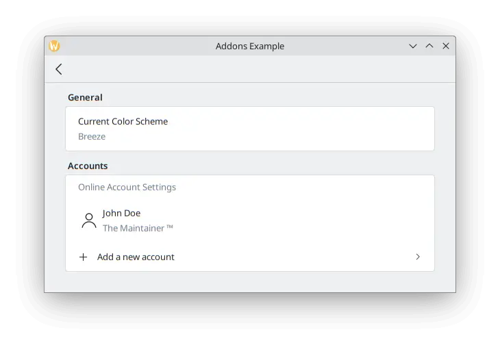
FormButtonDelegate
The FormButtonDelegate is visually similar to a FormTextDelegate, but it is clickable and shows an arrow pointing to the right. We used it in the Kirigami Addons introduction before.
While the FormTextDelegate had the leading and trailing properties to show an item before and after the main content, the FormButtonDelegate only has the leading property, because the right side is occupied by the arrow.
import QtQuick
import org.kde.kirigami as Kirigami
import org.kde.kirigamiaddons.formcard as FormCard

FormCard.FormCardPage {
    FormCard.FormHeader {
        title: i18n("General")
    }

    FormCard.FormCard {
        FormCard.FormTextDelegate {
            text: i18n("Current Color Scheme")
            description: "Breeze"
        }
    }

    FormCard.FormHeader {
        title: i18n("Accounts")
    }

    FormCard.FormCard {
        FormCard.FormSectionText {
            text: i18n("Online Account Settings")
        }
        FormCard.FormTextDelegate {
            leading: Kirigami.Icon {source: "user"}
            text: "John Doe"
            description: i18n("The Maintainer ™️")
        }
        FormCard.FormButtonDelegate {
            icon.name: "list-add"
            text: i18n("Add a new account")
            onClicked: console.info("Clicked!")
        }
    }
}
We use its icon.name property to set a plus (+) icon to appear after the space where the leading would appear, and before the main content. This is a common pattern to indicate your button will add something to a list.
Ĉar ĉi tiu ekzemplo estas por simplaj ilustraj celoj, ni ne enprofundiĝas pri tio, kio estus farita post kiam la butono estas klakita: ĝi nur presas "Klakita!" al la terminalo. Ni povus fari novan paĝon por kreado de konto kiu aldonas alian uzanton al modelo, tiam puŝi la paĝon en vido, simile al tio, kion ni faris en Main.qml.
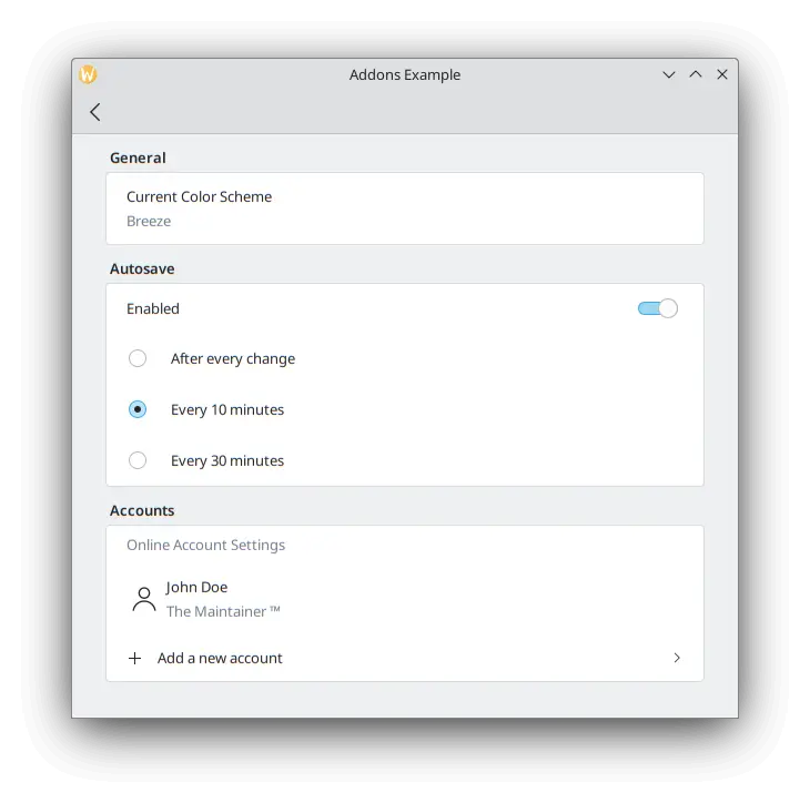
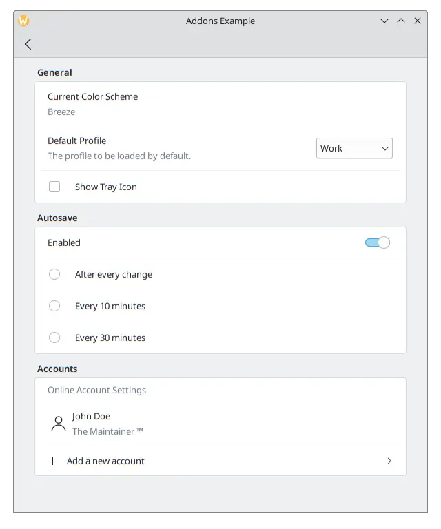
FormRadioDelegate, FormCheckDelegate kaj FormSwitchDelegate
The RadioButton, CheckBox and Switch are very commonly used components in any user interface. Kirigami Addons provides them as FormRadioDelegate, FormCheckDelegate and FormSwitchDelegate.
Iliaj nuraj ĉefaj trajtoj estas teksto kaj priskribo. Ili estas malsamaj laŭ uzo ĉar ili ĉiuj heredas AbstractButton, kaj do oni atendas, ke oni uzu ĝiajn signalojn kaj prizorgilojn: checked kaj onChecked, toggled kaj onToggled, clicked kaj onClicked.
We want to create some autosave functionality in our application, and we want to only show its settings if the user has enabled this functionality. Create a new section using a FormCard and a FormHeader, then add a FormSwitchDelegate and a FormRadioDelegate.
FormCard.FormHeader {
    title: i18n("Autosave")
}

FormCard.FormCard {
    FormCard.FormSwitchDelegate {
        id: autosave
        text: i18n("Enabled")
    }
    FormCard.FormRadioDelegate {
        text: i18n("After every change")
        visible: autosave.checked
    }
    FormCard.FormRadioDelegate {
        text: i18n("Every 10 minutes")
        visible: autosave.checked
    }
    FormCard.FormRadioDelegate {
        text: i18n("Every 30 minutes")
        visible: autosave.checked
    }
}
Ni ligas la videblecon de ĉiu radiobutono al ŝaltilo, do ili aperas nur kiam la ŝaltilo estas ebligita.
Plej bonaj Praktikoj
Alklaku ĉi tie por legi pli
If you have some programming background in imperative languages such as C++, you might be tempted to set the checked property of the switch to turn the visibility of the radio buttons to true with a JavaScript assignment such as:
checked: {
    radio1.visible = true;
    radio2.visible = true;
    radio3.visible = true;
}
Ĉi tio ne estas tre efika por la deklara lingvo de QML kaj ĝiaj signaloj kaj fendoj. Provu uzi QML-ligojn kiel en la kazo de visible: autosave.checked kiel eble plej multe anstataŭ JavaScript-esprimoj.
Vidu ĉi tiun paĝon por detaloj.
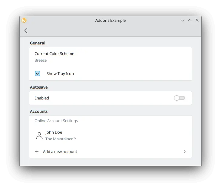
To test our checkbox, we can add a new FormCheckDelegate to our General section.
FormCard.FormHeader {
    title: i18n("General")
}

FormCard.FormCard {
    FormCard.FormTextDelegate {
        text: i18n("Current Color Scheme")
        description: "Breeze"
    }
    FormCard.FormCheckDelegate {
        text: i18n("Show Tray Icon")
        onToggled: {
            if (checkState) {
                console.info("A tray icon appears on your system!")
            } else {
                console.info("The tray icon disappears!")
            }
        }
    }
}
Here we use the signal handler called onToggled to show some dummy text to simulate a tray icon appearing in the system. If you really wanted to, you could easily implement a tray icon using KDE's KStatusNotifierItem or Qt's SystemTrayIcon.
Ĝis nun nia aplikaĵo devus aspekti jene:
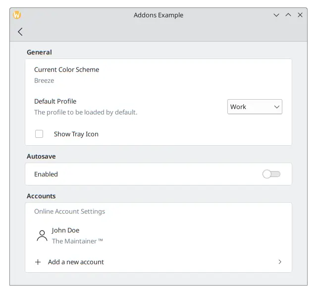
FormComboBoxDelegate
The common ComboBox component can be created using a FormComboBoxDelegate.
This combobox has several useful properties we can make use of: editable, displayText and displayMode.
Agordo redaktebla: vera permesas al la uzanto redakti la tekston de la kombokesto, kio estas utila se aldoni novajn kombokest-elekteblojn necesas:
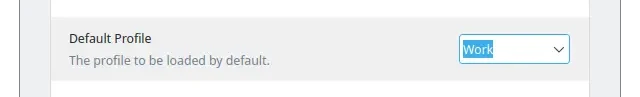
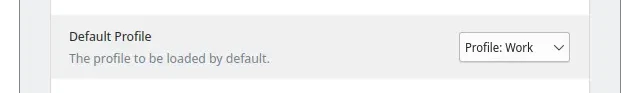
Kiam ajn vi bezonas montri plian tekston antaŭ ĉiu opcio, vi povas uzi ion kiel displayText: "Profile: " + currentText:
And the most interesting one, which we will be using in our example, is displayMode. It can have three options:
- FormComboBoxDelegate.ComboBox: la norma malgranda skatolo montranta liston de elektebloj.
- FormComboBoxDelegate.Dialog: a dialog showing a list of options in the middle of the window, like a Kirigami.OverlaySheet.
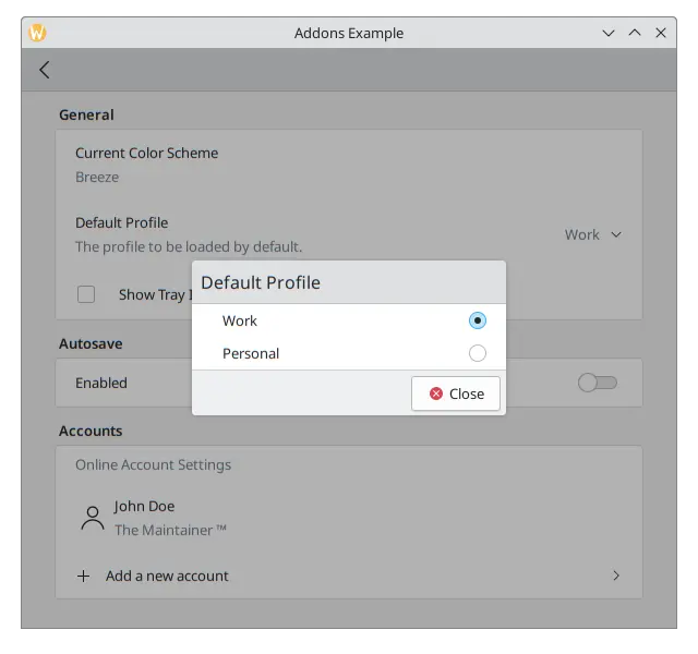
- FormComboBoxDelegate.Page: nova paĝo enhavanta liston de elektebloj montritaj en aparta fenestro.
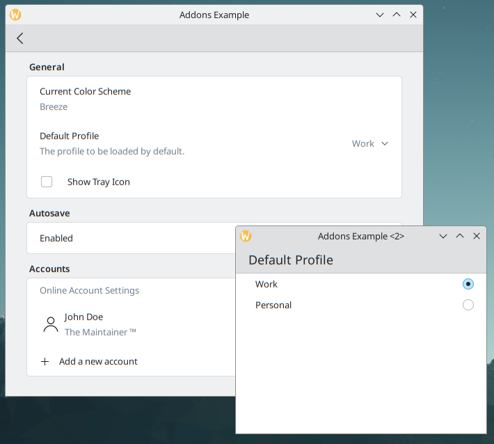
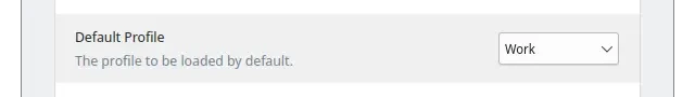
Aldonu la jenon inter la delegitoj "Nuna Kolorskemo" kaj "Montri Pleto-piktogramon" en via "Ĝenerala" formularkarto.
FormCard.FormComboBoxDelegate {
    text: i18n("Default Profile")
    description: i18n("The profile to be loaded by default.")
    displayMode: FormCard.FormComboBoxDelegate.ComboBox
    currentIndex: 0
    editable: false
    model: ["Work", "Personal"]
}
Kun la markobutono, nia paĝo de Agordoj devus aspekti jene:
FormDelegateSeparator
Our Settings page is taking shape, but each section is starting to get long. We can add a few FormDelegateSeparator instances to make our page tidier:
import QtQuick
import org.kde.kirigami as Kirigami
import org.kde.kirigamiaddons.formcard as FormCard

FormCard.FormCardPage {
    id: root

    title: i18nc("@title", "Settings")

    FormCard.FormHeader {
        title: i18nc("@title:group", "General")
    }

    FormCard.FormCard {
        FormCard.FormTextDelegate {
            text: i18nc("@info", "Current Color Scheme")
            description: "Breeze"
        }

        FormCard.FormComboBoxDelegate {
            id: combobox
            text: i18nc("@label:listbox", "Default Profile")
            description: i18nc("@info:whatsthis", "The profile to be loaded by default.")
            displayMode: FormCard.FormComboBoxDelegate.ComboBox
            currentIndex: 0
            editable: false
            model: ["Work", "Personal"]
        }

        FormCard.FormDelegateSeparator {
            above: combobox
            below: checkbox
        }

        FormCard.FormCheckDelegate {
            id: checkbox
            text: i18nc("@option:check", "Show Tray Icon")
            onToggled: {
                if (checkState) {
                    console.info("A tray icon appears on your system!")
                } else {
                    console.info("The tray icon disappears!")
                }
            }
        }
    }

    FormCard.FormHeader {
        title: i18nc("@title:group", "Autosave")
    }

    FormCard.FormCard {
        FormCard.FormSwitchDelegate {
            id: autosave
            text: i18nc("@option:check", "Enabled")
        }
        FormCard.FormDelegateSeparator {
            above: autosave
            below: firstradio
            visible: autosave.checked
        }
        FormCard.FormRadioDelegate {
            id: firstradio
            text: i18nc("@option:radio", "After every change")
            visible: autosave.checked
        }
        FormCard.FormRadioDelegate {
            text: i18nc("@option:radio", "Every 10 minutes")
            visible: autosave.checked
        }
        FormCard.FormRadioDelegate {
            text: i18nc("@option:radio", "Every 30 minutes")
            visible: autosave.checked
        }
    }

    FormCard.FormHeader {
        title: i18nc("@title:group", "Accounts")
    }

    FormCard.FormCard {
        FormCard.FormSectionText {
            text: i18nc("@info:whatsthis", "Online Account Settings")
        }
        FormCard.FormTextDelegate {
            id: lastaccount
            leading: Kirigami.Icon {source: "user"}
            text: "John Doe"
            description: i18nc("@info:credit", "The Maintainer ™️")
        }
        FormCard.FormDelegateSeparator {
            above: lastaccount
            below: addaccount
        }
        FormCard.FormButtonDelegate {
            id: addaccount
            icon.name: "list-add"
            text: i18nc("@action:button", "Add a new account")
            onClicked: console.info("Clicked!")
        }
    }
}
Ĝenerale, vi povas uzi apartigilojn kiam ajn vi vidas gravajn distingojn inter komponantoj, kvankam la elekto de kie meti ilin finfine estas via. Ekzemple, en la sekcio Ĝenerala, la markobutono diferencas de siaj antaŭaj komponantoj ĉar ĝi ne komenciĝas per teksto; en la Aŭtomatkonserva sekcio, la apartigilo grupigas la radiobutonojn kune; kaj en la sekcio Kontoj, aldoni apartigilon inter la lasta konto kaj la butono provizas iom da plia fokuso al la butono.
The above and below properties are rather self-explanatory when it comes to their use: you pass the id of the components above and below the separator. When they are set, the separator will swiftly disappear whenever the above or below item is highlighted/hovered. They are most useful, for instance, when you need to generate components dynamically and you can't automatically assume which item will come immediately before or after the separator. That would be the case in the Accounts section of our application once the logic to add new accounts were actually implemented, in which case we could always grab the last item in the model to do so.
Rimarku kiel la apartigilo super la pleta piktograma agordo ne aperas dum ĝi ŝvebas.