QML
This is a quick intro to QML. If you are already comfortable with it, skip to the next section.
The official QML tutorial can be found in the QML Documentation.
Item
import QtQuick 2.0

Item {
    id: widget

    Item {
        id: childItemA
    }

    Item {
        id: childItemB
    }
}
Rectangle
import QtQuick 2.0

Rectangle {
    color: "#0ff" // Teal
}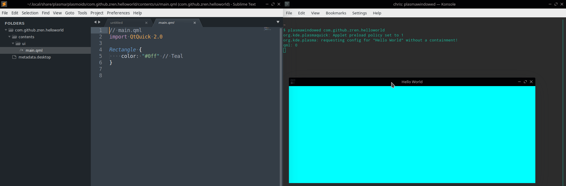
Items are 0px wide by default
By default, an Item will not expand to fit its contents. Nor will it expand to fit the width of its parent (like a <div> in HTML).
In the this example, only the Teal Rectangle will be visible, since the Green Rectangle has the default width of 0px and height of 0px. The Teal Rectangle is only visible since the root item in a widget's main.qml has a default size which will be explained later.
import QtQuick 2.0

Rectangle { // Unlike everything else, the widget's main item will have a default size.
    color: "#0ff" // Teal

    Rectangle { // For everything else, we need to set the size.
        color: "#0f0" // Green
    }
}
anchors.fill
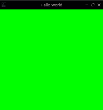
In this second example, we make the Green Rectangle resize to the parent item, the Teal Rectangle. This will completely cover the Teal Rectangle so only the Green Rectangle will be visible.
import QtQuick 2.0

Rectangle { // Unlike everything else, the widget's main item will have a default size.
    color: "#0ff" // Teal

    Rectangle { // For everything else, we need to set the size.
        color: "#0f0" // Green
        anchors.fill: parent // Make sure we're the same size as the parent.
    }
}
anchors.bottom
In this third example, we anchor the Green Rectangle to the bottom right, and make it half the width & height of the Teal rectangle. So we end up with a rectangle which is 3/4 teal and 1/4 green.
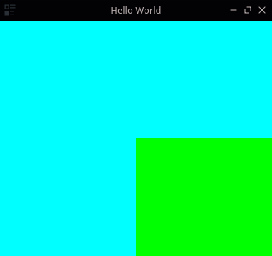
Other ways to use anchors properties can be read in the QML Documentation page on Positioning with Anchors and the Item.anchors property group.
import QtQuick 2.0

Rectangle {
    color: "#0ff" // Teal

    Rectangle {
        color: "#0f0" // Green
        anchors.right: parent.right
        anchors.bottom: parent.bottom
        width: parent.width / 2
        height: parent.height / 2
    }
}
ColumnLayout
If you want to stack a number of items on top of each other, you should use a ColumnLayout.
This example uses Labels which are just fancy Text items which follow Plasma's color theme. They have a default font size, which means they have their own default height. So they will be stacked on top of each other.
Note that if the ColumnLayout is taller than its contents, the children will have spacing between them.
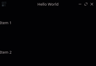
import QtQuick 2.0
import QtQuick.Layouts 1.0
import org.kde.plasma.components 2.0 as PlasmaComponents

ColumnLayout {
    PlasmaComponents.Label {
        text: "Item 1"
    }
    PlasmaComponents.Label {
        text: "Item 2"
    }
}
Layout.fillWidth: true
If you want an item to scale to the parent's width, you have the option of setting it to be the same width as the parent (which doesn't work in a Layout). You can also try anchoring to the left and right (which does work).
Within a Layout however, the proper way to do so is to use the special property attached to the contents of a Layout, Layout.fillWidth. Setting it to true will make the item scale to fill up the empty space.
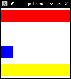
The other Layout related properties can be read here.
import QtQuick 2.0
import QtQuick.Layouts 1.0

ColumnLayout {
    Rectangle {
        color: "#f00" // Red
        height: 40
        Layout.fillWidth: true
    }
    Rectangle {
        color: "#0f0" // Green
        height: 40
        width: parent.width // Does not work
    }
    Rectangle {
        color: "#00f" // Blue
        height: 40
        width: 40 // Does not fill parent
    }
    Rectangle {
        color: "#ff0" // Yellow
        height: 40
        anchors.left: parent.left
        anchors.right: parent.right
        // anchors in a ColumnLayout throws a "undefined behavior" warning.
    }
}
Layout.fillHeight: true
If you want one item (or several) in a Layout to expand to take up the unused space, you can use Layout.fillHeight: true.
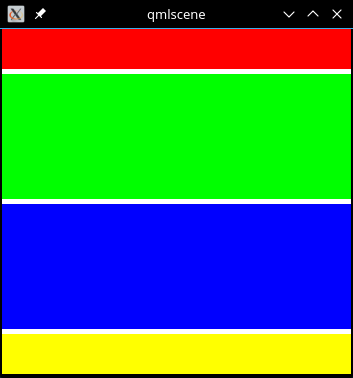
import QtQuick 2.0
import QtQuick.Layouts 1.0

ColumnLayout {
    Rectangle {
        color: "#f00" // Red
        height: 40
        Layout.fillWidth: true
    }
    Rectangle {
        color: "#0f0" // Green
        Layout.fillHeight: true
        Layout.fillWidth: true
    }
    Rectangle {
        color: "#00f" // Blue
        Layout.fillHeight: true
        Layout.fillWidth: true
    }
    Rectangle {
        color: "#ff0" // Yellow
        height: 40
        Layout.fillWidth: true
    }
}
Spacing between items in a Layout
In the last screenshot you might have noticed how there is still spacing between the items. That's because the default ColumnLayout.spacing property is set to 5. Assigning it to 0 will remove the extra whitespace.
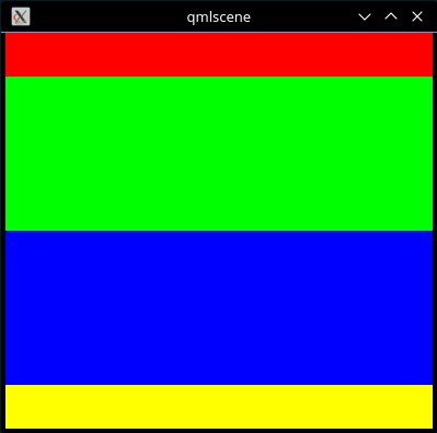
import QtQuick 2.0
import QtQuick.Layouts 1.0

ColumnLayout {
    spacing: 0

    Rectangle {
        color: "#f00" // Red
        height: 40
        Layout.fillWidth: true
    }
    Rectangle {
        color: "#0f0" // Green
        Layout.fillHeight: true
        Layout.fillWidth: true
    }
    Rectangle {
        color: "#00f" // Blue
        Layout.fillHeight: true
        Layout.fillWidth: true
    }
    Rectangle {
        color: "#ff0" // Yellow
        height: 40
        Layout.fillWidth: true
    }
}
Other Layouts
There's also RowLayout and GridLayout. Lastly there's Flow which will treat its contents as if they all had the CSS display: inline-block.
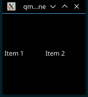
import QtQuick 2.0
import QtQuick.Layouts 1.0
import org.kde.plasma.components 2.0 as PlasmaComponents

RowLayout {
    PlasmaComponents.Label {
        text: "Item 1"
    }
    PlasmaComponents.Label {
        text: "Item 2"
    }
}