Plasma's QML API
Intro
KDE Frameworks ships with a number of useful extensions to Qt's QML. The API documentation is a good start if you need to know what a specific property does. If you want to browse any of the sources more easily, it's also available on GitLab.
PlasmaComponents Controls
QML ships with various controls, like CheckBox, RadioButton, ComboBox (dropdown menu), SpinBox, Slider, TextField, TextArea, Button, ToolButton. Plasma extends these controls to style them using the SVGs from the Plasma Style. It also assigns a number of default settings like setting the text color to follow the panel's color scheme.
PlasmaComponents 3 is a QML library that extends the Qt Quick Controls 2 components with defaults adapted to fit into Plasma widgets. Because PlasmaComponents 3 inherits from Qt Quick Controls 2, they have the same API, so the Qt documentation can be followed. For Plasma's specific behaviour changes, you can read the QML source code for each control in:
plasma-framework/src/declarativeimports/plasmacomponents3/
Removed in Plasma 6.0: PlasmaComponents 2 was used in Plasma 5. It used the older Qt Quick Controls 1.
Label
Labels are used for displaying text to the user. Plasma's Label are assigned a number of defaults. One thing is it sets the text color to follow the panel's color scheme.
For the specifics, you can read the Label.qml source code.
import QtQuick 2.0
import org.kde.plasma.components 3.0 as PlasmaComponents3

PlasmaComponents3.Label {
    text: i18n("Hello World")
}
CheckBox - Toggle
For a simple toggle, QML ships with CheckBox. For Plasma's specific changes, you can read the QML source code at:
import QtQuick 2.0
import org.kde.plasma.components 3.0 as PlasmaComponents3

PlasmaComponents3.CheckBox {
    text: i18n("Hello World")
    checked: true
}
RadioButton - Multiple Choice
For multiple choices, QML ships with RadioButton. For Plasma's specific changes, you can read the QML source code at:
Note that the KDE Human Interface Guidelines suggest using a ComboBox when there are more than 3 options.
import QtQuick 2.0
import QtQuick.Controls 1.0
import QtQuick.Layouts 1.0
import org.kde.plasma.components 3.0 as PlasmaComponents3

ColumnLayout {
    PlasmaComponents3.RadioButton {
        text: i18n("Top")
        checked: true
        autoExclusive: true
    }
    PlasmaComponents3.RadioButton {
        text: i18n("Bottom")
        autoExclusive: true
    }
}
ComboBox - Multiple Choice
For multiple choices, QML also ships with ComboBox (dropdown menu). For Plasma's specific changes, you can read the QML source code at:
Note that ComboBox.valueRole and ComboBox.currentValue was introduced in Qt 5.14. Ubuntu 20.04 only has Qt 5.12 so you will need to use your own _valueRole and _currentValue properties until Ubuntu 22.04. Make sure to not define a valueRole or currentValue property or it will break when your users upgrade to Qt 5.14.
import QtQuick 2.0
import org.kde.plasma.components 3.0 as PlasmaComponents3

PlasmaComponents3.ComboBox {
    textRole: "text"
    valueRole: "value"
    model: [
        { value: "a", text: i18n("A") },
        { value: "b", text: i18n("B") },
        { value: "c", text: i18n("C") },
    ]
}PlasmaComponents3.ComboBox {
textRole: "text"
property string _valueRole: "value"
readonly property var _currentValue: _valueRole && currentIndex >= 0 ? model[currentIndex][_valueRole] : null
}Slider - Numbers
To control Integer or Real numbers, QML ships with SpinBox and Slider. For Plasma's specific changes, you can read the QML source code at:
import QtQuick 2.4
import QtQuick.Layouts 1.0
import org.kde.plasma.components 3.0 as PlasmaComponents3

RowLayout {
    PlasmaComponents3.Slider {
        id: slider
        Layout.fillWidth: true
        from: 0
        to: 100
        value: 50
        stepSize: 5
    }
    PlasmaComponents3.Label {
        id: sliderValueLabel
        function formatText(value) {
            return i18n("%1%", value)
        }
        text: formatText(slider.value)

        TextMetrics {
            id: textMetrics
            font.family: sliderValueLabel.font.family
            font.pointSize: sliderValueLabel.font.pointSize
            text: sliderValueLabel.formatText(slider.to)
        }
        Layout.minimumWidth: textMetrics.width
    }
}
SpinBox - Numbers
To control Integer or Real numbers, QML ships with SpinBox and Slider. For Plasma's specific changes, you can read the QML source code at:
import QtQuick 2.0
import QtQuick.Controls 1.0
import QtQuick.Layouts 1.0
import org.kde.plasma.components 3.0 as PlasmaComponents3

RowLayout {
    PlasmaComponents3.Label {
        text: i18n("Label:")
        Layout.alignment: Qt.AlignRight
    }
    PlasmaComponents3.SpinBox {
        from: 0
        to: 100
        value: 25
        stepSize: 1
    }
}
TextField, TextArea - Input
To enter text, QML ships with TextField and TextArea. For Plasma's specific changes, you can read the QML source code for each:
import QtQuick 2.0
import QtQuick.Layouts 1.0
import org.kde.plasma.components 3.0 as PlasmaComponents3

RowLayout {
    PlasmaComponents3.Label {
        Layout.alignment: Qt.AlignRight
        text: i18n("Name:")
    }
    PlasmaComponents3.TextField {
        placeholderText: i18n("Name")
    }
}import QtQuick 2.0
import org.kde.plasma.components 3.0 as PlasmaComponents3
PlasmaComponents3.TextArea {
text: "Lorem ipsum\ndolor sit amet,\nconsectetur adipisicing elit"
}Button, ToolButton
For buttons, QML ships with Button and the flat ToolButton version. For Plasma's specific changes, you can read the QML source code for each:
import QtQuick 2.0
import org.kde.plasma.components 3.0 as PlasmaComponents3

PlasmaComponents3.Button {
    icon.name: "view-refresh"
    text: i18n("Refresh")
}import QtQuick 2.0
import org.kde.plasma.components 3.0 as PlasmaComponents3
PlasmaComponents3.ToolButton {
icon.name: "view-refresh-symbolic"
text: i18n("Refresh")
}ScrollView
To add a scrollbar to manage overflow, QML ships with ScrollView. For Plasma's specific changes, you can read the QML source code at:
import QtQuick 2.0
import org.kde.plasma.components 3.0 as PlasmaComponents3

PlasmaComponents3.ScrollView {
    id: scrollView

    ListView {
        model: 100
        delegate: PlasmaComponents3.CheckBox {
            text: i18n("CheckBox #%1", index+1)
        }
    }
}
BusyIndicator
This draws widgets/busywidget.svg from the Plasma Style and spins it. If animation speed is Instant in System Settings, it will not rotate.
PlasmaExtras
To be consistent with elsewhere in Plasma, Plasma ships with a couple of special components. These components have their own API and are particularly helpful when creating a Plasma Widget.
You will need to import PlasmaExtras to use them.
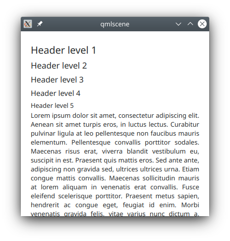
Heading, Paragraph
To be consistent with elsewhere in Plasma, Plasma ships with a couple different Label/Text
types with preset default sizes. The first one is Heading
for subsections of texts and the second one is Paragraph.
Both wraps by default with Layout.fillWidth: true.
import QtQuick 2.0
import QtQuick.Layouts 1.0
import org.kde.plasma.extras 2.0 as PlasmaExtras

ColumnLayout {
    spacing: 0

    Repeater {
        model: 5
        PlasmaExtras.Heading {
            Layout.fillWidth: true
            level: index + 1
            text: i18n("Header level %1", level)
        }
    }

    PlasmaExtras.Paragraph {
        Layout.fillWidth: true
        text: i18n("Lorem ipsum dolor sit amet, consectetur adipiscing elit. Aenean sit amet turpis eros, in luctus lectus. Curabitur pulvinar ligula at leo pellentesque non faucibus mauris elementum. Pellentesque convallis porttitor sodales. Maecenas risus erat, viverra blandit vestibulum eu, suscipit in est. Praesent quis mattis eros. Sed ante ante, adipiscing non gravida sed, ultrices ultrices urna. Etiam congue mattis convallis. Maecenas sollicitudin mauris at lorem aliquam in venenatis erat convallis. Fusce eleifend scelerisque porttitor. Praesent metus sapien, hendrerit ac congue eget, feugiat id enim. Morbi venenatis gravida felis, vitae varius nunc dictum a. Etiam accumsan, velit ac tempor convallis, leo nibh consequat purus, sit amet fringilla nisi mi et libero.")
    }
}
PlasmaCore
import org.kde.plasma.core 2.0 as PlasmaCore- The very useful
ThemeandUnitssingletons. - A number of enums listed in Plasma::Types.
- Kirigami.Icon for drawing icons.
- SvgItem, Svg and FrameSvgItem for drawing SVGs coloured with the Plasma Style color palette.
See the API docs for the full list of types in PlasmaCore. You can also skim the generated .../core/plugins.qmltypes file.
PlasmaCore.Theme
PlasmaCore.Theme contains the Plasma Style color palette.
PlasmaCore.Theme.textColorPlasmaCore.Theme.highlightColorPlasmaCore.Theme.highlightedTextColorPlasmaCore.Theme.backgroundColorPlasmaCore.Theme.linkColorPlasmaCore.Theme.visitedLinkColorPlasmaCore.Theme.positiveTextColorPlasmaCore.Theme.neutralTextColorPlasmaCore.Theme.negativeTextColorPlasmaCore.Theme.disabledTextColor
There is also properties for the various color groups using a prefix.
PlasmaCore.Theme.buttonTextColorPlasmaCore.Theme.viewTextColorPlasmaCore.Theme.complementaryTextColorPlasmaCore.Theme.headerTextColor
The full list of PlasmaCore.Theme color properties can be found in the QuickTheme class definition:
plasma-framework/src/declarativeimports/core/quicktheme.h
The QuickTheme class extends Plasma::Theme which also contains:
PlasmaCore.Theme.defaultFontfontPlasmaCore.Theme.palettepalettePlasmaCore.Theme.smallestFontfontPlasmaCore.Theme.styleSheetstringPlasmaCore.Theme.themeNamestringPlasmaCore.Theme.useGlobalSettingsboolPlasmaCore.Theme.wallpaperPathstring
PlasmaCore.Units.devicePixelRatio
In order to scale an Item by display scaling to support HiDPI monitors, you will need to multiply a pixel value by PlasmaCore.Units.devicePixelRatio. Plasma also ships with a few preset values for consistent spacing throughout Plasma.
PlasmaCore.Units.devicePixelRatio=QScreen::logicalDotsPerInchX/ 96(Primary Screen)PlasmaCore.Units.smallSpacing= max(2, gridUnit/4)PlasmaCore.Units.largeSpacing= gridUnitPlasmaCore.Units.gridUnit(width of the capital letter M)
Note that Kirigami.Units does not use the exact same logic as PlasmaCore.Units.
import QtQuick 2.0
import QtQuick.Layouts 1.0
import org.kde.plasma.core 2.0 as PlasmaCore
import org.kde.plasma.components 3.0 as PlasmaComponents3
RowLayout {
spacing: PlasmaCore.Units.smallSpacing
Rectangle {
implicitWidth: 4 * PlasmaCore.Units.devicePixelRatio
Layout.fillHeight: true
color: PlasmaCore.Theme.highlightColor
}
PlasmaComponents3.Label {
text: i18n("Label")
}
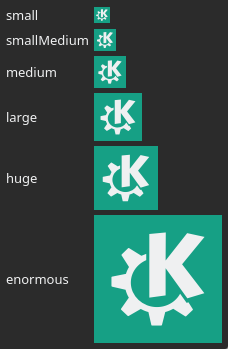
}PlasmaCore.Units.iconSizes
PlasmaCore.Units.iconSizes is scaled by DPI.
PlasmaCore.Units.iconSizes.small= 16pxPlasmaCore.Units.iconSizes.smallMedium= 22pxPlasmaCore.Units.iconSizes.medium= 32pxPlasmaCore.Units.iconSizes.large= 48pxPlasmaCore.Units.iconSizes.huge= 64pxPlasmaCore.Units.iconSizes.enormous= 128px
PlasmaCore.Units.shortDuration
These properties are scaled by the Animation Speed in System Settings.
PlasmaCore.Units.veryShortDuration= 50msPlasmaCore.Units.shortDuration= 100msPlasmaCore.Units.longDuration= 200msPlasmaCore.Units.veryLongDuration= 400ms
This property is a hardcoded value and shouldn't be used for animations. Instead, it can be used to measure how long to wait until the user should be informed of something, or can be used as the limit for how long something should wait before being automatically initiated.
PlasmaCore.Units.humanMoment= 2000ms