Configuration
Configuration Intro
MyWidget Settings.... By default it will contain a form to set a global shortcut to activate your widget.
contents/config/main.xml
main.xml is where you define the properties that will be serialized into ~/.config/plasma-org.kde.plasma.desktop-appletsrc. All properties will be accessible with plasmoid.configuration.variableName regardless of what group it's in.
KConfig has a variety of data types:
Intfor an Integer numberDoublefor a double precision floating point number (Real)Stringfor a string of characters to represent textColorfor a hexadecimal color. The color defaults to#000000(black) if the default is left empty.Pathis a string that is specially treated as a file-path. In particular paths in the home directory are prefixed with$HOMEwhen being stored in the configuration file.StringListfor a comma separated list of Strings
I've listed the more common use cases. More can be found in KConfigXT's documentation.
I personally don't recommend using Color if you want to default to a color from the color scheme (eg: PlasmaCore.ColorScope.textColor). I would instead suggest using a String that is empty by default. You can then use the following in the QML:
<entry name="labelColor" type="String">
    <default></default>
</entry>PlasmaComponents.Label {
color: plasmoid.configuration.labelColor || PlasmaCore.ColorScope.textColor
}<?xml version="1.0" encoding="UTF-8"?>
<kcfg xmlns="http://www.kde.org/standards/kcfg/1.0" xmlns:xsi="http://www.w3.org/2001/XMLSchema-instance" xsi:schemaLocation="http://www.kde.org/standards/kcfg/1.0 http://www.kde.org/standards/kcfg/1.0/kcfg.xsd">
<kcfgfile name=""/>
<group name="General">
<entry name="variableName" type="Bool">
<default>true</default>
</entry>
<entry name="integerExample" type="Int">
<default>6</default>
</entry>
<entry name="floatingPointExample" type="Double">
<default>3.1459</default>
</entry>
<entry name="textExample" type="String">
<default>Hello World</default>
</entry>
<entry name="listExample" type="StringList">
<default>First Item,Second Item,Third Item</default>
</entry>
<entry name="colorExample" type="Color">
<default>#336699</default>
</entry>
</group>
<group name="AnotherGroup">
<entry name="secondGroupExample" type="Bool">
<default>false</default>
</entry>
</group>
</kcfg>contents/config/config.qml
config.qml is where we define the tabs in the configuration window.
We import the ConfigModel and ConfigCategory, and define the tab name, icon, and qml file that will be loaded.
import QtQuick 2.0
import org.kde.plasma.configuration 2.0

ConfigModel {
    ConfigCategory {
        name: i18n("General")
        icon: "configure"
        source: "configGeneral.qml"
    }
    ConfigCategory {
        name: i18n("Another Tab")
        icon: "color-management"
        source: "configAnotherTab.qml"
    }
}
contents/ui/configGeneral.qml
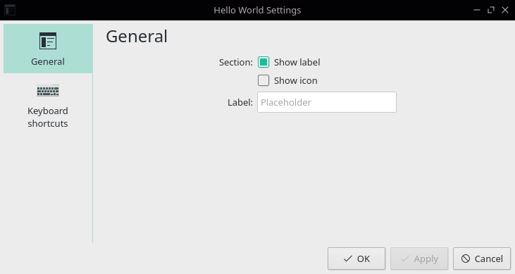
configGeneral.qml is where we can place all the checkboxes and textboxes.
Please note that your should not use PlasmaComponents.* controls in the config window, as those are styled and colored for the panel. The normal QtQuick.Controls are styled using your application window style + colors.
Kirigami.FormLayout is used to layout the controls in the center of the page. The Kirigami.FormData.label attached property is used to place labels in front of the controls. Kirigami labels are optional, so you do not need to use them for CheckBoxes which have their own labels on the right.
import QtQuick 2.0
import QtQuick.Controls 2.5 as QQC2
import org.kde.kirigami 2.4 as Kirigami

Kirigami.FormLayout {
    id: page

    property alias cfg_showLabel: showLabel.checked
    property alias cfg_showIcon: showIcon.checked
    property alias cfg_labelText: labelText.text

    QQC2.CheckBox {
        id: showLabel
        Kirigami.FormData.label: i18n("Section:")
        text: i18n("Show label")
    }
    QQC2.CheckBox {
        id: showIcon
        text: i18n("Show icon")
    }
    QQC2.TextField {
        id: labelText
        Kirigami.FormData.label: i18n("Label:")
        placeholderText: i18n("Placeholder")
    }
}
configPage.cfg_variableName
By default, all values are copied to the top level Item of the file prefixed with cfg_ like page.cfg_variableName. This is so the user can hit discard or apply the changes. You will need to define each cfg_ property so you can bind the value with a QML control.
Note that you can use a property alias to a control's property like checkBox.checked or textField.text.
import QtQuick 2.0
import QtQuick.Controls 2.5 as QQC2
import org.kde.kirigami 2.4 as Kirigami

Kirigami.FormLayout {
    id: page
    property alias cfg_variableName: variableName.checked

    QQC2.CheckBox {
        id: variableName
        Kirigami.FormData.label: i18n("Icon:")
        text: i18n("Show")
    }
}
CheckBox - Boolean
A CheckBox is used for boolean on/off values.
<entry name="variableName" type="Bool">
    <default>true</default>
</entry>import QtQuick 2.0
import QtQuick.Controls 2.5 as QQC2
import org.kde.kirigami 2.4 as Kirigami
Kirigami.FormLayout {
id: page
property alias cfg_variableName: variableName.checked
QQC2.CheckBox {
id: variableName
}
}SpinBox - Integer
A SpinBox is used for numbers.
If you want decimal places, a QtQuick.Controls 1.0 SpinBox is a little easier to use than the QtQuick.Controls 2.0 version. QtQuickControls1 has a SpinBox.decimals to easily switch from an Integer decimals: 0 to decimals: 3 to represent a Real number (the Double data type).
<entry name="variableName" type="Int">
    <default>6</default>
</entry>import QtQuick 2.0
import QtQuick.Controls 2.5 as QQC2
import org.kde.kirigami 2.4 as Kirigami
Kirigami.FormLayout {
id: page
property alias cfg_variableName: variableName.value
QQC2.SpinBox {
id: variableName
}
}SpinBox - Double/Real
If you want decimal places, a QtQuick.Controls 1.0 SpinBox is a little easier to use than the QtQuick.Controls 2.0 version. QtControls1 has a SpinBox.decimals property to easily switch from an Integer decimals: 0 to decimals: 3 to represent a Real number (the Double config data type).
<entry name="variableName" type="Double">
    <default>3.1459</default>
</entry>
If you really want to use QtQuick.Controls 2.0, look at Zren's libconfig/SpinBox.qml for an example on implementing the decimals property.
import QtQuick 2.0
import QtQuick.Controls 1.0 as QtControls1
import org.kde.kirigami 2.4 as Kirigami

Kirigami.FormLayout {
    id: page
    property alias cfg_variableName: variableName.value

    QtControls1.SpinBox {
        id: variableName
        decimals: 2
    }
}
TextField - String/Text
A TextField is used for a single line of text. It can be used as a base for many other data types as well. You will also want to look at the base TextInput for more properties.
<entry name="variableName" type="String">
    <default>Hello World</default>
</entry>import QtQuick 2.0
import QtQuick.Controls 2.5 as QQC2
import org.kde.kirigami 2.4 as Kirigami
Kirigami.FormLayout {
id: page
property alias cfg_variableName: variableName.text
QQC2.TextField {
id: variableName
}
}TextArea - Multi-Line String/Text
A TextArea is used for paragraphs of text. You will also want to look at the base TextEdit for more properties.
<entry name="variableName" type="String">
    <default>Hello World</default>
</entry>import QtQuick 2.0
import QtQuick.Controls 2.5 as QQC2
import org.kde.kirigami 2.4 as Kirigami
Kirigami.FormLayout {
id: page
property alias cfg_variableName: variableName.text
QQC2.TextArea {
id: variableName
}
}ColorButton - Color
KDE Frameworks has ColorButton which provides a preview of the selected color and will open QtQuick's ColorDialog for selecting a color.
<entry name="variableName" type="Color">
    <default>#336699</default>
</entry>
I personally don't recommend using the Color data type in main.xml if you want the default color to be a color from the color scheme (eg: PlasmaCore.ColorScope.textColor). I would instead suggest using a String that is empty by default. You can then use the following:
<entry name="labelColor" type="String">
    <default></default>
</entry>PlasmaComponents.Label {
color: plasmoid.configuration.labelColor || PlasmaCore.ColorScope.textColor
}Unfortunately KDE Framework's ColorButton doesn't easily support this pattern as it stores the value in a QML color property which will read the empty string and cast it as the default color #000000 (black). I worked around this issue in the No-Apply Control Library's libconfig/ColorField.qml. I used a TextField to store the value as a string, and displayed the default color scheme color as placeholderText.
import QtQuick 2.0
import org.kde.kirigami 2.4 as Kirigami
import org.kde.kquickcontrols 2.0 as KQControls

Kirigami.FormLayout {
    id: page
    property alias cfg_variableName: variableName.color

    KQControls.ColorButton {
        id: variableName
        showAlphaChannel: true
    }
}
FileDialog - Path
When we need to store a filepath in the config, we should use the Path or PathList config type. It will substitute /home/user/... with $HOME/.... To properly layout the file selector, we need a RowLayout with a TextField and Button which opens a FileDialog. We can specify the default folder the dialog opens to with FileDialog's shortcuts property (eg: shortcuts.pictures).
Note that we place the Kirigami.FormData.label in the RowLayout as it is the direct child of Kirigami.FormLayout.
<entry name="variableName" type="Path">
    <default>/usr/share/sounds/freedesktop/stereo/message.oga</default>
</entry>import QtQuick 2.0
import QtQuick.Controls 2.5 as QQC2
import QtQuick.Dialogs 1.0 as QQD
import QtQuick.Layouts 1.0
import org.kde.kirigami 2.4 as Kirigami
Kirigami.FormLayout {
id: page
property alias cfg_variableName: variableName.text
RowLayout {
Kirigami.FormData.label: i18n("Sound File:")
QQC2.TextField {
id: variableName
placeholderText: i18n("No file selected.")
}
QQC2.Button {
text: i18n("Browse")
icon.name: "folder-symbolic"
onClicked: fileDialogLoader.active = true
Loader {
id: fileDialogLoader
active: false
sourceComponent: QQD.FileDialog {
id: fileDialog
folder: shortcuts.music
nameFilters: [
i18n("Sound files (%1)", "*.wav *.mp3 *.oga *.ogg"),
i18n("All files (%1)", "*"),
]
onAccepted: {
variableName.text = fileUrl
fileDialogLoader.active = false
}
onRejected: {
fileDialogLoader.active = false
}
Component.onCompleted: open()
}
}
}
}
}IconDialog - Icon
KQuickAddons.IconDialog makes it easy to search and preview icons.
See the configurable icon example for an example of KQuickAddons.IconDialog based on the Application Launcher's (aka kickoff) icon selector code.
Assigning to plasmoid.configuration.varName
plasmoid.configuration.variableName if necessary in the configuration window or anywhere else in your widget. If you do this in the configuration page, you will skip the "apply" process and the property will be applied right away. I leave this up to the reader whether this is a pro or con.import QtQuick 2.0
import QtQuick.Controls 2.5 as QQC2
import QtQuick.Layouts 1.0
import org.kde.kirigami 2.4 as Kirigami
Kirigami.FormLayout {
id: page
QQC2.CheckBox {
id: variableName
checked: plasmoid.configuration.variableName
onCheckedChanged: plasmoid.configuration.variableName = checked
}
}Configuration Examples
To learn by example, we can look at a couple widgets:
- Application Launcher
- Task Manager
No-Apply Control Library
Zren has written a few files that apply the above pattern of skipping "Apply" and updating right after you change the value.
https://github.com/Zren/plasma-applet-lib/tree/master/package/contents/ui/libconfig
- libconfig/CheckBox.qml for on/off booleans values.
- libconfig/ColorField.qml for use with a
StringorColorconfig data type. If you use use aStringdata type, you can treat an empty string as a certain color theme color. Eg: - libconfig/ComboBox.qml is useful for creating enums using the
Stringconfig data type. KConfig comes with a enum datatype as well, but you have to either use hardcoded integers (with comments), or declare the enum in your QML code and keep it in sync. String comparison is less efficient but is easier to program with.- FontFamily.qml inherits
ComboBox.qmland is populated with all available fonts.
- FontFamily.qml inherits
- libconfig/IconField.qml based on the Application Launcher icon selector.
- libconfig/RadioButtonGroup.qml takes a similar model as
ComboBox.qmlbut will display the options asRadioButton. - libconfig/SpinBox.qml for Integer or Real numbers.
- libconfig/TextAlign.qml for use with an
Intconfig data type. It has your typical 4 buttons for left/center/right/justify alignment. It serializes theText.AlignHCenterenum.- TextFormat.qml is used to toggle bold, italic, underline, and embeds the text alignment. For use with 3
Boolconfig keys and 1Intconfig key (used for the embeddedTextAlign.qml).
- TextFormat.qml is used to toggle bold, italic, underline, and embeds the text alignment. For use with 3
- libconfig/TextArea.qml for a string with multiple lines of text.
- TextAreaStringList.qml overloads
TextArea.qml'svalueToText(value)andtextToValue(text)functions to treat a new line as the separator for theStringListtype.
- TextAreaStringList.qml overloads
- libconfig/TextField.qml for a single line of text.
cd ~/Code/plasmoid-helloworld/package/contents/ui
mkdir -p ./libconfig
cd ./libconfig
wget https://github.com/Zren/plasma-applet-lib/archive/master.zip
unzip -j master.zip plasma-applet-lib-master/package/contents/ui/libconfig/*
rm master.zipimport QtQuick 2.0
import QtQuick.Controls 2.0 as QQC2
QQC2.CheckBox {
id: configCheckBox
property string configKey: ''
checked: plasmoid.configuration[configKey]
onClicked: plasmoid.configuration[configKey] = !plasmoid.configuration[configKey]
}import QtQuick 2.0
import org.kde.kirigami 2.4 as Kirigami
import "./libconfig" as LibConfig
Kirigami.FormLayout {
id: page
LibConfig.CheckBox {
Kirigami.FormData.label: i18n("CheckBox:")
configKey: 'showVariable'
}
LibConfig.ColorField {
Kirigami.FormData.label: i18n("ColorField:")
configKey: 'labelColor'
defaultColor: PlasmaCore.ColorScope.textColor
}
LibConfig.ComboBox {
Kirigami.FormData.label: i18n("ComboBox:")
configKey: "variableName"
model: [
{ value: "a", text: i18n("A") },
{ value: "b", text: i18n("B") },
{ value: "c", text: i18n("C") },
]
}
}