Theme elements reference
Current Theme Elements
As mentioned in Theme Location, Structure and Definition, each theme is stored in its own sub-folder following the name of the theme.
Each theme contains the following file structure. All SVG files should be in either .svg or .svgz format.
If you are looking for a list of elements to start creating your Plasma Style fast, consider starting with the following recommended elements:
- dialogs/background: background for Plasma widgets on the panel
- widgets/arrows: arrows used in several places
- widgets/background: background for Plasma widgets on the desktop
- widgets/button: buttons used in several places
- widgets/containment-controls: elements used for Edit Mode
- widgets/panel-background: background for Plasma panels
- widgets/plasmoidheading: heading and footer of Plasma widgets
- widgets/tasks: task manager icons
- widgets/tooltip: thumbnail shown when hovering task manager icons
dialogs/ folder
This folder contains elements used for dialogs.
dialogs/background.svg
This file contains the generic dialog background used by Plasma widgets managed on the panel, in addition to the Add Widget pane, and KRunner.
See Background SVG Format for information on the required elements in this file.
widgets/ folder
This folder contains elements used for the generic background used for desktop widgets.
widgets/action-overlays.svg
This file contains 9 overlays for icons used to indicate actions, with their respective states.
[type]-[state][type]can be:add: icon used to add the parent icon to a selection of elements (used for instance to select files in Dolphin when you have Single Click enabled).remove: icon used to remove the parent icon to a selection of elements (used for instance to deselect files in Dolphin when you have Single Click enabled).open: icon used to initialize a tooltip (used for instance in the Folder View widget to preview the contents of a folder).
[state]can be:normalhoverpressed
widgets/actionbutton.svg
[size]-[state][size]can be:- empty
24-2422-2216-16
[state]can be:normalpressedhoverfocus
widgets/analog_meter.svg
This file contains the icons used for an analog gauge widget (similar to a pressure gauge or fuel tank indicator).
Deprecated relic from KDE4, only used in plasma-sdk/themeexplorer.
background: the body of the analog instrumentforeground: the pin where the hand rotatespointer: the hand of the instrumentpointer-shadowrotateminmax: how much the hand can rotate, the width is the maximum angle in degrees the height the minimum anglerotatecenterlabel0: the rect for the first labellabel1: the rect for the second label
widgets/arrows.svg
Arrow icons that match the theme. Four elements should exist and have the following IDs in this SVG file:
up-arrowright-arrowdown-arrowleft-arrow
widgets/background.svg
This file contains the generic widget background used for Plasma widgets managed on the desktop or used in Edit Mode.
See the section on backgrounds above for information on the required elements in this file.
See Background SVG Format for information on the required elements in this file.
widgets/bar_meter_horizontal.svg
A horizontal meter that serves as a progressbar. Used, for instance, in the Battery and Brightness widget to indicate battery levels.
background: background of the progressbarbackground-[position]: 9-piece SVG elements forming a single frame with thebackgroundprefix, it replaces the background element if availablebar-[state]-[position]: 9-piece SVG elements forming a single frame with thebar-activeandbar-inactiveprefixes used to replace thebarelement when available, they will be drawn tiled (repeating their pattern until they fill the available area), unless an element with IDhint-bar-stretchexists.[state]can be:active: the colored section of the progressbar indicating active progressinactive: the grayed out section of the progressbar indicating remaining progress
[position]can be:toptoprightrightbottomrightbottombottomleftlefttopleftcenter
label0:<rect>containing text to be shown at the beginning of the progressbarlabel1:<rect>containing text to be shown at the end of the progressbarlabel2:<rect>containing text to be shown at the middle of the progressbarhint-bar-size: default height of the bar, if not present the default is taken from sum of heights ofbar-inactive-topandbar-inactive-bottomhint-bar-stretch: make the progressbar background element stretched rather than tiledhint-tile-center
widgets/bar_meter_vertical.svg
A vertical meter that serves as a vertical progressbar. It has the same format of bar_meter_horizontal.svg.
widgets/branding.svg
A little Plasma logo that can be customized by distributors as a branding element.
Contains a single element with ID brilliant.
widgets/busywidget.svg
Used to indicate a busy state, it's a circular image that will be animated with a rotation. It is used for instance as the default animation in the Task Manager to indicate that an application is opening.
busywidget: the main spinner22-22-busywidget16-16-busywidgetpaused: the paused statehint-rotation-angle
widgets/button.svg
This file contains graphical elements used for the standard button and toolbutton widgets.
[toolbutton/mask]-[state]-[position/hint][toolbutton]can be:toolbutton: has no borders by default and only shows them when hovered, focused or pressed, so they can only be combined with these three prefixes. Used for instance for the Settings and Pin buttons of multiple Plasma widgets- empty
[mask]can be:mask- empty
[state]can be:normal: default buttonpressed: pressed buttonhover: element that will be in the background of the widget, will act as a border (useful for gloweffects)focus: keyboard focus rectangle superimposed to the button graphicsshadow: a shadow for the button, can be bigger than the button itself
[position]can be:toptoprightrightbottomrightbottombottomleftlefttopleftcenter
[hint]can be:hint-top-marginhint-right-marginhint-bottom-marginhint-left-margin
Two optional hints are available for the background rendering:
normal-hint-compose-over-borderpressed-hint-compose-over-border
To better visualize how the element names are composed, here is a random selection of possible example IDs for buttons and toolbuttons:
| TOOLBUTTON/MASK | STATE | POSITION/HINT | RESULT |
|---|---|---|---|
| normal | topleft | normal-topleft | |
| toolbutton | hover | bottom | toolbutton-hover-bottom |
| pressed | bottomright | pressed-bottomright | |
| mask | normal | center | mask-normal-center |
| hover | hint-top-margin | hover-hint-top-margin | |
| toolbutton | pressed | hint-left-margin | toolbutton-pressed-hint-left-margin |
Each button/toolbutton consists of a single frame of 9 main elements for the rectangular shape and 4 extra elements for size hints. See the Background SVG Format for details on handling positions and hints.
widgets/calendar.svg
Contains a single element with ID event.
It is proportional to the SVG page, and while it is no longer in use by Plasma, the marking can be found in the third party Event Calendar widget to represent an event happening during a certain day.
widgets/checkmarks.svg
This file contains only two elements:
radiobutton: the ticked state of a radiobutton. The actual radio button is stored in widgets/radiobutton.svg insteadcheckbox: the ticked state of a checkbox
If no checkmarks.svg file is provided, the default style from Qt will be used instead.
widgets/clock.svg
This file contains the graphical elements needed to make an analog clock icon. It must have the following IDs:
ClockFace: the background of the clock, usually containing the numbers and other background elementsHourHand: the hour hand, pointing down in the SVGMinuteHand: the minute hand, pointing down in the SVGSecondHand: the second hand, pointing down in the SVGHourHandShadow,MinuteHandShadowandSecondHandShadow: drop shadows for the hands (optional)HandCenterScrew: the "pin" that holds the hands together in the centerGlass: a final overlay which allows for things such as the appearance of glasshint-square-clock: if present the shape of the clock will be square rather than roundhint-[hand(shadow)]-rotation-center-offset: the point of a hand (shadow) where it is "pinned" to the clock center, defined by the center of the hint, relative to the element position (can be outside the element)[hand(shadow)]: the default is "(width/2, width/2)" from top-left of the hand (shadow) element (since Plasma 5.16)[hand(shadow)]can be:hourhandhourhandshadowminutehandminutehandshadowsecondhandsecondhandshadow
hint-hands-shadow-offset-to-westorhint-hands-shadows-offset-to-east: horizontal offset of the hands shadows, default is 0 offset (since Plasma 5.16)hint-hands-shadow-offset-to-northorhint-hands-shadow-offset-to-south: vertical offset of the hands shadows, default is 0 offset (since Plasma 5.16)
Note
In the SVG, the Hand elements as well as their optional Shadow counterparts must be oriented in a direction as the one indicating the time 6:30:30.
The relative position of the Hand elements as well as their optional Shadow counterparts with respect to the center of ClockFace does not matter.
widgets/configuration-icons.svg
This file contains a set of simple icons that are meant to be shortcuts for configuration actions. Must contain the following elements:
close: a close iconconfigure: a setup actionmove: a move action, similar to the cursor move statesize-vertical: a vertical grab or resize action, similar to the cursor state when grabbing a separator between two panessize-horizontal: a horizontal grab or resize action, similar to the cursor state when grabbing a separator between two panessize-diagonal-tl2br: resize diagonally, usually an arrow from top-left to bottom-rightsize-diagonal-tr2bl: resize diagonally, usually an arrow from top-right to bottom-leftrotate: a rotate actionhelp: a help icon, similar to the KHelpCenter iconmaximize: a maximize icon, not similar to the maximize window decorationunmaximize: an unmaximize icon, not the same as minimizecollapse: set something in a minimized, collapsed statusrestore: restore from collapse statusstatus: refers to a status of something, logging or system monitoring in generalreturn-to-source: make detached extender items return to their owner appletaddandremove: specular actions, adding and removing for instance an item from a listdelete: the (potentially dangerous) action of deleting somethingshowbackgroundfilter: the icon for sorting/filtering actionsmenu: the icon for the hamburger menu
widgets/containment-controls.svg
This file handles the controls used to resize the panel in Edit Mode.
Which control will be used depends on the position of the panel, namely the top, right, bottom and left edges of the screen, represented as [cardinaldirection]:
[cardinaldirection]-[slidertype/position][cardinaldirection]can be:northeastsouthwest
[slidertype]can be:- empty
maxslidermaximum size sliderminsliderminimum size slideroffsetsliderpositioning slider
[position]can be:toptoprightrightbottomrightbottombottomleftlefttopleftcenter
horizontal-centerindicatorvertical-centerindicator
widgets/dragger.svg
This file contains an icon meant to be a generic drag handle (not currently used, but available).
It uses the same elements as other backgrounds similarly to the Background SVG Format, except left, topleft, bottomleft, right, topright, bottomright.
It also has the following elements:
hint-preferred-icon-size: the size icons within the drag handle should get. The vertical size of the dragger is also derived from this: this size hint + the dragger's margins.background-vertical-topbackground-vertical-toprightbackground-vertical-topleft
widgets/frame.svg
This file contains a generic frame used mostly to visually group widgets together in widget containers.
It must have three frames and uses the same elements as other backgrounds similarly to the Background SVG Format, but with the following [3dlook] prefixes:
[3dlook]-[position/hint][3dlook]can be:sunkenplainraised
[position]can be:toptoprightrightbottomrightbottombottomleftlefttopleftcenter
[hint]can be:hint-top-marginhint-right-marginhint-bottom-marginhint-left-margin
widgets/glowbar.svg
This file contains a single frame that represents a glow and it is used for instance in the panel autohide/unhide hint of the Plasma Desktop.
It follows the Background SVG Format, without prefixes.
In other words, it's simply:
[position/hint][position]can be:toptoprightrightbottomrightbottombottomleftlefttopleftcenter
[hint]can be:hint-top-marginhint-right-marginhint-bottom-marginhint-left-margin
widgets/identiconshapes.svg
Probably a relic from KDE 4.
shape[number][number]can be from 1 to 32.
widgets/identicontheme.svg
Probably a relic from KDE 4.
common-[type][type]can be:backgroundmaskcontent
normal-overlaydisabled-[type][type]can be:backgroundcontent
active-overlayselected-overlay
widgets/line.svg
This file contains a simple line used to separate items in layouts, it contains only two elements IDs:
vertical-linehorizontal-line
widgets/lineedit.svg
This file contains a frame SVG used to style line edits, spinboxes and other similar fields.
It must have three frames and uses the same elements as other backgrounds, similarly to the Background SVG Format, but with the following [state] prefixes:
[state]-[position/hint][state]can be:base: the background of the line editfocus: will be drawn outside the base, when the line edit has input focushover: will be drawn outside the base, when the line edit is under the mouse
[position]can be:toptoprightrightbottomrightbottombottomleftlefttopleftcenter
[hint]can be:hint-top-marginhint-right-marginhint-bottom-marginhint-left-margin
widgets/listitem.svg
This file contains an icon used for opened/clicked notifications.
It must have 3 frames and uses the same elements as other backgrounds, similarly to the Background SVG Format, but with the following [type] prefixes:
[type]-[position/hint][type]can be:normalpressedhoversection
[position]can be:toptoprightrightbottomrightbottombottomleftlefttopleftcenter
[hint]can be:hint-top-marginhint-right-marginhint-bottom-marginhint-left-margin
hint-stretch-bordershint-tile-centerseparator
widgets/margins-highlight.svg
This file includes four diagonal margin elements with a triangle shape and a central fill element.
toplefttoprightbottomrightbottomleftfill
widgets/media-delegate.svg
Intended to be used as delegate for media types.
It uses the same elements as other backgrounds, similarly to the Background SVG Format, but with the [picture] and [selected] prefixes:
picture-[selected]-[position/hint][selected]can be:- empty
selected
[position]can be:toptoprightrightbottomrightbottombottomleftlefttopleftcenter
[hint]can be:hint-top-marginhint-right-marginhint-bottom-marginhint-left-margin
widgets/menubaritem.svg
This file contains three frames of 9 elements, similarly to the Background SVG Format, with each frame representing a menu state:
[state]-[position][state]can be:normalhoverpressed
[position]can be:toptoprightrightbottomrightbottombottomleftlefttopleftcenter
[state]-hint-[direction]-margin[direction]can be:toprightbottomleft
widgets/monitor.svg
This file contains several elements used to represent a screen used in places such as the wallpaper configuration dialog.
It contains a frame with 9 elements, similarly to the Background SVG Format, and a few extra elements:
[position][position]can be:toptoprightrightbottomrightbottombottomleftlefttopleftcenter
glass: glass reflection effect over the screen, to be overlayed on top ofcenterbase: a stand for the monitorhint-stretch-borders
widgets/notes.svg
This file contains the elements used to design note stickers, with 10 different color variants:
[color]-notes: colored note sticker[color]can be:whiteblackredorangeyellowgreenbluepinktranslucenttranslucent-light
widgets/pager.svg
This file contains the graphical elements used for the little rectangle screens of the Virtual Desktop Pager widgets.
It must have 3 frames with the following IDs:
[state]-[position][state]can be:normal: all virtual desktopsactive: active virtual desktophover: virtual desktop under mouse
[position]can be:toptoprightrightbottomrightbottombottomleftlefttopleftcenter
And the following optional IDs:
leftrightbottomcenterhint-stretch-borders
widgets/panel-background.svg
This file contains the background image used for panels.
It follows the Background SVG Format and must have at least one frame and at most three frames. In other words, the available base frames are:
[position/hint][position]can be:toptoprightrightbottomrightbottombottomleftlefttopleftcenter
[hint]can be:hint-top-marginhint-right-marginhint-bottom-marginhint-left-margin
thick-[hint]thick-centershadow-[position/hint]mask-[position/hint]
Optionally, for each of the base frames, if you want to create a different background for panels located at the top, bottom, left or right, you should create additional frames for each [cardinaldirection]:
northeastsouthwest
In other words, the available optional frames are:
[cardinaldirection]-[position/hint][cardinaldirection]-shadow-[position/hint][cardinaldirection]-mask-[position/hint]
All prefixes fallback to a no prefix version when not available.
If an element ID with prefix shadow is available, it will be used as a drop shadow for the panel when compositing is available.
If an element called floating-center is present, elements named floating-hint-[direction]-margin (where direction is one of top, bottom, left or right) set to a specific width and height can be used to specify the margins that panels should have in floating mode.
See Background SVG Format for information on the required elements in this file.
widgets/picker.svg
This file contains two frames following the Background SVG Format, in addition to a few hints:
[mask]-[position][mask]can be:- empty
mask
[position]can be:toptoprightrightbottomrightbottombottomleftlefttopleftcenter
hint-[direction]-margin[direction]can be:toprightbottomleft
hint-compose-over-borderhint-stretch-borders
widgets/plasmoidheading.svg
This file contains the header and footer of a widget/notification popup.
It has 2 frames with the following prefixes:
header-[position]: most widgets have the heading at the topfooter-[position]: the reverse position of a header, typically in popups originating from a top panel[position]can be:toptoprightrightbottomrightbottombottomleftlefttopleftcenter
hint-top-marginhint-right-marginhint-bottom-marginhint-left-marginhint-stretch-borders
widgets/plot-background.svg
This file contains the background for plotting (graph) widgets, such as the plots in KSysGuard.
This seems to be deprecated.
widgets/radiobutton.svg
This file contains four elements used to represent the different states of a radio button, two elements for additional decoration, and one hint to specify its size.
normal: default statechecked: checked statehover: hovered statefocus: the state it will be in when using keyboard navigation, when the radio button is selected but not checkedshadow: a shadow that be presented behind the radio button checked sign (symbol)symbol: the symbol to be used as a checked signhint-size: the size of the whole radio button
widgets/scrollbar.svg
This file contains the classical elevator scrollbar. It must have the following prefixes:
[state]-arrow-[direction][state]can be:- empty: default state
mouseover: hovered statesunken: pressed state
[direction]can be:toprightbottomleft
hint-scrollbar-size: the size the scrollbar should be rendered as (the<width>attribute will be used if vertical,<height>if horizontal)background-vertical-[position]background-horizontal-[position][state]-slider-[position][position]can be:toptoprightrightbottomrightbottombottomleftlefttopleftcenter
widgets/scrollwidget.svg
Used by Plasma::ScrollWidget, it must contain a single frame:
border-[position]: the border used when the scrollbar is enabled[position]can be:toptoprightrightbottomrightbottombottomleftlefttopleftcenter
widgets/slider.svg
Used to theme sliders, it must have the following elements:
groove-[position]: groove for the slider (since Plasma 4.8 replaces*-slider-line)groove-highlight-[position]: highlight part of the groove (since Plasma 4.8 replaces*-slider-line)[position]can be:toptoprightrightbottomrightbottombottomleftlefttopleftcenter
vertical-slider-line: the background for vertical sliders, it indicates how much the indicator can scroll (replaced bygroove-*)vertical-slider-handle: the handle for vertical slidersvertical-slider-focus: background for the handle when it has input focusvertical-slider-hover: background for the handle when it is under the mousehorizontal-slider-line: the background for horizontal sliders (replaced bygroove-*)horizontal-slider-handle: the handle for horizontal slidershorizontal-slider-focus: background for the handle when it has input focushorizontal-slider-hover: background for the handle when it is under the mousehint-stretch-borders
widgets/tabbar.svg
This file contains graphical elements for tabbars.
This is used, for instance, in the Grouped Widget, the Applications/Places tabs of Kickoff, and in the Devices/Applications tabs of plasma-pa.
It must have 4 frames, each one for tabs in the possible orientations a tabbar can be relative to its contents or window, that is to say, the top, right, bottom and left edges of the window/plasmoid, represented as [cardinaldirection]:
[cardinaldirection]-active-tab-[position/hint][cardinaldirection]can be:northeastsouthwest
[position]can be:toptoprightrightbottomrightbottombottomleftlefttopleftcenter
[hint]can be:hint-top-marginhint-right-marginhint-bottom-marginhint-left-margin
hint-tile-center
widgets/tasks.svg
This file contains elements used for task item backgrounds in the panel Task Manager and follows the Background SVG Format, with a few extras.
Each task [state] must be represented by a single frame of 9 [position] elements. The size [hint] can only be applied to the normal state.
Optionally, for each of the base frames, if you want to create a different background for task items located at the top, bottom, left or right edges of the panel, you should create additional frames for each [cardinaldirection]:
panel-[cardinaldirection]: elements for the panel toolbox.[cardinaldirection]-[state]-[position]: if any of the 5 states is missing, that element will be not be drawn[cardinaldirection]can be:northeastsouthwest
[state]can be:normal: background of normal, unfocused task itemfocus: background of focused task item. It can have thicker borders that will be painted outside the task button, useful to make a glow effecthover: background when hovering the task item. It can have thicker borders that will be painted outside the task button, useful to make a glow effectattention: background when a task item is trying to get attentionminimized: background for minimized tasks
[position]can be:toptoprightrightbottomrightbottombottomleftlefttopleftcenter
normal-[hint][hint]can be:hint-top-marginhint-right-marginhint-bottom-marginhint-left-margin
group-expander-[direction][direction]can be:toprightbottomleft
hint-stretch-borders
widgets/timer.svg
This file contains the numbers and separators used for the Timer widget.
[number]: the numbers in default state[number]can be numbers from 0 to 9
[number]_1: the numbers in countdown state, typically with red colorseparator: the default separator (:)separator_1: the default separator (:), in countdown stateseparatorB: the dot separator (.)separatorB_1: the dot separator (.), in countdown stateseparatorC: the blank separator (separatorC_1: the blank separator (
widgets/toolbar.svg
Used in the ToolBar QML component, it can be used in custom applications in a similar way and must use a single frame without prefix.
[position][position]can be:toptoprightrightbottomrightbottombottomleftlefttopleftcenter
hint-stretch-borders
widgets/toolbox.svg
Probably a relic from KDE 4.
[position]mask-[position][position]can be:toptoprightrightbottomrightbottombottomleftlefttopleftcenter
desktop-[diagonalcardinaldirection][diagonalcardinaldirection]can be:northeastsoutheastsouthwestnorthwest
panel-[cardinaldirection][cardinaldirection]can be:northeastsouthwest
hint-[direction]-[type][direction]can be:toprightbottomleft
[type]can be:marginshadow
hint-stretch-bordershint-compose-over-border
widgets/tooltip.svg
Background for tooltips used for instance in the panel taskbar.
See Background SVG Format for information on the required elements in this file.
widgets/translucentbackground.svg
A standard background image for plasmoids that for their nature are bigger and with not much text. In this case a translucent background looks better.
If this file is not present, plasmoids that use this will use background.svg instead.
See Background SVG Format for information on the required elements in this file.
widgets/viewitem.svg
Controls the background look of selections (results in KRunner, networks in network applet), it can have 4 frame of 9 parts each:
[state]-[position][state]can be:normalhoverselectedselected+hover.
[position]can be:toptoprightrightbottomrightbottombottomleftlefttopleftcenter
hint-tile-center
opaque/solid/translucent folders
The folders opaque/, solid/ and translucent/ contain special versions of some of the theme elements that will be activated under certain conditions and preferred over the corresponding files listed above if present. Only elements that will be rendered as top level window backgrounds should be present in these folders, so the dialogs folder, plus the panel and tooltip backgrounds; the file hierarchy is the same as in the level above.
opaque/ folder
Elements in this folder are used when compositing is disabled, which can only be done in the X11 session.
Since top-level windows will be shaped according to the transparency of the SVG and window shapes don't support alpha-blending, if the SVG has rounded borders, those borders should have a shape that doesn't require anti-aliasing, like the following example.
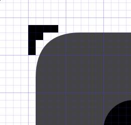
This is how a border of the Plasma "opaque" background SVGs should appear when it has a rounded border (since the window shape won't have antialiasing the outer contour must not have rounded lines).
solid/ folder
Elements in this folder will be used when compositing is available, but elements should not be rendered transparent.
For example, if a panel is configured to use adaptive opacity and a maximized window is present, then an opaque version of the panel is used rather than a transparent version.
translucent/ folder
Elements in this folder will be used when the KWin Background Contrast effect is enabled. When it is possible to blur the background of the window, the graphics can be more transparent, keeping the window text readable.
icons/ folder
In the folder icons/, there are SVG files that contain scalable icons for use with application status items (for example, icons in the system tray).
Some of the most common icons:
audio.svgbattery.svgcomputer.svgconfigure.svgdevice.svginput.svgmedia.svgnetwork.svgnotification.svgpreferences.svgstart.svgsystem.svg- More...