Background SVG format
Many Plasma SVGs follow a common format for their background elements, either fully (like all background.svg versions) or partially, with modifications (like lineedit.svg, dragger.svg and glowbar.svg).
The element IDs for all SVG files are listed in the Theme Elements Reference, including all SVG files that differ from the background SVG format, with a listing of elements according to their placement.
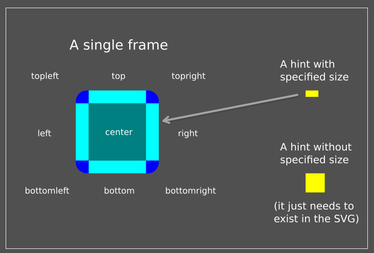
All background SVGs (except for wallpaper images) must have SVG elements that have the following element ID parts representing their position, all of which will be painted at the native size (and can therefore be bitmaps), except for center which will be scaled.
For brevity's sake, the many element ID parts available in the current Background SVG Format and in the Theme Elements Reference are bundled together into semantic groups for easier reading using square brackets []:
[position][position]can be:top: the top bar between the two top cornerstopright: the top right cornerright: the right bar between the two right cornersbottomright: the bottom right cornerbottom: the bottom bar between the two bottom cornersbottomleft: the bottom left cornerleft: the left bar between the two left cornerstopleft: the top left cornercenter: the center fill; it will be scaled, so it should be an actual SVG element
The set of nine elements with position IDs put together is called a frame. Frames are typically found in buttons or containments, the latter being the space where some additional content is stored, like panels, Plasma widgets or dialogs.
Some Plasma components may use the above named ID names with prefixes, as mentioned in Position and meaning of element IDs in Plasma SVG files. For example, if you inspect widgets/panel-background.svg, the panel placed on the left side of the screen uses the "west" prefix (west-topleft, west-topright, etc.). The cardinal directions available are north, east, south and west and they are further referenced as [cardinaldirection]:
[cardinaldirection][cardinaldirection]can be:northeastsouthwest
Cardinal directions are particularly useful, for instance, when combined with the center element ID to have panels with different colors depending on their position on the screen, among other special use cases like widgets/tabbar.svg.
Following this format, something like west-topleft can then be referenced as [cardinaldirection]-[position]. If we compare top, west-right and north-left, we would have something like:
| CARDINALDIRECTION | POSITION | RESULT |
|---|---|---|
| top | top | |
| west | right | west-right |
| north | center | north-center |
So far, this works for plain backgrounds without shadows or background masks. To create those, you can use the shadow and mask prefixes to make frames that follow the same structure:
shadow-[position]: each element can use SVG effects like gradients and alpha channels to create shadows that will show up in your backgroundsmask-[position]: all elements for the mask should be black
Shadows and background masks cannot use cardinal directions.
Additionally, elements with a few hint IDs can be used to control the rendering of the backgrounds:
[hint][hint]can be:hint-stretch-borders: if it exists, the borders will not be tiled but rather stretched to fill the entire areahint-tile-center: if it exists, the center will not be scaled but rather tiled to fit, that is, the pattern with this hint will be repeated until it fills the entire area (optional, from 4.1 and later).hint-no-border-padding: if it exists, padding will not be added for the borders, and content will fill the entire area (including borders).hint-apply-color-scheme: if it exists, the SVG will be colorized using the color scheme colors defined by the user. Colorization is applied at 100%, with tapered lines off on either side, and an HSV color value/intensity of 127.hint-compose-over-border: if it exists, thecenterelement will be drawn with the same size as the full image, composed under the borders and shaped with the alpha mask frame, which has to be present in order to make this hint work (optional).
hint-[direction]-shadow: hints used to determine the size of the shadow[direction]can be:top: the top edge of the frame; the hint's height will be used for this elementright: the right edge of the frame; the hint's width will be used for this elementbottom: the bottom edge of the frame; the hint's height will be used for this elementleft: the left edge of the frame; the hint's height will be used for this element
[prefix]-hint-[direction]-margin: Use these optional hints if you want different margins than the border size in the SVG. height of these hints are used, for theleftandrightmargins, the width.
Next there can optionally be another element with an ID overlay (or [prefix]-overlay if it applies to a frame with a different prefix). It will be rendered over the frame like a watermark, with the rules given from the following mutually exclusive hints:
hint-overlay-random-pos: it will be put at a random position, this works only for applet backgroundshint-overlay-tile: tile the overlay; in other words, repeat the same pattern in the entire overlayhint-overlay-stretch: the overlay will be stretchedhint-overlay-pos-right: align the overlay to the right of the background rather than to the lefthint-overlay-pos-bottom: align the overlay at the bottom of the background rather than at the top
To summarize, here is a table of example element IDs used in backgrounds:
| CARDINALDIRECTION | SHADOW/MASK | POSITION/HINT | RESULT |
|---|---|---|---|
| left | left | ||
| west | top | west-top | |
| shadow | topright | shadow-topright | |
| mask | bottom | mask-bottom | |
| hint-stretch-borders | hint-stretch-borders | ||
| shadow | hint-top-margin | shadow-hint-top-margin | |
| east | hint-bottom-margin | east-hint-bottom-margin |
The last element ID is special and needs a section of its own:
current-color-scheme: if it exists, it is replaced by a CSS style with colors from the current color scheme. See System and Accent Colors for details.