Typography
Laying out your content
For demonstrative purposes, this tutorial uses an AbstractCard to make the text examples clearer. A better way to achieve the same results would be to use a Kirigami Addons FormCard.
Headings
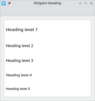
Kirigami provides a Heading that can be used for page or section titles.
import QtQuick
import QtQuick.Layouts
import org.kde.kirigami as Kirigami

Kirigami.ApplicationWindow {
    title: "Kirigami Heading"
    height: 400
    width: 400

    pageStack.initialPage: Kirigami.Page {
        Kirigami.AbstractCard {
            anchors.fill: parent
            contentItem: ColumnLayout {
                anchors.fill: parent
                Kirigami.Heading {
                    text: "Heading level 1"
                    level: 1
                }
                Kirigami.Heading {
                    text: "Heading level 2"
                    level: 2
                }
                Kirigami.Heading {
                    text: "Heading level 3"
                    level: 3
                }
                Kirigami.Heading {
                    text: "Heading level 4"
                    level: 4
                }
                Kirigami.Heading {
                    text: "Heading level 5"
                    level: 5
                }
            }
        }
    }
}
Labels
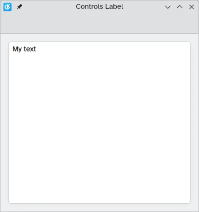
Text elements should use the Label component from QtQuick Controls 2.
import QtQuick
import QtQuick.Controls as Controls
import org.kde.kirigami as Kirigami

Kirigami.ApplicationWindow {
    title: "Controls Label"
    height: 400
    width: 400

    pageStack.initialPage: Kirigami.Page {
        Kirigami.AbstractCard {
            anchors.fill: parent
            contentItem: Controls.Label {
                    text: "My text"
            }
        }
    }
}
Text Alignment
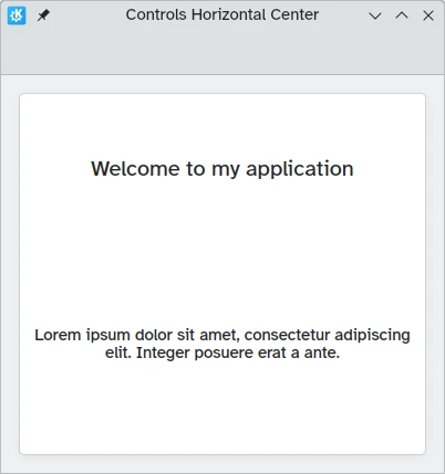
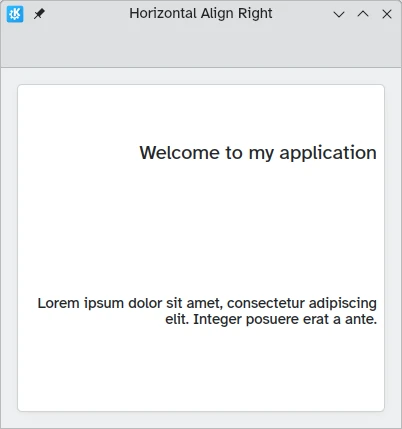
You can align your text elements using the horizontalAlignment and verticalAlignment properties.
import QtQuick
import QtQuick.Layouts
import QtQuick.Controls as Controls
import org.kde.kirigami as Kirigami

Kirigami.ApplicationWindow {
    title: "Controls Horizontal Center"
    height: 400
    width: 400

    pageStack.initialPage: Kirigami.Page {
        Kirigami.AbstractCard {
            anchors.fill: parent
            contentItem: ColumnLayout {
                Kirigami.Heading {
                    Layout.fillWidth: true
                    horizontalAlignment: Text.AlignHCenter
                    text: "Welcome to my application"
                    wrapMode: Text.Wrap
                }
                Controls.Label {
                    Layout.fillWidth: true
                    horizontalAlignment: Text.AlignHCenter
                    text: "Lorem ipsum dolor sit amet, consectetur adipiscing elit. Integer posuere erat a ante."
                    wrapMode: Text.Wrap
                }
            }
        }
    }
}
import QtQuick
import QtQuick.Layouts
import QtQuick.Controls as Controls
import org.kde.kirigami as Kirigami

Kirigami.ApplicationWindow {
    title: "Horizontal Align Right"
    height: 400
    width: 400

    pageStack.initialPage: Kirigami.Page {
        Kirigami.AbstractCard {
            anchors.fill: parent
            contentItem: ColumnLayout {
                Kirigami.Heading {
                    Layout.fillWidth: true
                    horizontalAlignment: Text.AlignRight
                    text: "Welcome to my application"
                    wrapMode: Text.Wrap
                }
                Controls.Label {
                    Layout.fillWidth: true
                    horizontalAlignment: Text.AlignRight
                    text: "Lorem ipsum dolor sit amet, consectetur adipiscing elit. Integer posuere erat a ante."
                    wrapMode: Text.Wrap
                }
            }
        }
    }
}
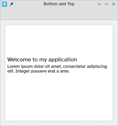
import QtQuick
import QtQuick.Layouts
import QtQuick.Controls as Controls
import org.kde.kirigami as Kirigami

Kirigami.ApplicationWindow {
    title: "Bottom and Top"
    height: 400
    width: 400

    pageStack.initialPage: Kirigami.Page {
        Kirigami.AbstractCard {
            anchors.fill: parent
            contentItem: ColumnLayout {
                Kirigami.Heading {
                    Layout.fillWidth: true
                    Layout.fillHeight: true
                    verticalAlignment: Text.AlignBottom
                    text: "Welcome to my application"
                    wrapMode: Text.WordWrap
                }
                Controls.Label {
                    Layout.fillWidth: true
                    Layout.fillHeight: true
                    verticalAlignment: Text.AlignTop
                    text: "Lorem ipsum dolor sit amet, consectetur adipiscing elit. Integer posuere erat a ante."
                    wrapMode: Text.WordWrap
                }
            }
        }
    }
}
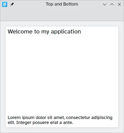
import QtQuick
import QtQuick.Layouts
import QtQuick.Controls as Controls
import org.kde.kirigami as Kirigami

Kirigami.ApplicationWindow {
    title: "Top and Bottom"
    height: 400
    width: 400

    pageStack.initialPage: Kirigami.Page {
        Kirigami.AbstractCard {
            anchors.fill: parent
            contentItem: ColumnLayout {
                Kirigami.Heading {
                    Layout.fillWidth: true
                    Layout.fillHeight: true
                    verticalAlignment: Text.AlignTop
                    text: "Welcome to my application"
                    wrapMode: Text.WordWrap
                }
                Controls.Label {
                    Layout.fillWidth: true
                    Layout.fillHeight: true
                    verticalAlignment: Text.AlignBottom
                    text: "Lorem ipsum dolor sit amet, consectetur adipiscing elit. Integer posuere erat a ante."
                    wrapMode: Text.WordWrap
                }
            }
        }
    }
}
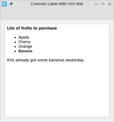
Rich Text
QML allows you to display (and edit) rich text. The behavior can be controlled via the textFormat property.
import QtQuick
import QtQuick.Layouts
import QtQuick.Controls as Controls
import org.kde.kirigami as Kirigami

Kirigami.ApplicationWindow {
    title: "Controls Label with rich text"
    height: 400
    width: 400

    pageStack.initialPage: Kirigami.Page {
        Kirigami.AbstractCard {
            anchors.fill: parent
            contentItem: Controls.Label {
                text: "<p><strong>List of fruits to purchase</strong></p>
                <ul>
                <li>Apple</li>
                <li>Cherry</li>
                <li>Orange</li>
                <li><del>Banana</del></li>
                </ul>
                <p>Kris already got some bananas yesterday.</p>"
            }
        }
    }
}
Theme
The font size of the Kirigami.Theme is available
as Kirigami.Theme.defaultFont.pointSize in your application.