Colors and themes in Kirigami
Kirigami has a color palette that follows the system colors to better integrate with the platform it is running on (i.e. Plasma Desktop, Plasma Mobile, GNOME, Android, etc.).
All of the QML components of Kirigami and QtQuick Controls should already follow this palette by default, so usually no custom coloring should be needed for these controls.
Primitive components such as Rectangle should always be colored with the color palette provided by Kirigami via the Kirigami.Theme attached property.
Hardcoded colors in QML, such as #32b2fa or red, should usually be
avoided; if it is really necessary to have elements with custom colors, it should be an area where only custom colors are used (usually in the content area of the app, and never in chrome areas such as toolbars or dialogs). For instance, a hardcoded black foreground cannot be used over a
Kirigami.Theme.backgroundColor background, because if the platform uses a
dark color scheme the result will have poor contrast with black over almost black. This is an accessibility issue and should be avoided.
Note
If you really need to use custom colors, check out Kontrast to ensure that the colors you choose have good contrast and are WCAG compliant.Theme
Kirigami.Theme is an attached property, and therefore it is available to use for any QML item. Its properties include all the colors available in the palette, and what palette to use, such as the colorSet property.
import QtQuick
import org.kde.kirigami as Kirigami

Kirigami.ApplicationWindow {
    height: 300
    width: 400

    pageStack.initialPage: Kirigami.Page {
        Rectangle {
            anchors.centerIn: parent
            implicitHeight: 100
            implicitWidth: 200
            color: Kirigami.Theme.highlightColor
        }
    }
}
Kirigami Gallery provides a code example showcasing all colors available for Kirigami through Kirigami.Theme. This includes all their states: if you click outside the window, the colors change to their inactive state, and if you switch your system to a dark theme, the dark variants of the colors should show up in real time.
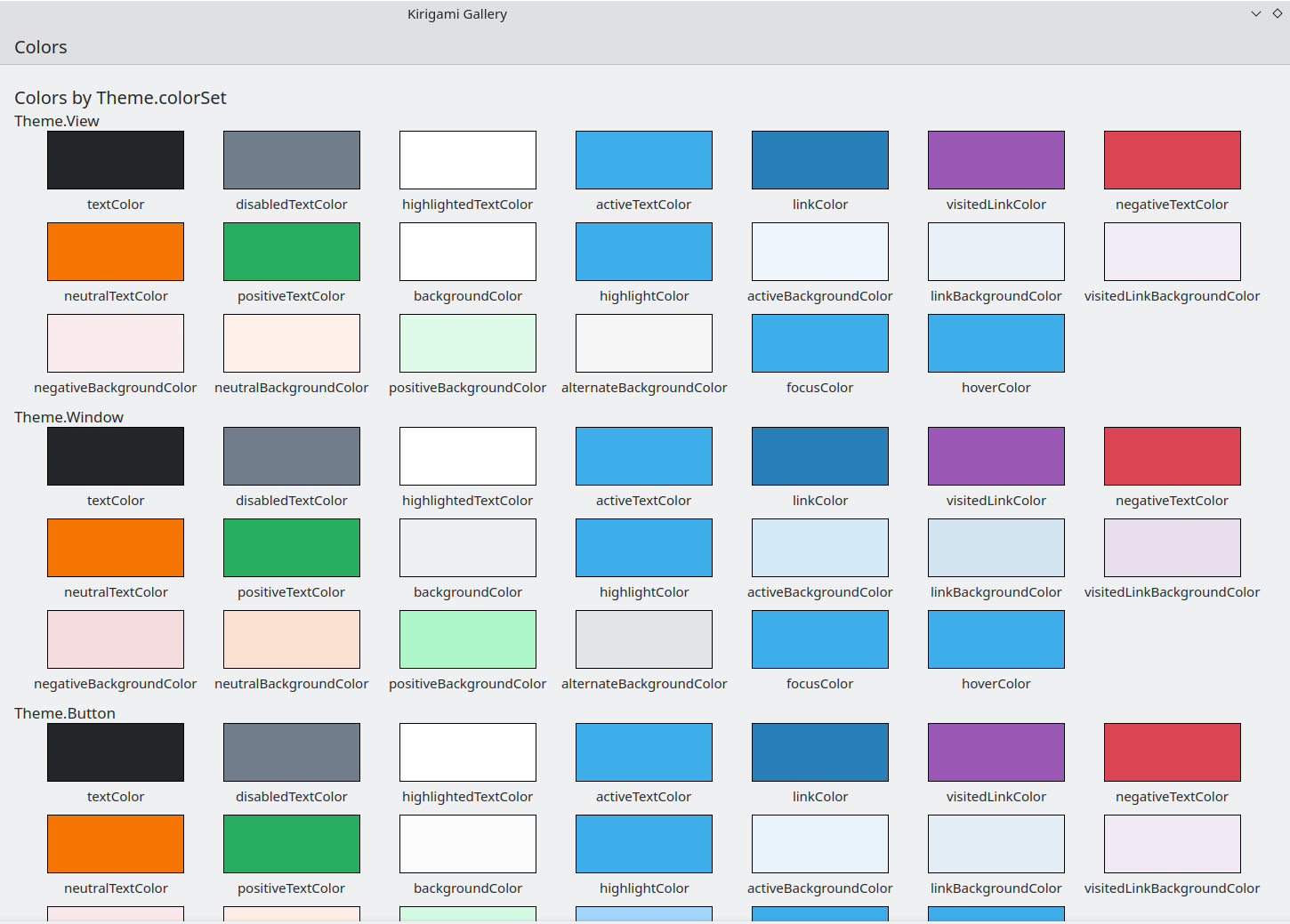
The Colors component in Kirigami Gallery
Color Set
Depending on where a control is located, it should use a different color set: for instance, when the Breeze Light color scheme is used in Views, the normal background is almost white, while in other regions, such as toolbars or dialogs, the normal background color is gray.
If you define a color set for an item, all of its child items will recursively inherit it automatically (unless the property inherit has
explicitly been set to false, which should always be done when the developer
wants to force a specific color set) so it is easy to change colors for an
entire hierarchy of items without touching any of the items themselves.
Kirigami.Theme supports 5 different color sets:
- View: Color set for item views, usually the lightest of all (in light color themes)
- Window: Color set for windows and chrome areas (this is also the default color set)
- Button: Color set used by buttons
- Selection: Color set used by selected areas
- Tooltip: Color set used by tooltips
- Complementary: Color set meant to be complementary to Window: usually dark even in light themes. May be used for emphasis in small areas of the application
Here is an example showcasing how color sets are inherited and can be used to distinguish different components. A large border has been added to contrast colors.
| |
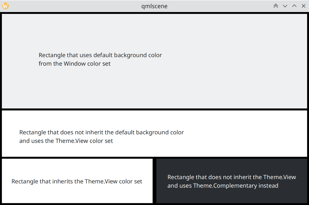
How color sets differ in Breeze
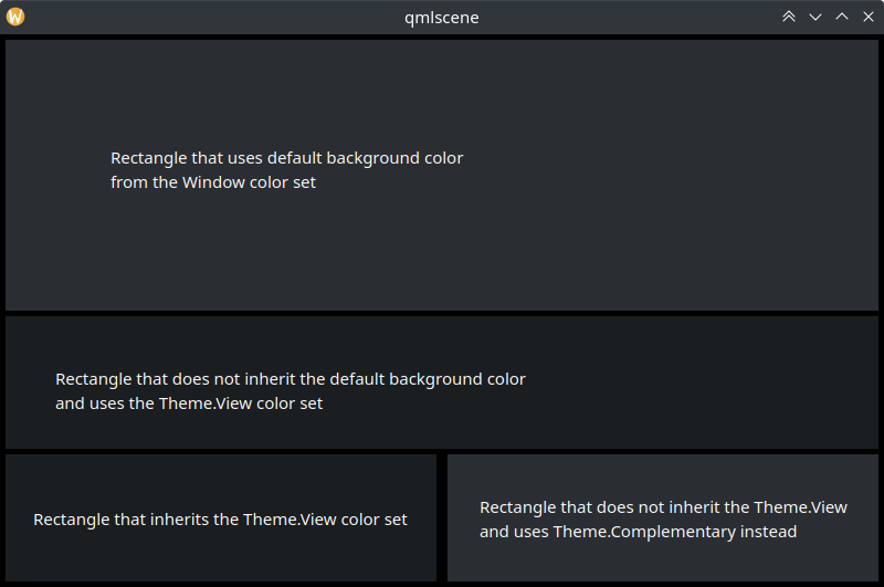
How color sets differ in Breeze Dark
Using Custom Colors
Although it's discouraged to use hardcoded colors, Kirigami offers a more maintainable way to assign a custom hardcoded palette to an item and all its children, which allows to define such custom colors in one place and one only:
import QtQuick
import org.kde.kirigami as Kirigami

Kirigami.ApplicationWindow {
    title: "Custom colors"
    height: 300
    width: 300

    Rectangle {
        anchors.fill: parent
        Kirigami.Theme.inherit: false
        // NOTE: regardless of the color set used, it is recommended
        // to replace all available colors in Theme, to avoid
        // badly contrasting colors

        Kirigami.Theme.colorSet: Kirigami.Theme.Window
        Kirigami.Theme.backgroundColor: "#b9d795"
        Kirigami.Theme.textColor: "#465c2b"
        Kirigami.Theme.highlightColor: "#89e51c"
        // Redefine all the other colors you want

        // This will be "#b9d795"
        color: Kirigami.Theme.backgroundColor

        Rectangle {
            // This will be "#465c2b"
            anchors.centerIn: parent
            height: Math.round(parent.height / 2)
            width: Math.round(parent.width / 2)
            color: Kirigami.Theme.textColor
        }
    }
}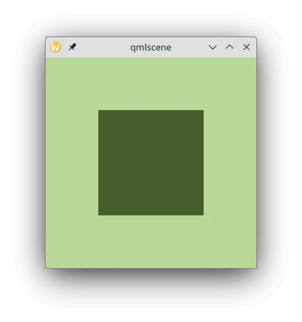
Example with custom colors