Explaining pages
Our app
In the previous tutorial, we managed to set up, build, and compile our first Kirigami application. With the basics in place, we can begin our journey towards creating a fully-featured application.
These tutorials will focus on creating an application that lets the user see how many days are left until an event of their choice.
We also recommend you check out the Kirigami Gallery, which provides a number of useful UI examples.
In this section we'll be focusing on pages, one of the key structural elements of any Kirigami application.
Pages
Kirigami apps are typically organized in pages by using Kirigami.Page. Pages are the different "screens" of an app. You will want to have a page dedicated to specific aspects of your app's interaction, and to make things easier you can create different QML files for each page.
Pages are organized in a page stack where they can be pushed and popped. On a phone only the top-most page is shown, whereas on a larger screen (desktop or tablet), if desired, multiple pages can be shown next to each other.
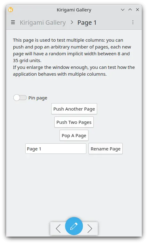
A single page on the phone
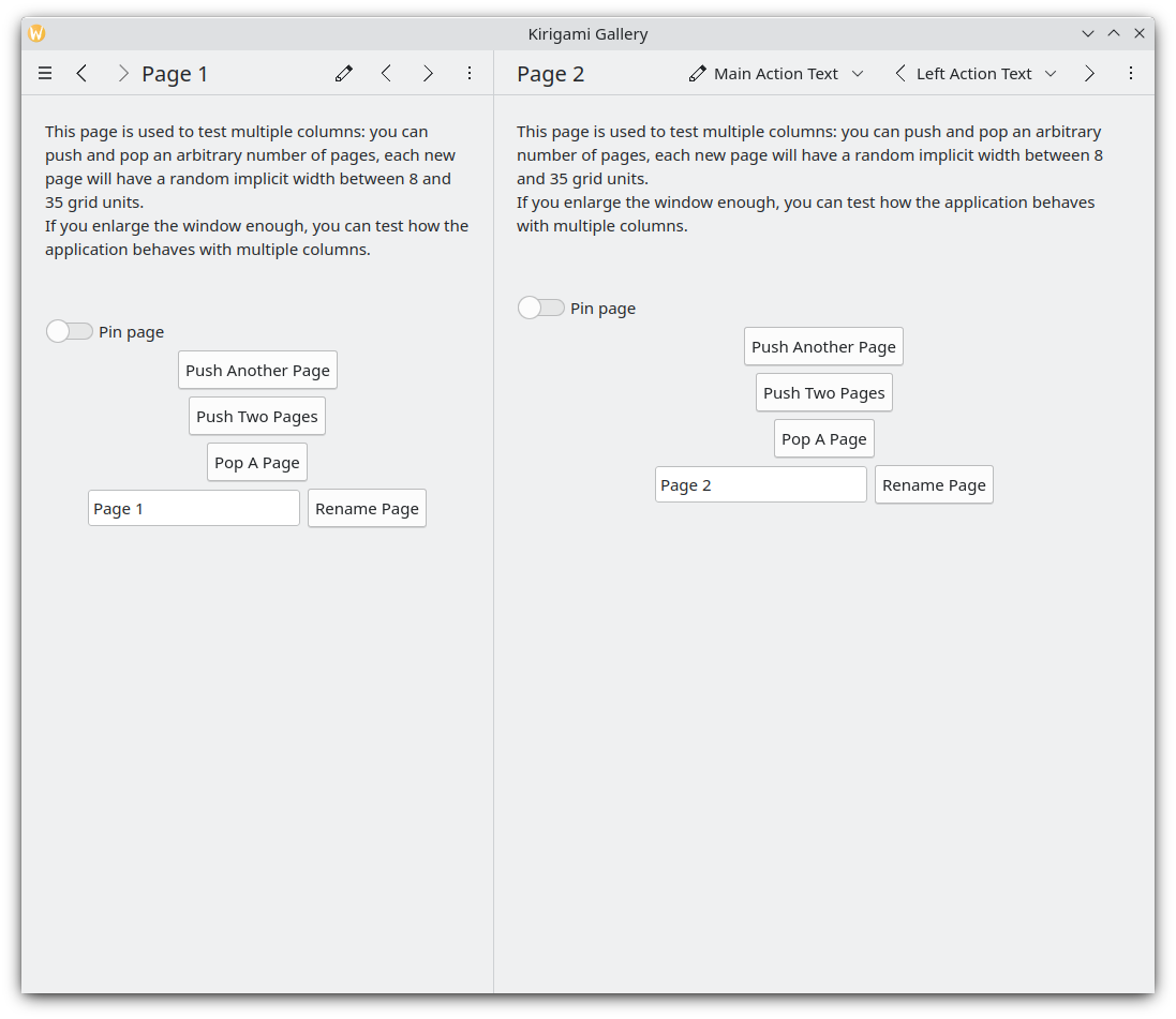
Two pages next to each other on the desktop
Note
A Kirigami.Page inherits from a Controls.Page, and as such you can use the latter's properties as well.
When looking through QML API documentation, make sure to look into the functions and properties inherited by the API you are looking at as well.
Let's go back to the Main.qml file we created in our previous tutorial:
| |
We make our application start to our Kirigami.Page. All we have included in it is a label containing "Hello World", but we're going to spruce things up a little.
The idea behind our app is that we're going to be able to display a bunch of countdowns to the user. The problem with a normal Kirigami.Page is that it has a fixed vertical size, so instead we can use a Kirigami.ScrollablePage, which already comes with its own built-in scrollbar.
| |
Kirigami pages also feature neat titles placed within the toolbar, quickly indicating to the user which page they are on. All we need to do is to set a page title using the title property of Kirigami.ScrollablePage. In this case, we used one of the i18nc() functions we explored in our previous tutorial to this end.
Note
You could also choose to define your page within its own QML document. To do so, you'd create the new QML file, for example kirigami-tutorial/src/qml/StartPage.qml, add it to your kirigami-tutorial/src/CMakeLists.txt file, and set the window's first page to load it, like so:
pageStack.initialPage: Qt.resolvedUrl("StartPage.qml")pageStack.initialPage sets the initial Page of the application's page stack, and Qt.resolvedUrl converts the relative URL of the QML file into an absolute one.
There is further information about alternative page structures within our Kirigami documentation.