Adding a dialog

Getting to grips with Kirigami dialogs.

Making our app useful

We have a window, we have cards, and we have actions. Yet, we still need to find some way of inputting a name, description, and date of our choice.

One way we could do this is by creating a new page where we place the required input elements. However, a whole page dedicated to providing a name, description, and date seems a bit excessive.

Instead, we'll be using a dialog.

Dialog appearing in the middle of the application

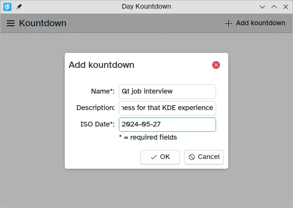
Countdown-adding dialogs

The new component we add is a Kirigami.Dialog . Dialogs appear at the center of the window and can be used to provide extra information relevant to the current content. They can't be moved, but they adapt their own size to the window.

Kirigami.Dialog {
    id: addDialog
    title: i18nc("@title:window", "Add kountdown")
    standardButtons: Kirigami.Dialog.Ok | Kirigami.Dialog.Cancel
    padding: Kirigami.Units.largeSpacing
    preferredWidth: Kirigami.Units.gridUnit * 20

    // Form layouts help align and structure a layout with several inputs
    Kirigami.FormLayout {
        // Textfields let you input text in a thin textbox
        Controls.TextField {
            id: nameField
            // Provides a label attached to the textfield
            Kirigami.FormData.label: i18nc("@label:textbox", "Name*:")
            // What to do after input is accepted (i.e. pressed Enter)
            // In this case, it moves the focus to the next field
            onAccepted: descriptionField.forceActiveFocus()
        }
        Controls.TextField {
            id: descriptionField
            Kirigami.FormData.label: i18nc("@label:textbox", "Description:")
            placeholderText: i18n("Optional")
            // Again, it moves the focus to the next field
            onAccepted: dateField.forceActiveFocus()
        }
        Controls.TextField {
            id: dateField
            Kirigami.FormData.label: i18nc("@label:textbox", "ISO Date*:")
            // D means a required number between 1-9,
            // 9 means a required number between 0-9
            inputMask: "D999-99-99"
            // Here we confirm the operation just like
            // clicking the OK button
            onAccepted: addDialog.onAccepted()
        }
        Controls.Label {
            text: "* = required fields"
        }
    }
    // The dialog logic goes here
}

Dialogs by default have a header and a footer, both inherited from Controls.Dialog .

The header by default includes a title and a close button that can be disabled with showCloseButton . The footer by default includes a close button, and it can be overridden with standardButtons.

We first set it to show an "Ok" button and a "Cancel" button, add some padding, and add a reasonable preferredWidth . The preferred width is the default expected size of the dialog, which can increase if needed. We can use standard Kirigami.Units that we will revisit later on.

Then we come to a Kirigami.FormLayout . Unlike a ColumnLayout, the layout of its child components is automatic and centered, with optional labels. As the name implies, it is used to create input forms.

These form layouts are designed to work with a variety of different input types, though we're sticking to simple Controls.Textfield inputs that give us simple text boxes to write things in.

We have created Textfield elements that act as:

  1. Input for the name of our countdown
  2. Input for the description of our countdown
  3. Input for the date we are counting down towards, which must be provided in a YYYY-MM-DD format

Within each of these Controls.Textfield elements, we are setting a Kirigami.FormData.label property that lets us define labels for them. The form will present the correct labels to the left of each of these text input fields.

Finally, we are also setting the onAccepted property to trigger the forceActiveFocus() method of the following field; this will switch the active field once the user hits the ENTER key, improving the usability of the form.

We have also set a property called inputMask on the text field for our date. Setting this to D999-99-99 prevents users from entering something that might break the functionality of the application (such as text), restricting them to only entering digits which we can then try to parse into a date object.

Once the user interface for the dialog is done, we need to change how it behaves. For this we need three things:

  1. Show the Ok button only when the required fields are filled
  2. Add the input information to the model
  3. Clear the input form
// Once the Kirigami.Dialog is initialized,
// we want to create a custom binding to only
// make the Ok button visible if the required
// text fields are filled.
// For this we use Kirigami.Dialog.standardButton(button):
Component.onCompleted: {
    const button = standardButton(Kirigami.Dialog.Ok);
    // () => is a JavaScript arrow function
    button.enabled = Qt.binding( () => requiredFieldsFilled() );
}
onAccepted: {
    // The binding is created, but we still need to make it
    // unclickable unless the fields are filled
    if (!addDialog.requiredFieldsFilled()) return;
    appendDataToModel();
    clearFieldsAndClose();
}

The first thing that needs to be done is create a binding between the OK button's enabled property and a check on whether the fields are filled, which in this case needs to be done with Qt.binding() in JavaScript. In effect, the line:

button.enabled = Qt.binding( () => requiredFieldsFilled() );

is similar to the QML bindings we have seen so far, like in the following pseudo-code:

enabled: requiredFieldsFilled()

The signal handler that triggers the Ok button is onAccepted. It remains empty and without doing anything if the required fields are filled; otherwise, it will add the input to the model and clear the dialog for the next time it is opened.

// We check that the nameField is not empty and that the
// dateField (which has an inputMask) is completely filled
function requiredFieldsFilled() {
    return (nameField.text !== "" && dateField.acceptableInput);
}
function appendDataToModel() {
    kountdownModel.append({
        name: nameField.text,
        description: descriptionField.text,
        date: new Date(dateField.text)
    });
}
function clearFieldsAndClose() {
    nameField.text = ""
    descriptionField.text = ""
    dateField.text = ""
    addDialog.close();
}

For our required name field, all we need to do is to check whether the field text is an empty string. For the date field, because it has an input mask, we need to use acceptableInput instead, which only becomes true once the whole field is filled and contains only acceptable characters.

Then, the append() method of our kountdownModel list model adds a JavaScript object including the properties we have provided.

Lastly, we make sure to clear the text fields by setting their text properties to an empty string, then close() it.

Opening the dialog

actions: [
    Kirigami.Action {
        id: addAction
        icon.name: "list-add"
        text: i18nc("@action:button", "Add kountdown")
        onTriggered: addDialog.open()
    }
]

Adding the button to open the dialog is much simpler: just a Kirigami.Action that triggers the dialog's open() function.

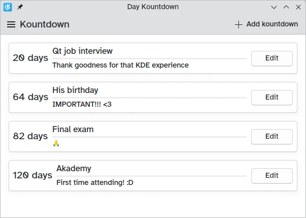
Once we save our files and build our program, we'll be able to add our own custom countdowns! We can make one last touch to improve the interface, namely remove the dummy countdown we had in the previous lessons:

26
27
28
    ListModel {
        id: kountdownModel
    }

Much nicer.

Our app so far

Main.qml:
  1
  2
  3
  4
  5
  6
  7
  8
  9
 10
 11
 12
 13
 14
 15
 16
 17
 18
 19
 20
 21
 22
 23
 24
 25
 26
 27
 28
 29
 30
 31
 32
 33
 34
 35
 36
 37
 38
 39
 40
 41
 42
 43
 44
 45
 46
 47
 48
 49
 50
 51
 52
 53
 54
 55
 56
 57
 58
 59
 60
 61
 62
 63
 64
 65
 66
 67
 68
 69
 70
 71
 72
 73
 74
 75
 76
 77
 78
 79
 80
 81
 82
 83
 84
 85
 86
 87
 88
 89
 90
 91
 92
 93
 94
 95
 96
 97
 98
 99
100
101
102
103
104
105
106
107
108
109
110
111
112
113
114
115
116
117
118
119
120
121
122
123
124
125
126
127
128
129
130
131
132
133
134
135
136
137
138
139
140
141
142
143
144
145
146
147
148
149
150
151
152
153
154
155
156
157
158
159
160
161
162
163
164
165
166
167
168
169
170
171
172
173
174
175
176
import QtQuick
import QtQuick.Layouts
import QtQuick.Controls as Controls
import org.kde.kirigami as Kirigami

Kirigami.ApplicationWindow {
    id: root

    width: 600
    height: 400

    title: i18nc("@title:window", "Day Kountdown")

    globalDrawer: Kirigami.GlobalDrawer {
        isMenu: true
        actions: [
            Kirigami.Action {
                text: i18n("Quit")
                icon.name: "application-exit-symbolic"
                shortcut: StandardKey.Quit
                onTriggered: Qt.quit()
            }
        ]
    }

    ListModel {
        id: kountdownModel
    }

    Component {
        id: kountdownDelegate
        Kirigami.AbstractCard {
            contentItem: Item {
                implicitWidth: delegateLayout.implicitWidth
                implicitHeight: delegateLayout.implicitHeight
                GridLayout {
                    id: delegateLayout
                    anchors {
                        left: parent.left
                        top: parent.top
                        right: parent.right
                    }
                    rowSpacing: Kirigami.Units.largeSpacing
                    columnSpacing: Kirigami.Units.largeSpacing
                    columns: root.wideScreen ? 4 : 2

                    Kirigami.Heading {
                        level: 1
                        text: i18n("%1 days", Math.round((date-Date.now())/86400000))
                    }

                    ColumnLayout {
                        Kirigami.Heading {
                            Layout.fillWidth: true
                            level: 2
                            text: name
                        }
                        Kirigami.Separator {
                            Layout.fillWidth: true
                            visible: description.length > 0
                        }
                        Controls.Label {
                            Layout.fillWidth: true
                            wrapMode: Text.WordWrap
                            text: description
                            visible: description.length > 0
                        }
                    }
                    Controls.Button {
                        Layout.alignment: Qt.AlignRight
                        Layout.columnSpan: 2
                        text: i18n("Edit")
                    }
                }
            }
        }
    }

    Kirigami.Dialog {
        id: addDialog
        title: i18nc("@title:window", "Add kountdown")
        standardButtons: Kirigami.Dialog.Ok | Kirigami.Dialog.Cancel
        padding: Kirigami.Units.largeSpacing
        preferredWidth: Kirigami.Units.gridUnit * 20

        // Form layouts help align and structure a layout with several inputs
        Kirigami.FormLayout {
            // Textfields let you input text in a thin textbox
            Controls.TextField {
                id: nameField
                // Provides a label attached to the textfield
                Kirigami.FormData.label: i18nc("@label:textbox", "Name*:")
                // What to do after input is accepted (i.e. pressed Enter)
                // In this case, it moves the focus to the next field
                onAccepted: descriptionField.forceActiveFocus()
            }
            Controls.TextField {
                id: descriptionField
                Kirigami.FormData.label: i18nc("@label:textbox", "Description:")
                // Again, it moves the focus to the next field
                onAccepted: dateField.forceActiveFocus()
            }
            Controls.TextField {
                id: dateField
                Kirigami.FormData.label: i18nc("@label:textbox", "ISO Date*:")
                // D means a required number between 1-9,
                // 9 means a required number between 0-9
                inputMask: "D999-99-99"
                // Here we confirm the operation just like
                // clicking the OK button
                onAccepted: addDialog.onAccepted()
            }
            Controls.Label {
                text: "* = required fields"
            }
        }
        // Once the Kirigami.Dialog is initialized,
        // we want to create a custom binding to only
        // make the Ok button visible if the required
        // text fields are filled.
        // For this we use Kirigami.Dialog.standardButton(button):
        Component.onCompleted: {
            const button = standardButton(Kirigami.Dialog.Ok);
            // () => is a JavaScript arrow function
            button.enabled = Qt.binding( () => requiredFieldsFilled() );
        }
        onAccepted: {
            // The binding is created, but we still need to make it
            // unclickable unless the fields are filled
            if (!addDialog.requiredFieldsFilled()) return;
            appendDataToModel();
            clearFieldsAndClose();
        }
        // We check that the nameField is not empty and that the
        // dateField (which has an inputMask) is completely filled
        function requiredFieldsFilled() {
            return (nameField.text !== "" && dateField.acceptableInput);
        }
        function appendDataToModel() {
            kountdownModel.append({
                name: nameField.text,
                description: descriptionField.text,
                date: new Date(dateField.text)
            });
        }
        function clearFieldsAndClose() {
            nameField.text = ""
            descriptionField.text = ""
            dateField.text = ""
            addDialog.close();
        }
    }

    pageStack.initialPage: Kirigami.ScrollablePage {
        title: i18nc("@title", "Kountdown")

        // Kirigami.Action encapsulates a UI action. Inherits from Controls.Action
        actions: [
            Kirigami.Action {
                id: addAction
                // Name of icon associated with the action
                icon.name: "list-add"
                // Action text, i18n function returns translated string
                text: i18nc("@action:button", "Add kountdown")
                // What to do when triggering the action
                onTriggered: addDialog.open()
            }
        ]

        Kirigami.CardsListView {
            id: cardsView
            model: kountdownModel
            delegate: kountdownDelegate
        }
    }
}

Screenshot of the application with four example cards