Adding actions
Recap
So far, we built a simple app that can display cards. However, there is currently no way for the user to add new cards to the card view.
In this tutorial, we'll be looking at Kirigami actions. These will help us add interactivity to our app in a consistent, fast, and accessible way.
Actions
A Kirigami.Action encapsulates a user interface action. We can use these to provide our applications with easy-to-reach actions that are essential to their functionality.
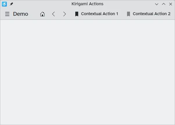
If you have used Kirigami apps before, you have certainly interacted with Kirigami actions. In this image, we can see actions to the right of the page title with various icons. Kirigami actions can be displayed in several ways and can do a wide variety of things.
Adding countdowns
A countdown app is pretty useless without the ability to add countdowns. Let's create an action that'll let us do this.
pageStack.initialPage: Kirigami.ScrollablePage {
    // Other page properties...
    actions: [
        Kirigami.Action {
            id: addAction
            icon.name: "list-add-symbolic"
            text: i18nc("@action:button", "Add kountdown")
            onTriggered: kountdownModel.append({
                name: "Kirigami Action added card!",
                description: "Congratulations, your Kirigami Action works!",
                date: 1000
            })
        }
    ]
    // ...
}
We are placing our Kirigami.Action within our main page from the previous tutorials. If we wanted to, we could add more actions to our page (and even nest actions within actions!).
The brackets [] used above are similar to JavaScript arrays, which means you can pass one or more things to them, separated by comma:
// General JavaScript array of components:
variable: [ component1, component2 ]
// Passing an array of Kirigami actions to QML:
actions: [ Kirigami.Action {}, Kirigami.Action {} ]
The id and text properties should be familiar from previous tutorials. However, the inherited Action.icon property should be interesting: it is an object with several properties letting you display certain icons for your actions. Fortunately, to use KDE icons all we need to do is provide the name property for the icon property, icon.name.
Viewing the available icons
Click here to see how to check the available icons on your system
Icon Explorer is a KDE application that lets you view all the icons that you can use for your application. It offers a number of useful features such as previews of their appearance across different installed themes, previews at different sizes, and more. You might find it a useful tool when deciding on which icons to use in your application.
Many of KDE's icons follow the FreeDesktop Icon Naming specification. Therefore, you might also find it useful to consult The FreeDesktop project's website, which lists all cross-desktop compatible icon names.
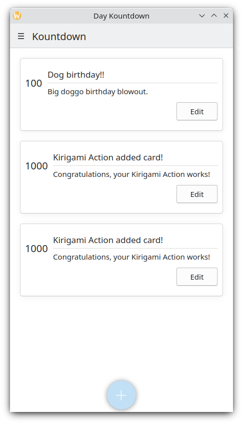
The onTriggered signal handler is the most important. This is what our action will do when it is used. You'll notice that in our example we're using the method kountdownModel.append of the kountdownModel we created in our previous tutorial. This method lets us append a new element to our list model. We are providing it with an object (indicated by curly braces {}) that has the relevant properties for our countdowns (name, description, and a placeholder date).
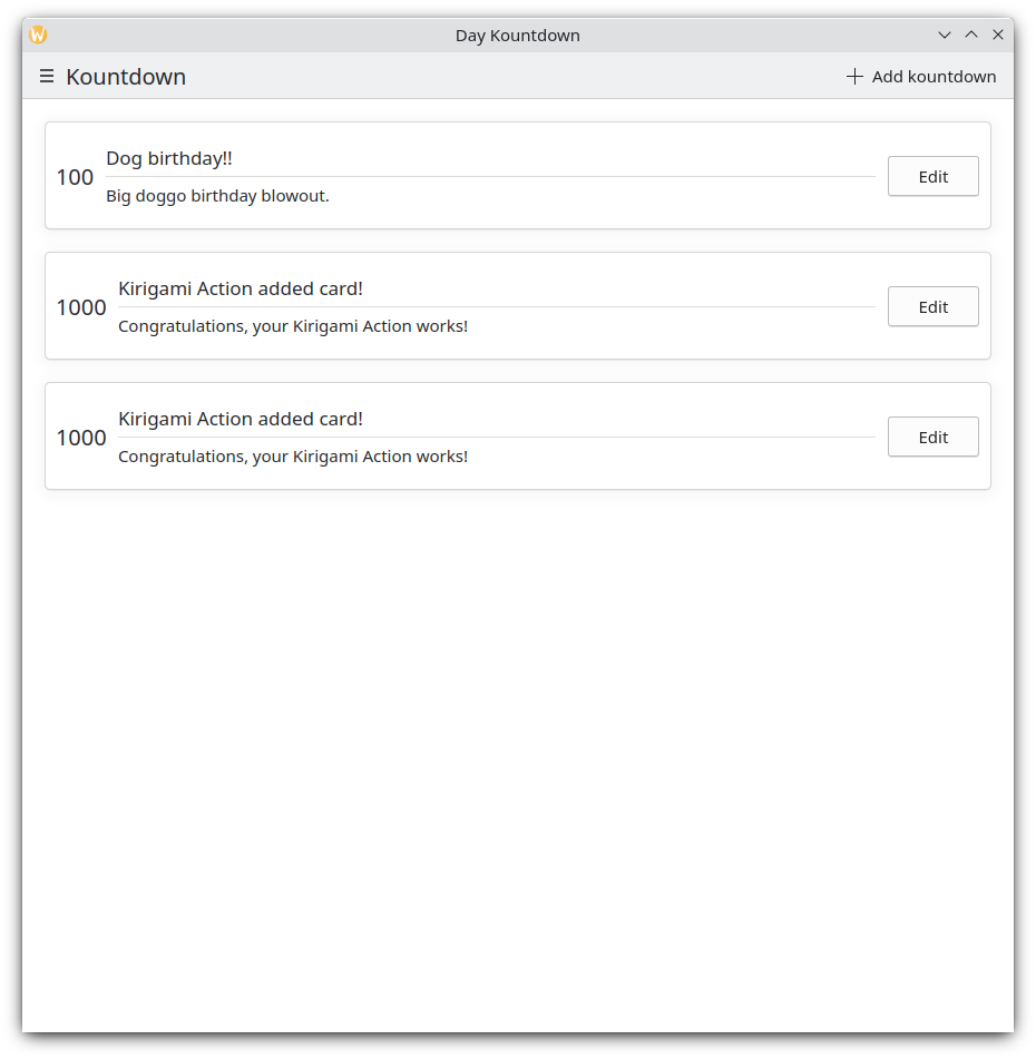
Each time we click our "Add kountdown" button on the top right, our custom countdown is added
Mobile version
Global drawer
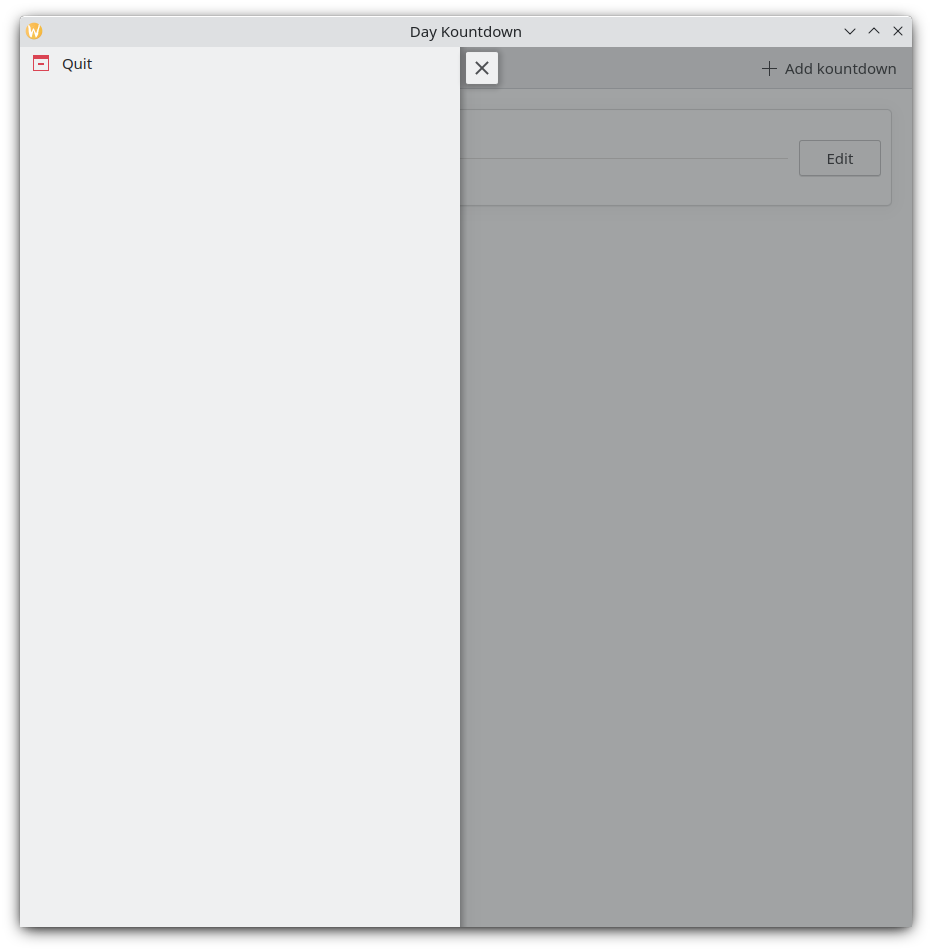
The next component is a Kirigami.GlobalDrawer. It shows up as a hamburger menu. By default it opens a sidebar, which is especially useful on mobile, as the user can just swipe in a side of the screen to open it. Global drawers are useful for global navigation and actions. We are going to create a simple global drawer that includes a "quit" button.
Kirigami.ApplicationWindow {
id: root
// Other window properties...
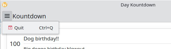
globalDrawer: Kirigami.GlobalDrawer {
isMenu: true
actions: [
Kirigami.Action {
text: i18n("Quit")
icon.name: "application-exit-symbolic"
shortcut: StandardKey.Quit
onTriggered: Qt.quit()
}
]
}
// ...
}Here, we put our global drawer inside our application window. The main property we need to pay attention to is GlobalDrawer.actions, which takes the form of an array of Kirigami.Action components. This action has an appropriate icon and executes the Qt.quit() function when triggered, closing the application.
Since we are keeping our global drawer simple for now, we are setting the GlobalDrawer.isMenu property to true. This displays our global drawer as a normal application menu, taking up less space than the default global drawer pane.
Global drawer
Global drawer as a menu
Tip
The Actions based components page of these docs provides further detail on Kirigami Actions and how they can be used.Actions are contextual
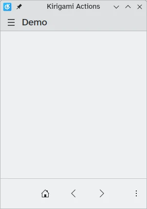
Kirigami components are designed in such a way that the place where you put Kirigami Actions is relevant. As seen above, if you add actions to a Kirigami.Page, Kirigami.ScrollablePage or any other derivative Page component, they will show up on the right side of the header in desktop mode, and on the bottom in mobile mode.
Similarly, if Kirigami Actions are added to a Kirigami.GlobalDrawer, they will show up in the resulting drawer or menu.
Other examples of Kirigami Actions showing up differently depending on their parent component are:
- Kirigami.ContextDrawer - ContextDrawer tutorial here
- Kirigami.AbstractCard and derivatives - Card tutorial here
- Kirigami.Dialog and derivatives - Dialog tutorial here
- Kirigami.ActionToolBar - ActionToolBar tutorial here
Among other Kirigami components.
Our app so far
Main.qml:
| |