Progress bars and indicators
Whenever your application does something that takes a noticeable amount of time, you will want to use a visual element that tells the user that something is happening in the background.
QtQuick Controls provides two useful components that you can use to this end.
Progress bar
Controls.ProgressBar is a component that lets you easily include progress bars in your application. There are four main properties you will need to use:
- from: the minimum value represented by the start of the progress bar
- to: the maximum value represented by the end of the progress bar
- value: the current value of the action that is in progress (e.g. 50% loaded)
- indeterminate: if the action that is in process currently has no clear progress value, you can set this property to
trueto show the user that something is happening but its progress is not yet clear (but will be soon).
import QtQuick
import QtQuick.Layouts
import QtQuick.Controls as Controls
import org.kde.kirigami as Kirigami

Kirigami.ApplicationWindow {
    title: "Progressbar App"
    width: 400
    height: 400
    pageStack.initialPage: Kirigami.Page {
        ColumnLayout {
            anchors.left: parent.left
            anchors.right: parent.right
            Controls.ProgressBar {
                Layout.fillWidth: true
                from: 0
                to: 100
                value: 50
                indeterminate: false
            }
            Controls.ProgressBar {
                Layout.fillWidth: true
                from: 0
                to: 100
                // value: 50
                indeterminate: true
            }
        }
    }
}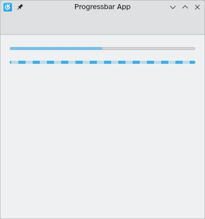
Above: progress bar at 50%; below: indeterminate progress bar
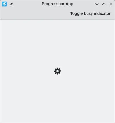
Busy indicator
In cases where loading times are shorter or measuring progress is not feasible, you can instead use Controls.BusyIndicator. This component provides a simple spinning wheel that shows users that something is happening.
If you want the indicator to stop running, you can do so by setting the running property to false, in which case the .
import QtQuick
import QtQuick.Controls as Controls
import org.kde.kirigami as Kirigami

Kirigami.ApplicationWindow {
    title: "Progressbar App"
    width: 400
    height: 400
    pageStack.initialPage: Kirigami.Page {
        actions: [
            Kirigami.Action {
                text: "Toggle busy indicator"
                onTriggered: indicator.running ? indicator.running = false : indicator.running = true
            }
        ]
        Controls.BusyIndicator {
            id: indicator
            anchors.centerIn: parent
        }
    }
}