Form layouts
Kirigami.FormLayout components make it easy for you to create forms that conform to the KDE Human Interface Guidelines. They are optimal for settings dialogs and for large groups of controls and input fields that are related to each other.
When provided with enough space, form layouts will take up two columns. The column on the left will be occupied by the labels provided for the form's children components, while the right will be taken up by the children components themselves. In more space-constrained windows (or on mobile), forms will consist of a single vertical column with the labels of children components being placed above their respective component.
Simple form
Kirigami.FormLayout components are similar in use to QtQuick Layout components such as ColumnLayout or RowLayout. The child components will be automatically arranged according to the size available to the form layout.
Children of a Kirigami.FormLayout have a property named Kirigami.FormData.label. This property lets you set the label that will be provided for the child component in question.
import QtQuick
import QtQuick.Layouts
import QtQuick.Controls as Controls
import org.kde.kirigami as Kirigami

Kirigami.ApplicationWindow {
    pageStack.initialPage: Kirigami.Page {

        Kirigami.FormLayout {
            anchors.fill: parent

            Controls.TextField {
                Kirigami.FormData.label: "TextField 1:"
            }
            Controls.TextField {
                Kirigami.FormData.label: "TextField 2:"
            }
            Controls.TextField {
                Kirigami.FormData.label: "TextField 3:"
            }
        }
    }
}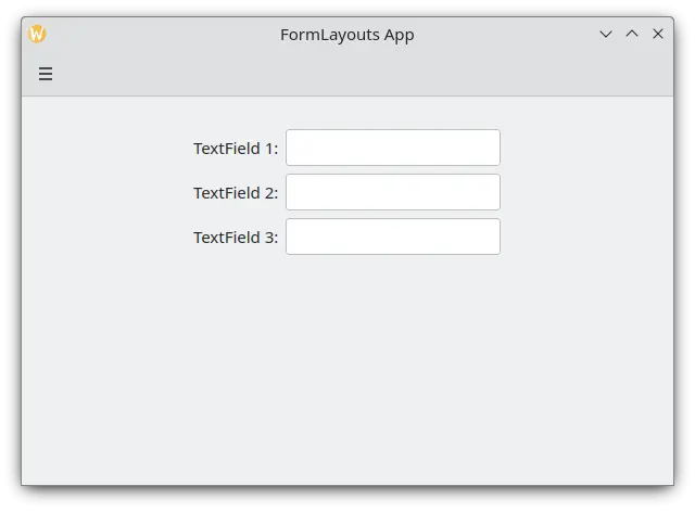
A simple form layout in desktop mode
Sections and separators
FormLayouts can also be divided into sections. Setting where a section starts is as easy as setting a child component's Kirigami.FormData.isSection to true. This will provide the component with some extra margin at the top to demarcate the start of the new section.
Kirigami.Separator components are best suited for starting new sections. Separators are used to draw a thin horizontal line, demarcating the end of a section. If you would rather not have a line drawn between sections, you can use a standard QML Item property. Alternatively you could use the Kirigami.FormData.isSection property on any other component.
However, this is not recommended. On components where Kirigami.FormData.isSection is set to true, the label text provided for this component's Kirigami.FormData.label property will be displayed as the section's header text.
Warning
This does not apply to every component, hence the recommendation that you use Kirigami.Separator or Item components in places where you would like to use a header text.This header text is larger than the normal label text, and provides users with a nice visual cue of what the form layout section is about.
Kirigami.FormLayout {
    anchors.fill: parent

    Controls.TextField {
        Kirigami.FormData.label: "TextField 1:"
    }
    Controls.TextField {
        Kirigami.FormData.label: "TextField 2:"
    }
    Controls.TextField {
        Kirigami.FormData.label: "TextField 3:"
    }
    Kirigami.Separator {
        Kirigami.FormData.isSection: true
        Kirigami.FormData.label: "New Section!"
    }
    ColumnLayout {
        Kirigami.FormData.label: "Radio buttons"
        Controls.RadioButton {
            text: "Radio 1"
            checked: true
        }
        Controls.RadioButton {
            text: "Radio 2"
        }
        Controls.RadioButton {
            text: "Radio 3"
        }
    }
    Item {
        Kirigami.FormData.isSection: true
        Kirigami.FormData.label: "Another Section! (lineless though)"
    }
    Controls.TextField {
        Kirigami.FormData.label: "TextField 4:"
    }
    Controls.TextField {
        Kirigami.FormData.label: "TextField 5:"
    }
    Controls.TextField {
        Kirigami.FormData.label: "TextField 5:"
    }
}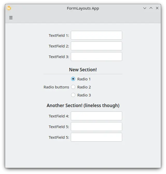
A form layout with sections
Forcing a desktop or mobile layout
If you would rather have your form layout stay consistent regardless of your application's environment, you can use the wideMode property of the Kirigami.FormLayout component:
- When set to
true, the form layout will be structured in a desktop-optimized widescreen (double-column) layout - When set to
false, the form layout will be structured in a mobile layout (single column)
Kirigami.FormLayout {
    anchors.fill: parent
    wideMode: false

    Controls.TextField {
        Kirigami.FormData.label: "TextField 1:"
    }
    Controls.TextField {
        Kirigami.FormData.label: "TextField 2:"
    }
    Controls.TextField {
        Kirigami.FormData.label: "TextField 3:"
    }
}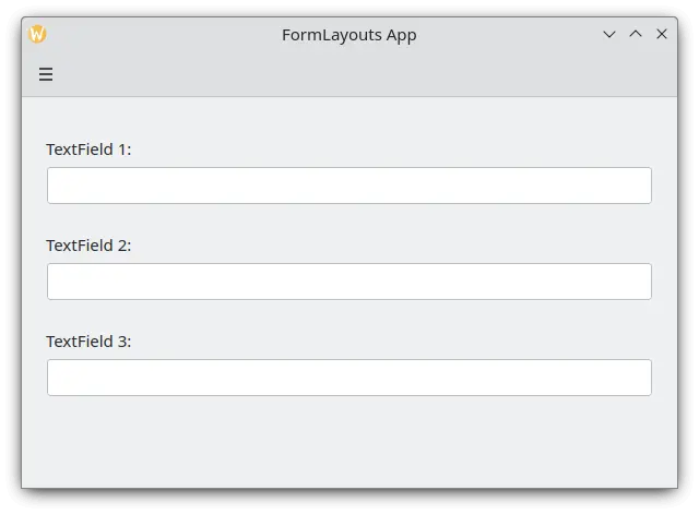
A form layout with forced mobile layout
Aligning your labels
There are instances when you want a label to be assigned to components that have more than one line or to a list of components. This can be achieved by putting the Kirigami.FormData.label in the ColumnLayout, as you might have noticed in Sections and Separators. By default the label is positioned in the vertical center of the layout, which is not always desirable. We can change this with help of Kirigami.FormData.labelAlignment.
Kirigami.FormLayout {
    anchors.fill: parent

    ColumnLayout {
        Kirigami.FormData.label: "This is a label:"
        Kirigami.FormData.labelAlignment: Qt.AlignTop

        Controls.Label {
            text: "This is some rather long text \nthat should elide to multiple lines \nto show how the label gets aligned."
            elide: Text.elideLeft
        }
    }
}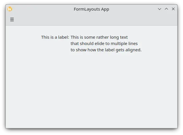
A form layout with top-aligned label
Setting the label alignment is particularly convenient to manage components or lists of components whose size you do not know beforehand. Elisa is a very good example of this:
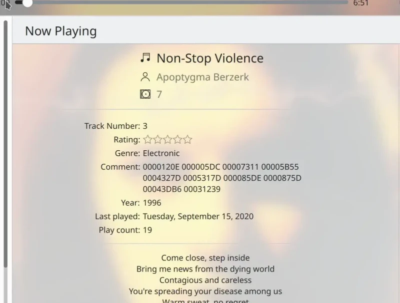
The Comment label is only top aligned when its corresponding component has more than one line
We can do something similar to this with a JavaScript ternary operator:
Kirigami.FormLayout {
    anchors.fill: parent

    ColumnLayout {
        Kirigami.FormData.label: "This is a label:"
        Kirigami.FormData.labelAlignment: labelText.text.lineCount > 1 ? Qt.AlignTop : Qt.AlignVCenter

        Controls.Label {
            id: labelText
            text: "This is some rather long text \nthat should elide to a new line \nso it appears below the Form Label."
            elide: Text.elideLeft
        }
    }
}