Action toolbars
While Kirigami pages allow you to easily place a set of actions in the page header, there are times when you might prefer to have something more flexible.
Kirigami provides the component Kirigami.ActionToolBar. It displays a list of Kirigami.Action objects and will display as many of them as possible, providing an overflow menu for the ones that don't fit. The ActionToolBar is dynamic and will move actions in and out of the overflow menu depending on the size available to it.
Note
This page assumes you are familiar with Kirigami.Action objects. If you are not, you can learn all about them in our beginner tutorial or in the dedicated documentation page for them.Creating our first ActionToolBar
The layout and location of your Kirigami.ActionToolBar are really up to you, though for the sake of user-friendliness it is usually a good idea to stick to UI conventions and put your toolbar near the top or bottom of your page and to have it spread width wise.
Like most other action-holding components, Kirigami.ActionToolBar has an actions property. We can assign an array of Kirigami.Action components to this property.
import QtQuick
import QtQuick.Layouts
import QtQuick.Controls as Controls
import org.kde.kirigami as Kirigami

Kirigami.ApplicationWindow {
    id: root

    title: "ActionToolBar App"
    width: 600
    height: 400

    pageStack.initialPage: Kirigami.Page {
        Kirigami.ActionToolBar {
            anchors.left: parent.left
            anchors.right: parent.right

            actions: [
                Kirigami.Action {
                    text: "Beep"
                    icon.name: "notifications"
                    onTriggered: showPassiveNotification("BEEP!")
                },
                Kirigami.Action {
                    text: "Action Menu"
                    icon.name: "overflow-menu"

                    Kirigami.Action {
                        text: "Deet";
                        icon.name: "notifications"
                        onTriggered: showPassiveNotification("DEET!")
                    }
                    Kirigami.Action {
                        text: "Doot";
                        icon.name: "notifications"
                        onTriggered: showPassiveNotification("DOOT!")
                    }
                },
                Kirigami.Action {
                    icon.name: "search"
                    displayComponent: Kirigami.SearchField { }
                }
            ]
        }
    }
}
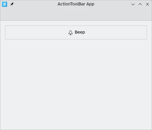
ActionToolBar with enough space for all children
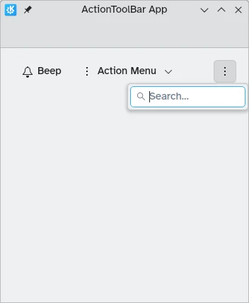
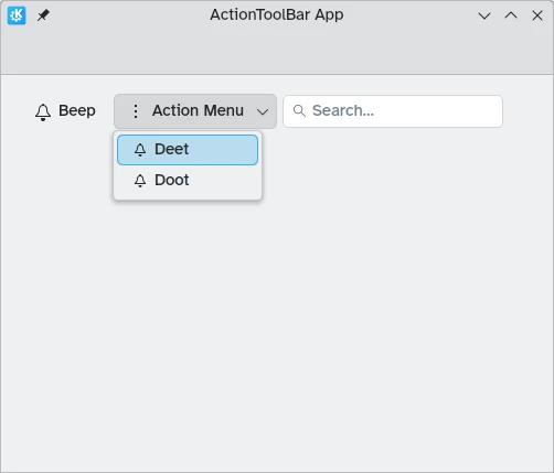
ActionToolBar with overflow menu containing children
Alignment
By default, actions in the Kirigami.ActionToolBar will be left aligned. This might not be desirable in all situations. Thankfully we can change this with the alignment property. We can set this property to a range of values, but the three most relevant ones are Qt.AlignLeft, Qt.AlignCenter, and Qt.AlignRight (which deal with horizontal alignment).
import QtQuick
import QtQuick.Layouts
import QtQuick.Controls as Controls
import org.kde.kirigami as Kirigami

Kirigami.ApplicationWindow {
    id: root

    title: "ActionToolBar App"
    width: 600
    height: 400

    pageStack.initialPage: Kirigami.Page {
        Controls.GroupBox {
            anchors.left: parent.left
            anchors.right: parent.right

            Kirigami.ActionToolBar {
                anchors.fill: parent

                alignment: Qt.AlignCenter

                actions: [
                    Kirigami.Action {
                        text: "Beep"
                        icon.name: "notifications"
                        onTriggered: showPassiveNotification("BEEP!")
                    }
                ]
            }
        }
    }
}