FormCard About pages

Learn to create About pages to credit your application.

Kirigami Addons is an additional set of visual components that work well on mobile and desktop and are guaranteed to be cross-platform. It uses Kirigami under the hood to create its components.

Some of those components allow you to credit your work and the work of other contributors in your project, as well as mention the frameworks being used in your application: AboutKDE and AboutPage.

About KDE

Each new button we created in the previous step should open a new page. You can add new pages by instantiating them as Components and then using pageStack.layers.push() for each button to load that page in our main.qml:

 1
 2
 3
 4
 5
 6
 7
 8
 9
10
11
12
13
14
15
16
17
18
19
20
21
22
23
24
25
26
27
28
29
30
31
32
33
34
35
36
37
38
39
40
41
42
43
import QtQuick 2.15
import QtQuick.Layouts 1.15

import org.kde.kirigami 2.20 as Kirigami
import org.kde.kirigamiaddons.formcard 1.0 as FormCard

import org.kde.about 1.0

Kirigami.ApplicationWindow {
    id: root
    width: 600
    height: 700

    Component {
        id: aboutkde
        FormCard.AboutKDE {}    // <==========
    }

    pageStack.initialPage: Kirigami.ScrollablePage {
        ColumnLayout {
            FormCard.FormCard {
                FormCard.FormButtonDelegate {
                    id: aboutKDEButton
                    icon.name: "kde"
                    text: i18n("About KDE Page")
                    onClicked: root.pageStack.layers.push(aboutkde)     // <==========
                }

                FormCard.FormButtonDelegate {
                    id: aboutPageButton
                    icon.name: "applications-utilities"
                    text: i18n("About Addons Example")
                }

                FormCard.FormButtonDelegate {
                    id: settingsButton
                    icon.name: "settings-configure"
                    text: i18n("Single Settings Page")
                }
            }
        }
    }
}

That's it really! All it takes is instantiating FormCard.AboutKDE. You should see something like this after clicking the AboutKDE button:
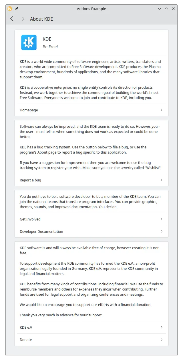
About Page

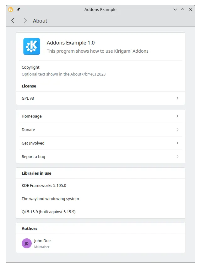
The application's AboutPage is slightly more complex, but it's still very simple to use. We will be adding a new QML file that will contain the information needed for our about page. First in our resources.qrc file:

<RCC version="1.0">
<qresource prefix="/">
    <file alias="main.qml">contents/ui/main.qml</file>
    <file alias="MyAboutPage.qml">contents/ui/MyAboutPage.qml</file>
</qresource>
</RCC>

And our contents/ui/MyAboutPage.qml should have the following:

import org.kde.kirigamiaddons.formcard 1.0 as FormCard
import org.kde.about 1.0

FormCard.AboutPage {
    aboutData: About
}

Here we use the information we set using KAboutData in our main.cpp. Here's a brief reminder of what is in main.cpp:

qmlRegisterSingletonType(
    "org.kde.about",        // <========== used in the import
    1, 0, "About",          // <========== C++ object exported as a QML type
    [](QQmlEngine *engine, QJSEngine *) -> QJSValue {
        return engine->toScriptValue(KAboutData::applicationData());
    }
);

The About object we exported to the QML side using qmlRegisterSingletonType() contains the data from KAboutData::applicationData() , and that is what we pass to the aboutData property.

Lastly, we add our new MyAboutPage to our main.qml:

 1
 2
 3
 4
 5
 6
 7
 8
 9
10
11
12
13
14
15
16
17
18
19
20
21
22
23
24
25
26
27
28
29
30
31
32
33
34
35
36
37
38
39
40
41
42
43
44
45
46
47
48
49
import QtQuick 2.15
import QtQuick.Layouts 1.15

import org.kde.kirigami 2.20 as Kirigami
import org.kde.kirigamiaddons.formcard 1.0 as FormCard

import org.kde.about 1.0

Kirigami.ApplicationWindow {
    id: root
    width: 600
    height: 700

    Component {
        id: aboutkde
        FormCard.AboutKDE {}
    }

    Component {
        id: aboutpage
        MyAboutPage {}      // <==========
    }

    pageStack.initialPage: Kirigami.ScrollablePage {
        ColumnLayout {
            FormCard.FormCard {
                FormCard.FormButtonDelegate {
                    id: aboutKDEButton
                    icon.name: "kde"
                    text: i18n("About KDE Page")
                    onClicked: root.pageStack.layers.push(aboutkde)
                }

                FormCard.FormButtonDelegate {
                    id: aboutPageButton
                    icon.name: "applications-utilities"
                    text: i18n("About Addons Example")
                    onClicked: root.pageStack.layers.push(aboutpage)    // <==========
                }

                FormCard.FormButtonDelegate {
                    id: settingsButton
                    icon.name: "settings-configure"
                    text: i18n("Single Settings Page")
                }
            }
        }
    }
}

The About page of our application should look like this:

Using JSON instead of KAboutData

If you were wondering why the About page was kept separate rather than embedded in main.qml, that is because it allows to set a custom model for the aboutData property.

Instead of letting your about page get information from KAboutData , it is possible to pass a JSON object directly. You will still need to use QApplication::setWindowIcon() in your main.cpp in order for your application icon to show up.

Change your MyAboutPage.json to something like this:

import org.kde.kirigamiaddons.formcard 1.0 as FormCard
import org.kde.about 1.0

FormCard.AboutPage {
    title: i18n("About")
    aboutData: {
        "displayName" : "Addons Example",
        "productName" : "",
        "componentName" : "addonsexample",
        "shortDescription" : "This program shows how to use AboutKDE and AboutPage",
        "homepage" : "https://kde.org",
        "bugAddress" : "",
        "version" : "1.0",
        "otherText" : "Optional text shown in the About",
        "authors" : [
            {
                "name" : "John Doe",
                "task" : "Maintainer",
                "emailAddress" : "",
                "webAddress" : "",
                "ocsUsername" : ""
            }
        ],
        "credits" : [],
        "translators" : [],
        "licenses" : [
            {
                "name" : "GPL v3",
                "text" : "Long license text goes here",
                "spdx" : "GPL-3.0"
            }
        ],
        "copyrightStatement" : "© 2023",
        "desktopFileName" : ""
    }

}

The main JSON object here contains the keys displayName, productName, homepage and so on. The keys authors, credits, translators and licenses can each be passed an array of objects. The objects passed to authors, credits and translators share the same keys so that they can be displayed each in their own section, while licenses includes the keys name, text and spdx for each license added, as it is not uncommon for the same project to include multiple licenses.

These keys are optional, but a reasonable minimum amount of keys is expected to make your application have no empty fields: displayName, version, description, homepage, copyrightStatement and authors. You are encouraged to fill as many key as possible, however.