Karty
The Kirigami types AbstractCard and Card are used to implement the popular card component used on many mobile and web platforms. Cards can be used to display a collection of information or actions in an attractive and distinctive way.
Kirigami also offers 3 kinds of views and positioners to aid you in presenting your cards with beautiful and responsive layouts.
AbstractCard
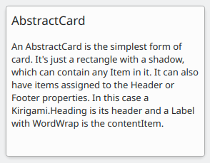
A Kirigami.AbstractCard is the simplest type of card. It's just a rectangle with a shadow, which can contain any Item in it. It can also have Items assigned to its header or footer properties. In this case a Kirigami.Heading is its header and a Controls.Label is the card's contentItem.
Kirigami.AbstractCard {
    Layout.fillHeight: true
    header: Kirigami.Heading {
        text: qsTr("AbstractCard")
        level: 2
    }
    contentItem: Controls.Label {
        wrapMode: Text.WordWrap
        text: "..."
    }
}
Karta
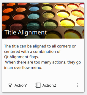
A Kirigami.Card inherits from AbstractCard and provides more features out of the box. Cards inherit the same header and footer from an Abstract Card, but you are encouraged to use a banner and a set of Kirigami.Action in the actions group instead.
Kirigami.Card {
    actions: [
        Kirigami.Action {
            text: qsTr("Action1")
            icon.name: "add-placemark"
        },
        Kirigami.Action {
            text: qsTr("Action2")
            icon.name: "address-book-new-symbolic"
        },
        // ...
    ]
    banner {
        source: "../banner.jpg"
        title: "Title Alignment"
        // The title can be positioned in the banner
        titleAlignment: Qt.AlignLeft | Qt.AlignBottom
    }
    contentItem: Controls.Label {
        wrapMode: Text.WordWrap
        text: "My Text"
    }
}
CardsLayout
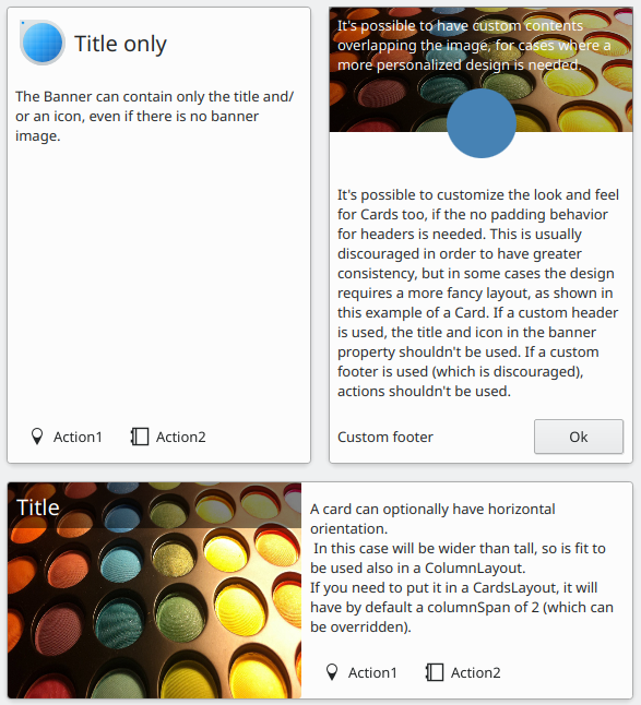
A Kirigami.CardsLayout is most useful when the cards being presented are either not instantiated by a model or are instantiated by a model that always has very few items. They are presented as a grid of two columns which will remain centered if the application is really wide, or become a single column if there is not enough space for two columns, such as a mobile phone screen.
Poznámka
CardsListView is better suited for larger models.Důležité
A CardsLayout should always be contained within a ColumnLayout.A card can optionally be oriented horizontally. In this case it will be wider than tall, and is better suited to being placed in a ColumnLayout. If you must put it in a CardsLayout, it will have a maximumColumns of 2 by default.
ColumnLayout {
    Kirigami.CardsLayout {
        Kirigami.Card {
            contentItem: Controls.Label {
                wrapMode: Text.WordWrap
                text: "My Text2"
            }
        }
        Kirigami.AbstractCard {
            contentItem: Controls.Label {
                wrapMode: Text.WordWrap
                text: "My Text"
            }
        }
        Kirigami.Card {
            headerOrientation: Qt.Horizontal
            contentItem: Controls.Label {
                wrapMode: Text.WordWrap
                text: "My Text2"
            }
        }
    }
}
CardsListView
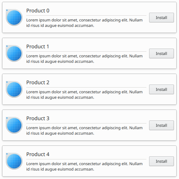
A Kirigami.CardsListView is a list view that can be used with AbstractCard components.
A CardsListView will stretch child cards to its own width. This component should therefore only be used with cards which will look good at any horizontal size. Use of a Card component inside it is discouraged, unless it has Qt.Horizontal as its headerOrientation property.
Kirigami.CardsListView {
    id: view
    model: 100

    delegate: Kirigami.AbstractCard {
        //NOTE: never put a Layout as contentItem as it will cause binding loops
        contentItem: Item {
            implicitWidth: delegateLayout.implicitWidth
            implicitHeight: delegateLayout.implicitHeight
            GridLayout {
                id: delegateLayout
                anchors {
                    left: parent.left
                    top: parent.top
                    right: parent.right
                    //IMPORTANT: never put the bottom margin
                }
                rowSpacing: Kirigami.Units.largeSpacing
                columnSpacing: Kirigami.Units.largeSpacing
                columns: width > Kirigami.Units.gridUnit * 20 ? 4 : 2
                Kirigami.Icon {
                    source: "applications-graphics"
                    Layout.fillHeight: true
                    Layout.maximumHeight: Kirigami.Units.iconSizes.huge
                    Layout.preferredWidth: height
                }
                Kirigami.Heading {
                    level: 2
                    text: qsTr("Product ")+ modelData
                }
                Controls.Button {
                    Layout.alignment: Qt.AlignRight
                    Layout.columnSpan: 2
                    text: qsTr("Install")
                }
            }
        }
    }
}